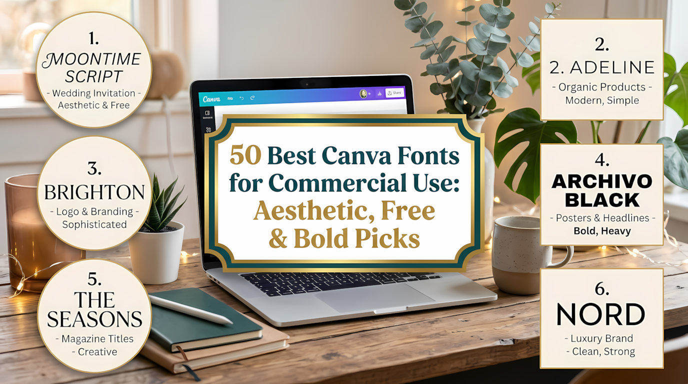
50 Best Canva Fonts for Commercial Use: Aesthetic, Free & Bold Picks
If you have ever spent twenty minutes scrolling through the Canva font dropdown, you know the struggle. There are hundreds of options, but finding the canva fonts that actually look professional, match your brand, and are safe for commercial use feels like a separate project altogether. I have been designing for Etsy shops, client brands, and my own digital products long enough to know that the right font does about 70% of the visual work before you even touch the colors.
This list is not a dump of every font I could find. I went through the Creative Fabrica and pulled the 50 that solve specific problems: elegant scripts for wedding stationery, chunky display fonts for social media graphics, playful handwritten options for kids’ brands, and frame templates that turn letters into drag-and-drop image containers.
Every pick here is relevant to Canva fonts aesthetic trends and suitable for commercial projects, though you should always double-check the individual license on the product page before you sell.
I prioritized fonts that are genuinely useful, not just popular. Some are bestsellers; others are quieter picks that deserve more attention. Whether you need cute Canva fonts for a boutique or a Canva fonts bundle free of clutter, this list covers the styles that small business owners, content creators, and DIY designers actually reach for.
Quick Navigation: Jump to Any Canva Font
- 1. Sewy Font Custom Canva Frames
- 2. Pearl Font Alphabet Canva Frame Template
- 3. Magic Frame Font
- 4. Retro Vintage Font
- 5. Pixo Font
- 6. Jelly Fish Font
- 7. Caskford Stacked Font
- 8. St. Patrick’s Day Lucky Font
- 9. Pumpkin Font
- 10. Boston Angel Font
- 11. Valencia Font
- 12. Charlotte Font
- 13. Gwen Mark Canva Font Frame Template
- 14. Night Sky Font Canva Frames Alphabet
- 15. Canva Letters Frame Alphabet Template192
- 16. Ultimate 500+ All Type Mega Bundle
- 17. Abcd Ref Dotted Font
- 18. Fox Gloria Font
- 19. Fox Cupid Font
- 20. Fox Muffin Font
- 21. Fox Mine Font
- 22. Summer Flowers Font
- 23. Fox Grinch Font
- 24. Fox Clover Font
- 25. Fox Naomi Font
- 26. Fox Marie Font
- 27. Fox Annie Font
- 28. Golden Pair Font
- 29. Dept Font
- 30. Fox Bread Font
- 31. Fox Lucky Font
- 32. Fox Milkcow Font
- 33. Fox Harvest Font
- 34. Fox Kitty Font
- 35. Agrolik Font
- 36. Modern Luxe Font
- 37. Fox Love 3d Font
- 38. Fox Irish Font
- 39. Fox Diane Font
- 40. Fox Thanksgiving Font
- 41. Fox Love Font
- 42. Ginger Coffe Font
- 43. Marker Brush Font
- 44. Fox Chick Font
- 45. Fox Cutie Font
- 46. Fox Heart Font
- 47. Fox Rosie Font
- 48. Fox Admire Font
- 49. Luxury Minimal Font
- 50. Emanie Font
Quick Comparison: My Top 5 Canva Fonts at a Glance
| Font | Best For |
|---|---|
| Fox Gloria | Romantic branding & wedding invites |
| Ultimate 500+ Mega Bundle | One-stop commercial font library |
| Caskford Stacked | Sports & vintage poster headlines |
| Sewy Font Custom Canva Frames | Interactive image-filled letters |
| Charlotte | Clean body text & presentations |
My Top Picks
- Best Overall for Versatility: Fox Gloria Font — an elegant script that works for everything from wedding suites to boutique logos without looking forced.
- Best Value for Commercial Designers: Ultimate 500+ All Type Mega Bundle — one purchase that covers scripts, serifs, sans-serifs, and display fonts for years of projects.
- Best for Eye-Catching Social Graphics: Caskford Stacked Font — the bold, stacked serif that makes headlines feel like vintage sports posters.
Top 50 Canva Fonts for Commercial Use
1. Sewy Font Custom Canva Frames — Turn Letters Into Image Containers
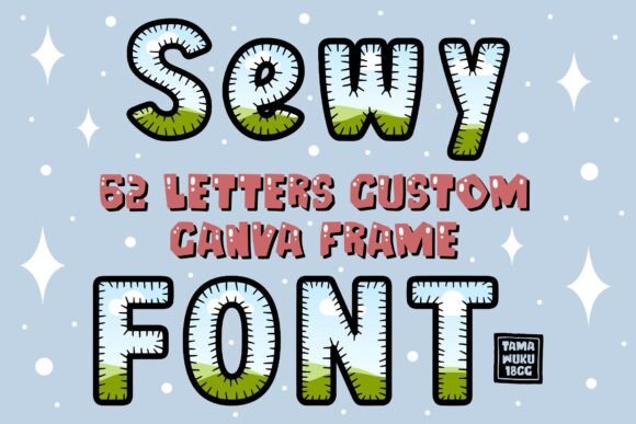
This is not a traditional font in the sense that you type and get letterforms. Sewy is a set of Canva frames shaped like letters, which means you drag a photo, video, or digital paper directly into the letter shape and it fills instantly.
For Etsy sellers making custom monograms or content creators building branded quote graphics, this opens up a workflow that normally requires Photoshop clipping masks. It works in both free and Pro Canva, which makes it unusually accessible for a frame-based product.
Best for: Personalized monograms, quote graphics with image fills, and boutique branding accents.
Why I like it: It solves a specific problem—putting images inside letters—without forcing you to leave Canva or learn a new tool.
Pairing idea: Use Sewy frames for the main initial or word, then set supporting text in a clean sans-serif like Charlotte to keep the design from feeling busy.
- Drag-and-drop image filling inside Canva
- Compatible with free and Pro accounts
- Ideal for monograms and personalized products
2. Pearl Font Alphabet Canva Frame Template — Preppy Beaded Lettering
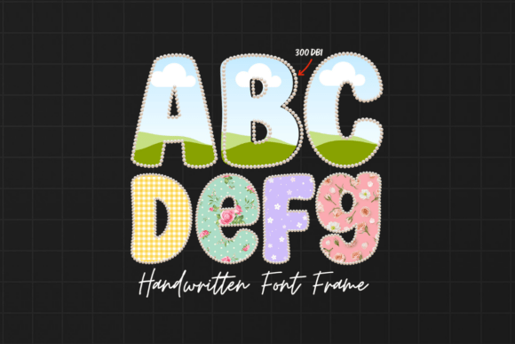
Pearl beaded lettering has been circulating in preppy and coquette design circles for a while, and this template brings that look into Canva without requiring you to manually place each bead. The package includes a PDF with the Canva template link, so you open it, swap the images inside the pearl frames, and you have a monogram that looks like it belongs on a boutique tote bag or a bridal shower invitation. The aesthetic is specific—sweet, slightly retro, and very feminine—which is exactly why it works for certain niches.
Best for: Preppy branding, bridal monograms, and cute social media profile graphics.
Why I like it: It captures a trend that buyers actively search for on Etsy without the tedious manual assembly.
Pairing idea: Keep everything else minimal—use a plain background and a thin serif for accompanying text so the pearl letters remain the focal point.
- Beaded pearl letter frames ready to customize
- Includes PDF with Canva template access
- Preppy, monogram-friendly aesthetic
3. Magic Frame Font — A Template for Custom Image-Filled Type
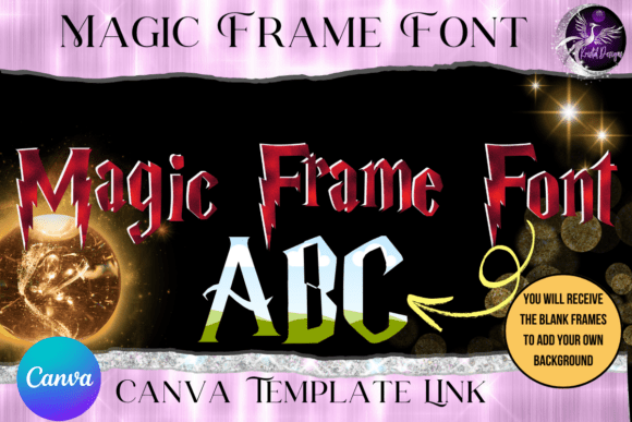
Magic Frame Font operates on the same principle as Sewy: you get letter-shaped frames and drop designs, patterns, or images into them. The difference is in the letter proportions and the overall feel.
Where Sewy leans slightly playful, Magic Frame feels more like a design tool for creating custom display type with texture—think floral patterns inside a headline, or a brand’s signature pattern filling a logo mark. It is a practical pick for designers who want to build a reusable asset rather than a one-off graphic.
Best for: Pattern-filled headlines, branded logo marks, and textured display typography.
Why I like it: It turns any pattern or image into a type treatment, which is a clever way to stretch a brand’s visual assets further.
Pairing idea: Fill Magic Frame letters with a subtle paper texture, then place a simple script accent like Fox Naomi nearby for contrast.
- Drag-and-drop frame-based lettering
- Works with designs, patterns, and images
- Useful for creating branded display assets
4. Retro Vintage Font — Romantic Handwritten Script
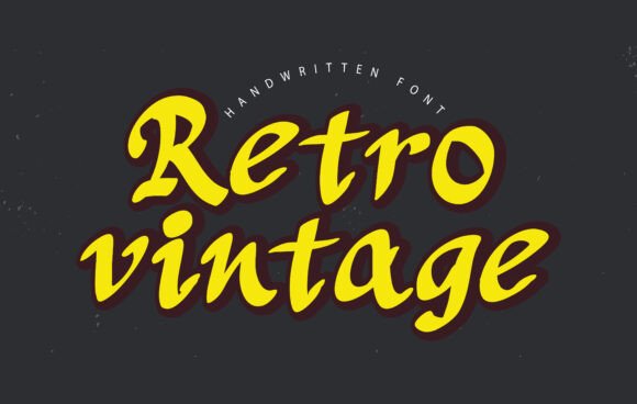
Some scripts try to be neutral and end up forgettable. This one has an actual point of view: it reads like handwriting with a romantic, slightly nostalgic slant, the kind of lettering you see on magazine headlines that want to feel personal rather than corporate.
The description positions it for wedding invitations and branding, which makes sense—it has enough personality to carry a save-the-date but enough legibility to work in a logo lockup.
Best for: Wedding stationery, romantic branding, and social media headlines with warmth.
Why I like it: It fills the gap between “too casual” and “too formal” scripts, which is exactly where a lot of lifestyle brands live.
Pairing idea: Set it large for a single headline line, then use Charlotte or Dept for the details underneath.
- Authentic handwritten character
- Suited to invitations and editorial headers
- Compatible with Canva workflows
5. Pixo Font — Whimsically Eccentric Handwriting
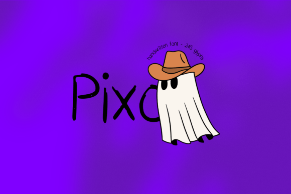
Pixo is the kind of font that works because it does not try to be everything. It is whimsical, a little eccentric, and clearly designed to charm rather than to look corporate. The description points to Halloween, branding, and stickers, and I can see it on all three—it has that hand-drawn quality that makes a sticker sheet feel cohesive, and enough quirk to carry a seasonal campaign without being overtly spooky. If you sell on Etsy, this is the kind of font that photographs well on mockups.
Best for: Sticker designs, Halloween-adjacent branding, and playful product packaging.
Why I like it: It has a distinct voice without being difficult to read, which is a harder balance than it sounds.
Pairing idea: Use Pixo for the main word or phrase and a simple rounded sans for any supporting information.
- Eccentric handwritten style
- Works for seasonal and year-round branding
- Canva, Procreate, and Cricut compatible per description
6. Jelly Fish Font — Bouncy and Playful
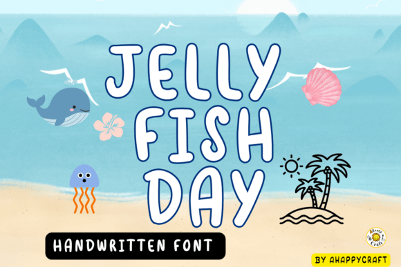
Jelly Fish is unapologetically cute. The letters bounce, the strokes feel hand-drawn, and the overall effect is friendly in a way that appeals directly to children’s brands and classroom materials. The description mentions commercial use, which matters if you are selling teaching resources or kids’ apparel designs. It is not a font you would use for a law firm, and that is fine—it knows exactly what it is for.
Best for: Children’s apparel, classroom printables, and playful social content.
Why I like it: It has the kind of bouncy rhythm that makes short phrases feel energetic without looking messy.
Pairing idea: Pair it with a clean, simple sans for readability on tags or product descriptions.
- Bouncy handwritten letterforms
- Commercial use included per description
- Suited to children’s and classroom designs
7. Caskford Stacked Font — Bold Sports Poster Energy
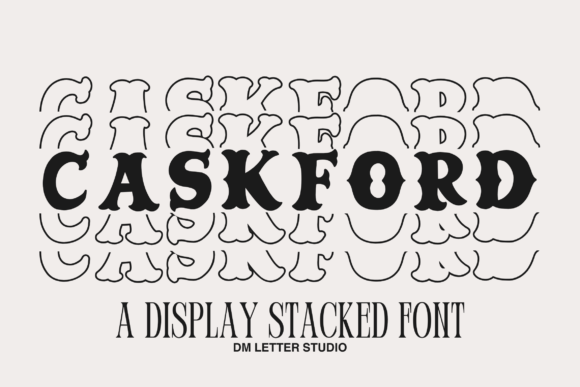
Stacked serif fonts are having a moment, and Caskford is a strong example of why. The letters are bold, tightly stacked, and built for headlines that need to stop a scroll—think team names, vintage-inspired event posters, or a gym brand that wants to look established. It is not subtle, and that is the point. When you need one line of text to carry an entire graphic, this kind of font does more work than three decorative elements combined.
Best for: Sports branding, vintage posters, and bold typographic headlines.
Why I like it: It has weight and presence without needing effects or gradients to feel finished.
Pairing idea: Keep the rest of the design quiet—use a neutral background and minimal supporting text so the stacked headline owns the layout.
- Bold stacked serif construction
- Designed for headlines and posters
- Compatible with Canva upload per description
8. St. Patrick’s Day Lucky Font — Festive and Thematic
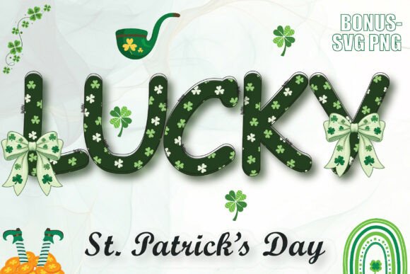
Seasonal fonts are a specific purchase: you need something that reads as St. Patrick’s Day immediately, without looking like a clip-art shamrock. This one leans decorative in a way that suits social posts, quote graphics, and small merchandise runs.
The commercial license is a practical plus if you sell holiday designs, because seasonal products are often where licensing mistakes happen. It is not a year-round workhorse, but for a focused holiday campaign, it does the job.
Best for: St. Patrick’s Day social graphics, quote posts, and seasonal merchandise.
Why I like it: It is festive without being childish, which is a narrow lane for holiday fonts.
Pairing idea: Use it for the main phrase and a simple sans for dates or shop names.
- Holiday-specific decorative style
- Commercial license included per description
- Suited to social and merchandise designs
9. Pumpkin Font — Spooky Without Being Scary
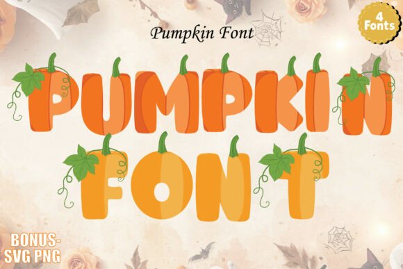
Halloween fonts tend to fall into two camps: overly gory or overly cute. Pumpkin sits comfortably in the latter, with a look that suggests jack-o’-lanterns and candy corn rather than horror movies.
The description lists Canva, Cricut, and Silhouette compatibility, which makes it a practical pick for crafters who cut vinyl or make seasonal decor. If your Halloween aesthetic is more “fall festival” than “haunted house,” this is the one to reach for.
Best for: Halloween crafts, seasonal social posts, and Cricut/Silhouette projects.
Why I like it: It captures the fun side of Halloween, which is what most buyers actually want for home and family designs.
Pairing idea: Pair with a simple handwritten font like Fox Annie for a friendly, approachable seasonal graphic.
- Fun Halloween-themed styling
- Craft-machine compatible per description
- Commercial use allowed per description
10. Boston Angel Font — Elegant Script with Swashes
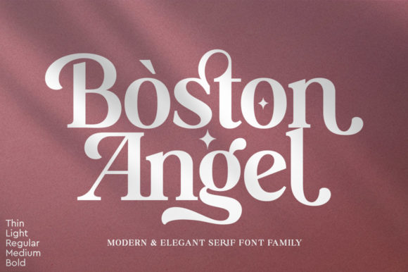
Boston Angel is the kind of script that makes a wedding invitation look expensive. The swashes are the detail that separates it from a basic cursive—they give the lettering a sense of movement and formality that suits logos, invitations, and any project where elegance is the goal.
The description notes commercial use, which matters for stationery designers and boutique owners. It is not a font for body text, but as a focal script, it carries a lot of visual weight.
Best for: Wedding invitations, elegant logos, and formal branding.
Why I like it: The swashes feel intentional rather than decorative for decoration’s sake, which keeps the script from looking dated.
Pairing idea: Use Boston Angel for the names or brand name, then a clean serif for the details to keep the hierarchy clear.
- Elegant script with swash details
- Suited to invitations and logos
- Commercial use allowed per description
11. Valencia Font — Modern Calligraphy with Flow
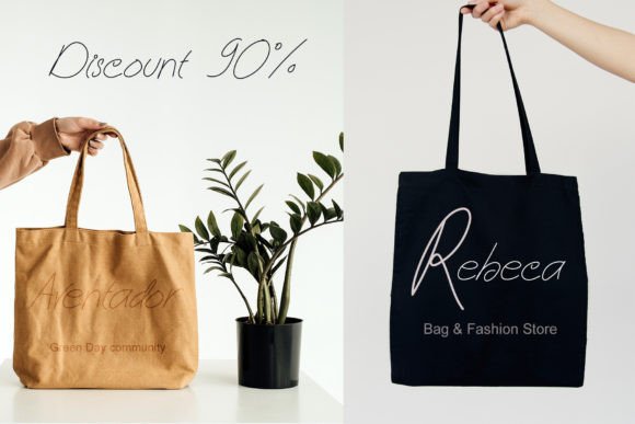
Valencia is a modern calligraphy script with a natural flow—the letters connect in a way that feels written rather than constructed. The description points to Canva designs, POD, and commercial branding, and that range makes sense because the style is versatile without being generic.
It works for a boutique logo, a quote graphic, or a product tag, and it does not demand a specific color palette or layout to look right.
Best for: Boutique logos, POD designs, and commercial branding accents.
Why I like it: It has the relaxed confidence of a signature, which makes branded graphics feel more personal.
Pairing idea: Use Valencia for the brand name and a clean sans like Dept for everything else.
- Natural modern calligraphy flow
- Suited to POD and branding
- Works within Canva design workflows
12. Charlotte Font — Clean Sans-Serif for Real Readability
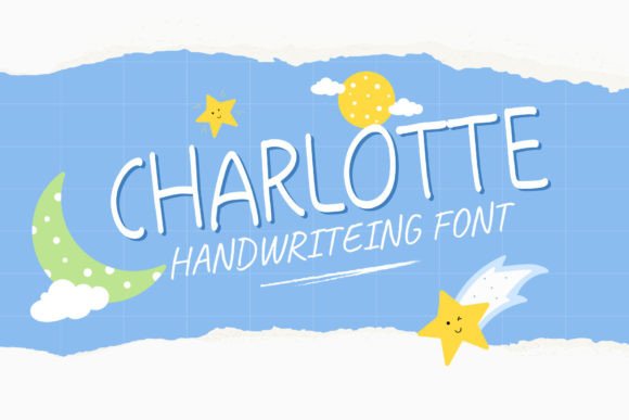
Every font list needs a workhorse, and Charlotte is it. This is a clean, versatile sans-serif built for legibility—the kind of font you use for presentations, ebooks, website copy, and any project where the text needs to be read rather than admired.
The description notes commercial web design suitability, and that is accurate: it has the neutrality that UI and body text demand. If you are building a brand system, Charlotte is the font that holds everything else together.
Best for: Body text, presentations, ebooks, and commercial web design.
Why I like it: It stays out of the way. When you have a decorative headline font doing the visual work, Charlotte handles the reading without competing.
Pairing idea: Pair it with almost any script or display font on this list—it is designed to be the supporting actor.
- Clean and highly legible sans-serif
- Suited to body copy and presentations
- Commercial web design friendly per description
13. Gwen Mark Canva Font Frame Template — Drag-and-Drop Lettering
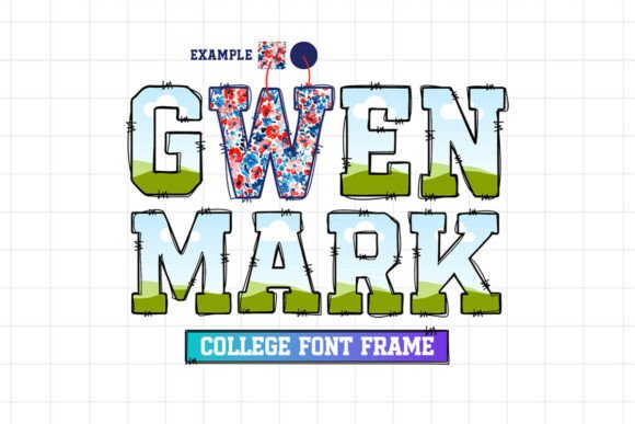
Gwen Mark follows the same frame-based logic as Sewy and Magic Frame, but the letter shapes have their own character—slightly more tailored, less chunky. The core use case is personalization: drop a photo into a letter and you have a custom graphic for a gift, a social post, or a product mockup.
Because it is a Canva template, the barrier to entry is low. You do not need design software or clipping mask experience to make it look intentional.
Best for: Personalized gifts, social media monograms, and custom product designs.
Why I like it: It makes personalization feel fast, which is exactly what you want when you are producing multiple variations for clients or products.
Pairing idea: Fill the letters with a client’s photo, then add a simple date or name in Charlotte underneath.
- Drag-and-drop alphabet frames
- Built for personalization and monograms
- Works inside Canva’s editor
14. Night Sky Font Canva Frames Alphabet — Celestial Lettering
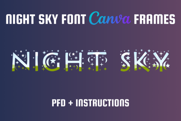
Celestial and astrology-inspired design has a dedicated audience, and this frame template speaks directly to it. The letters are designed to hold dreamy, starry, or textured images, which makes them suited to mood boards, aesthetic social graphics, and branded content for anyone working in the wellness or spiritual space.
The description emphasizes commercial use for dreamy and astrology-related designs, so the positioning is clear. It is a niche product, but within that niche, it solves a visual problem neatly.
Best for: Astrology branding, dreamy social graphics, and celestial mood boards.
Why I like it: It leans into a specific aesthetic instead of trying to be universally applicable, which usually leads to stronger designs.
Pairing idea: Fill the frames with a starry texture or galaxy image, then keep all supporting text minimal and clean.
- Celestial-themed alphabet frames
- Suited to dreamy and astrology designs
- Canva-compatible template format
15. Canva Letters Frame Alphabet Template192 — Comprehensive Monogram Tool
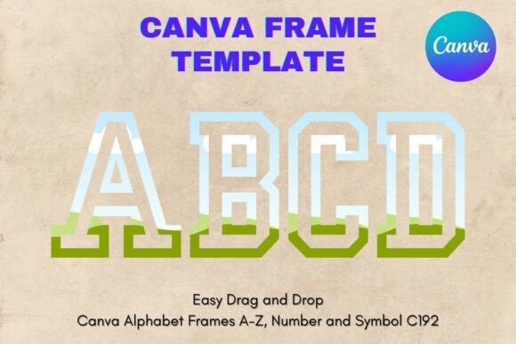
This is the practical choice among the frame templates: a full alphabet set that lets you build logos, monograms, and commercial graphics without piecing together individual letters from different sources.
The description emphasizes easy customization for logos and monograms, and that is where this kind of template earns its keep—when a client wants a custom initial mark, you can deliver it inside Canva rather than outsourcing. It is not flashy, but it is useful.
Best for: Logo monograms, custom initial graphics, and commercial brand marks.
Why I like it: It is a complete alphabet, which means you are not hunting for missing letters when a client name includes a Q or a Z.
Pairing idea: Use the frame letters as the logo mark, then set the full brand name in a complementary font like Modern Luxe.
- Full alphabet frame template
- Suited to logos and monograms
- Designed for Canva customization
16. Ultimate 500+ All Type Mega Bundle — The Whole Font Library in One
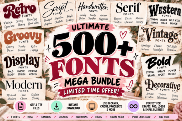
If you are a designer who regularly needs new fonts for client projects, a bundle like this is less about a single style and more about building a library. The bundle includes 500+ fonts across script, serif, sans-serif, and display categories, all positioned for commercial use.
That scale matters because it means you are not re-buying fonts every time a brief calls for something specific. The trade-off is that you need to organize your own system for finding the right font, but for the volume, it is hard to beat.
Best for: Designers building a commercial font library and agencies with varied client needs.
Why I like it: It solves the “I need a font for this project and have no budget left” problem in one purchase.
Pairing idea: Pick two or three fonts from the bundle to establish a brand system, then keep the rest as backup for future briefs.
- 500+ fonts across multiple categories
- Commercial use positioned in description
- High volume for ongoing design work
17. Abcd Ref Dotted Font — Playful Dotted Lettering
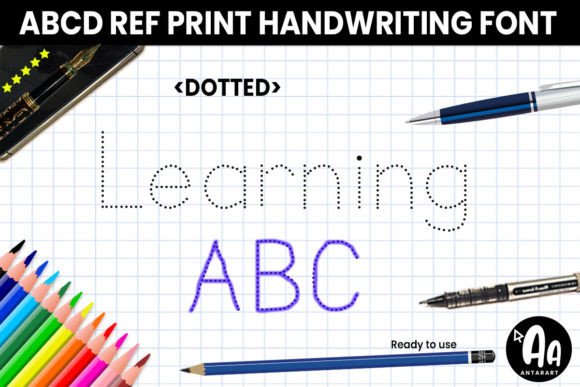
Dotted fonts have a specific job: they invite tracing, coloring, or a craft-like interaction. This one is positioned for kids’ crafts and educational templates, and that is exactly where it belongs.
The dotted construction makes it useful for worksheets, activity pages, and any design where the letterform itself is meant to be engaged with rather than just read. It is not a font for a luxury brand, but for the educational and children’s market, it is a functional choice.
Best for: Educational worksheets, kids’ activity pages, and craft templates.
Why I like it: It understands its audience—dotted letters signal “interactive” to teachers and parents immediately.
Pairing idea: Use it for the activity text and a clean sans for instructions.
- Dotted letterform style
- Suited to educational and kids’ designs
- Commercial use positioned in description
18. Fox Gloria Font — Elegant Script by Fox Fonts
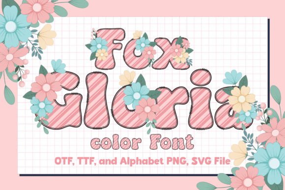
Fox Gloria is one of those scripts that looks like it was designed for wedding invitations but works just as well for a boutique logo. The flow is elegant without being overly ornate, and the letterforms have a romantic quality that suits brands selling to a female audience.
The description positions it for commercial branding and invitations, which is a useful pairing because both use cases demand a script that feels special but remains readable at a distance. It is a strong choice for a first script font.
Best for: Wedding invitations, romantic branding, and boutique logos.
Why I like it: It strikes the balance between decorative and readable, which is the hardest part of choosing a script.
Pairing idea: Pair with Charlotte or Dept for a complete brand typography system.
- Elegant flowing script
- Suited to invitations and branding
- Commercial use allowed per description
19. Fox Cupid Font — Sweet Romantic Handwriting
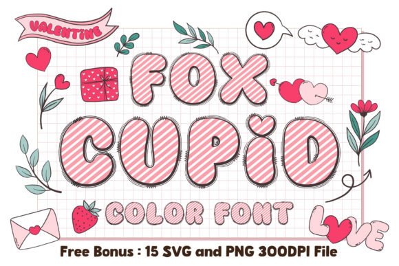
Fox Cupid is a Valentine’s font that does not rely on literal hearts or cupid icons to get its point across. The handwriting is sweet and romantic, with a softness that suits love-themed designs without crossing into cheesy.
The description points to Valentine’s Day Canva templates and commercial love-themed designs, which is a clear enough lane. If you sell seasonal products or create content around relationships, this is a practical font to have in your library.
Best for: Valentine’s Day graphics, romantic quote posts, and love-themed merchandise.
Why I like it: It feels handwritten and personal, which is exactly the tone Valentine’s content needs.
Pairing idea: Use Fox Cupid for the main phrase and a simple serif for names or dates.
- Romantic handwritten style
- Suited to Valentine’s and love-themed designs
- Commercial use allowed per description
20. Fox Muffin Font — Chunky and Cute Display
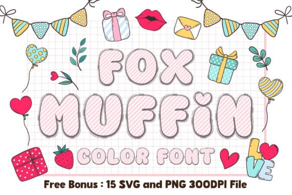
Fox Muffin is the kind of font that makes a bakery logo feel warm before you even read the name. The letters are chunky, rounded, and friendly—the visual equivalent of a fresh muffin, which is exactly what the description promises.
It is positioned for bakery logos, social media, and packaging, and that range works because the style translates well across formats. It is not a font for corporate reports, but for food brands, it has immediate appeal.
Best for: Bakery branding, food packaging, and warm social media graphics.
Why I like it: It communicates “friendly food” instantly, which is what small food businesses need from their branding.
Pairing idea: Pair with a simple handwritten script like Ginger Coffe for menu items or specials.
- Chunky rounded display style
- Suited to food and bakery brands
- Commercial use allowed per description
21. Fox Mine Font — Rugged and Bold
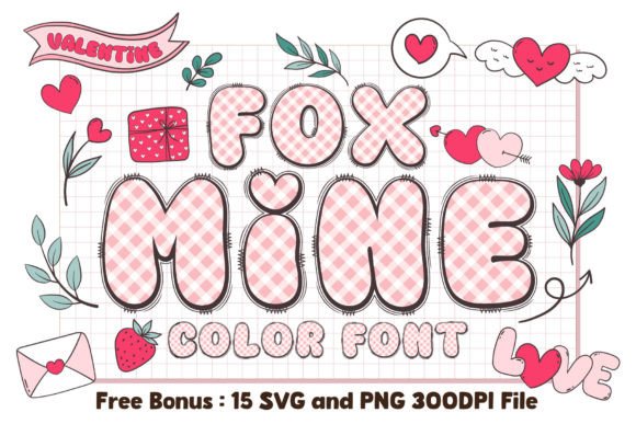
Fox Mine is built for the outdoor and masculine side of the market—think adventure brands, workwear, or any design that wants to feel sturdy rather than soft. The bold letterforms have a rugged quality that reads well on merchandise and social graphics, and the description notes full commercial rights, which is important if you are selling apparel or accessories. It is a specific tool for a specific aesthetic, and within that lane, it is effective.
Best for: Outdoor branding, masculine apparel designs, and adventure-themed graphics.
Why I like it: It has weight without looking aggressive, which is a useful distinction for lifestyle brands.
Pairing idea: Use Fox Mine for the headline and a simple sans for sizing or product details.
- Bold rugged letterforms
- Suited to outdoor and masculine brands
- Full commercial rights per description
22. Summer Flowers Font — Delicate Floral Script
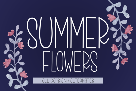
Summer Flowers is a script with a light, floral touch—the kind of font that feels like it belongs on a garden party invitation or a spring collection lookbook. The description positions it for spring/summer templates and commercial crafts, which makes sense because the style is seasonal without being limited to a single holiday.
It is delicate, so it works best for headlines and accents rather than long text, but in that role, it adds a softness that heavier scripts cannot match.
Best for: Spring and summer invitations, floral branding, and seasonal crafts.
Why I like it: It feels airy and light, which is exactly what seasonal designs need to avoid feeling heavy.
Pairing idea: Pair with a clean serif for details and let the script carry the emotional weight of the design.
- Delicate floral-inspired script
- Suited to spring and summer designs
- Commercial crafts positioning
23. Fox Grinch Font — Quirky Holiday Mischief
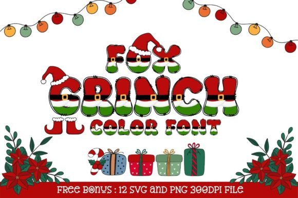
Fox Grinch leans into the mischievous side of Christmas rather than the formal or cozy side. The letterforms have a playful, slightly off-kilter quality that suits holiday designs with a sense of humor—think “naughty list” graphics, funny ornaments, or social posts that do not take the season too seriously.
The description points to commercial holiday products, so it is positioned for sellers who want a Christmas font that stands out from the usual script and serif options.
Best for: Funny Christmas graphics, holiday merchandise with personality, and social posts.
Why I like it: It gives Christmas designs an edge without being negative, which is a narrow but useful lane.
Pairing idea: Pair with a simple sans for contrast and let the quirk be the main event.
- Quirky holiday-inspired styling
- Suited to playful Christmas designs
- Commercial holiday use positioning
24. Fox Clover Font — Charming St. Patrick’s Day Type
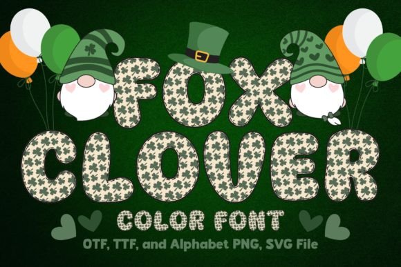
Fox Clover is a St. Patrick’s Day font that avoids the traps of the genre—it is charming rather than clichéd, and it works for festive graphics without relying on leprechaun imagery. The description positions it for holiday merchandise and Canva graphics, which is a practical fit for sellers who need a seasonal font that photographs well on product mockups. It is not a year-round font, but for March campaigns, it is a solid choice.
Best for: St. Patrick’s Day graphics, festive social posts, and seasonal merchandise.
Why I like it: It feels festive without being childish, which widens the range of products it can work on.
Pairing idea: Use it for the main phrase and a simple sans for shop names or dates.
- St. Patrick’s Day themed styling
- Suited to festive graphics and merchandise
- Commercial holiday use positioning
25. Fox Naomi Font — Modern Clean Script
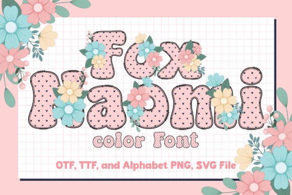
Fox Naomi is a script for people who usually avoid scripts. It is clean and modern, with a level of legibility that makes it suitable for branding and web graphics rather than just invitations. The description emphasizes excellent legibility, and that is the differentiator—many scripts look beautiful in a mockup but fall apart at small sizes.
Naomi holds up, which makes it a more practical choice for logos and headers that need to work across formats.
Best for: Modern logos, web graphics, and clean brand headers.
Why I like it: It gives you the personality of a script without the readability problems that often come with the category.
Pairing idea: Pair with Charlotte for body text and you have a complete, legible brand system.
- Modern script with strong legibility
- Suited to branding and web graphics
- Commercial use allowed per description
26. Fox Marie Font — Classic Calligraphy
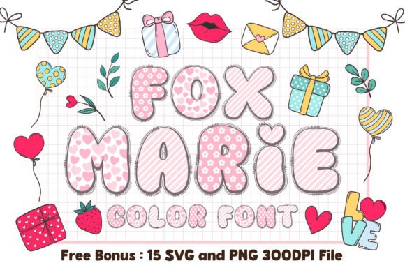
Fox Marie is timeless in the way that traditional calligraphy tends to be. It is not trying to be trendy or modern—it is doing the classic script thing and doing it well. The description points to elegant invitations and commercial stationery, and that is where this font earns its place.
If you design wedding suites, formal event materials, or any product that needs to feel established and refined, Marie is a reliable choice that will not look dated in two years.
Best for: Formal invitations, stationery, and classic branding.
Why I like it: It is the kind of font you can use for years without feeling like you need to update it.
Pairing idea: Use it as the focal script and keep all other elements minimal.
- Classic calligraphy style
- Suited to invitations and stationery
- Commercial use allowed per description
27. Fox Annie Font — Bouncy and Cheerful
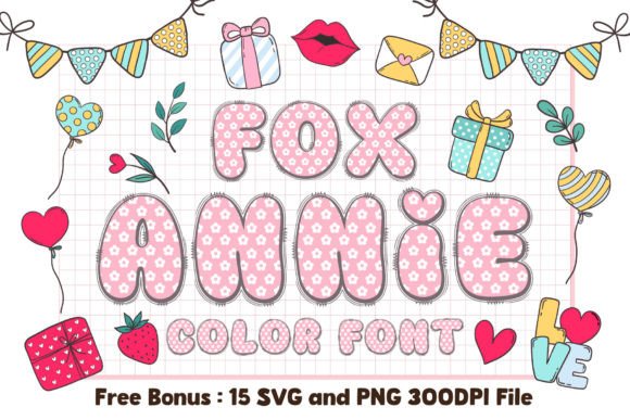
Fox Annie has a bounce that makes it feel like it is smiling. The handwriting is cheerful and open, which makes it a natural fit for children’s templates, teacher resources, and educational materials.
The description also notes commercial educational materials, which is an important distinction for sellers who create resources for classrooms. It is not a font for serious corporate work, but for the education and kids’ space, the personality is exactly right.
Best for: Kids’ templates, teacher resources, and educational materials.
Why I like it: It feels genuinely friendly rather than forced, which is harder to achieve than it looks.
Pairing idea: Pair with Abcd Ref Dotted for a complete educational worksheet system.
- Bouncy cheerful handwriting
- Suited to kids and educational designs
- Commercial educational use positioning
28. Golden Pair Font — Luxurious Duo
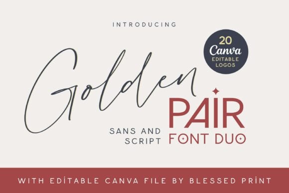
Golden Pair is a font duo, which means you get an elegant script and a clean sans-serif designed to work together. This is a practical format for designers because it removes the guesswork of pairing—the proportions and weights are already balanced.
The description positions it for premium branding, and the combination does have a luxury feel that suits fashion, beauty, and high-end service brands. If you struggle with font pairing, a duo like this is a shortcut worth taking.
Best for: Premium branding, fashion and beauty logos, and luxury packaging.
Why I like it: It eliminates the pairing decision entirely, which saves time and usually produces a better result than mixing random fonts.
Pairing idea: Use the script for the brand name and the sans for taglines and details—that is what the duo was built for.
- Script and sans-serif duo
- Designed for premium branding
- Commercial use allowed per description
29. Dept Font — Minimalist and Modern
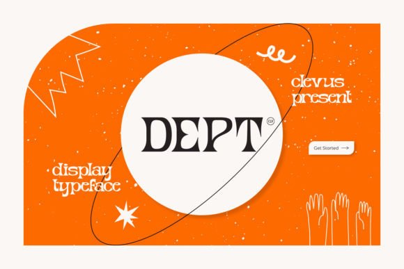
Dept is a minimalist sans-serif that does exactly what a good sans should do: it communicates clearly without drawing attention to itself. The description positions it for presentations, corporate designs, and commercial use, which is the right lane for this kind of font.
It is not exciting on its own, but it is the font you will use more than almost any other in this list because it handles the functional parts of design—body text, captions, labels, and UI elements.
Best for: Corporate presentations, body text, and minimalist branding systems.
Why I like it: It is versatile and neutral, which means it works with every decorative font on this list without clashing.
Pairing idea: Pair with any script or display font here—Dept is the supporting player that makes the headline font look better.
- Minimalist modern sans-serif
- Suited to corporate and presentation use
- Commercial use allowed per description
30. Fox Bread Font — Warm and Inviting
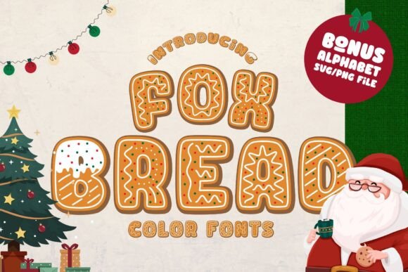
Fox Bread has the rounded softness of a font designed for food, and that is not an accident—the description positions it for bakeries, food blogs, and packaging. The letters feel warm and approachable, which is exactly what a small food business wants its branding to communicate.
It is not a font for a tech startup, but for the bakery down the street or the food blogger sharing recipes, it sets the right tone before a single word is read.
Best for: Bakery branding, food blogs, and warm packaging designs.
Why I like it: It feels inviting without being childish, which is the right balance for food brands.
Pairing idea: Pair with Ginger Coffe for a complete café or bakery brand system.
- Warm rounded letterforms
- Suited to food and bakery brands
- Commercial use allowed per description
31. Fox Lucky Font — Vibrant and Festive
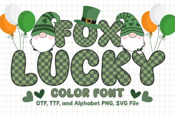
Fox Lucky is designed for energy—the kind of font you use when the message is about winning, celebration, or a promotion. The description points to lucky-themed designs, games, and promotional materials, which makes sense because the letterforms have a festive quality that suits those contexts.
It is not subtle, but for a sale graphic or a game-related post, subtle is not the goal. It does its job with a sense of fun.
Best for: Promotional graphics, game-related designs, and celebratory posts.
Why I like it: It brings energy to designs that might otherwise feel flat, which is useful for social media where attention is the currency.
Pairing idea: Use it for the main callout and a clean sans for the details.
- Vibrant festive lettering
- Suited to promotions and games
- Commercial use allowed per description
32. Fox Milkcow Font — Cute Farm Aesthetic
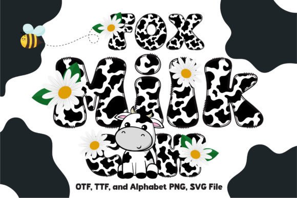
Fox Milkcow has a dairy-farm personality that makes it immediately recognizable—the kind of font that would look at home on a milk bottle label or a children’s book about farm animals. The description positions it for children’s projects and commercial crafts, which fits the playful, slightly rustic feel of the letterforms.
It is a niche font, but if your brand or project lives in that cozy, farm-adjacent space, it communicates the right mood instantly.
Best for: Children’s farm-themed designs, dairy branding, and craft projects.
Why I like it: It has a clear personality that makes design decisions easier—you know exactly what it is for.
Pairing idea: Use it for the headline and a simple handwritten font for supporting text.
- Cute farm-inspired aesthetic
- Suited to children’s and craft designs
- Commercial use allowed per description
33. Fox Harvest Font — Rustic Autumn Vibes
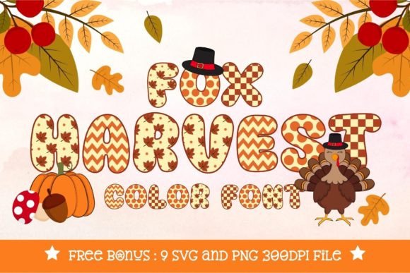
Fox Harvest is built for the fall season—the description points to autumn templates, Thanksgiving designs, and seasonal products, and the letterforms have a rustic quality that matches that brief.
It is not a font you would use in July, but for September through November, it does the work of setting a seasonal mood without requiring additional decorative elements. For sellers who build seasonal collections, this is a practical addition to the library.
Best for: Fall-themed designs, Thanksgiving graphics, and seasonal products.
Why I like it: It captures the warmth of autumn without feeling like a cliché.
Pairing idea: Pair with a simple serif for a complete fall collection look.
- Rustic autumnal styling
- Suited to fall and Thanksgiving designs
- Commercial seasonal use positioning
34. Fox Kitty Font — Whimsical Feline Details
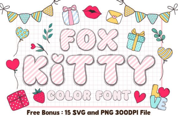
Fox Kitty is a font with feline details built into the letterforms—the kind of subtle touch that makes a design feel custom without adding extra elements. The description positions it for pet-related designs and commercial use, which is a smart lane because pet owners are passionate buyers and the aesthetic fits the category.
It is playful and whimsical, which suits the subject matter. If you design for pet brands or sell pet-themed products, this font is a natural fit.
Best for: Pet branding, cat-themed products, and playful commercial designs.
Why I like it: The feline details are integrated rather than bolted on, which makes the font feel more thoughtfully designed.
Pairing idea: Pair with a clean sans for product details and let the whimsical details stand out.
- Feline-inspired letter details
- Suited to pet-related designs
- Commercial use allowed per description
35. Agrolik Font — Industrial Strength Display
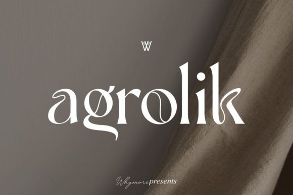
Agrolik is an industrial display font with the kind of weight and structure that suits gyms, outdoor brands, and merchandise that needs to feel substantial. The description points to rugged Canva designs and commercial merchandise, and the letterforms deliver on that—they are strong without being ornate, which is the right combination for brands that want to communicate durability.
It is not a font for a spa, but for the right client, it does a lot of brand work on its own.
Best for: Gym branding, industrial designs, and rugged merchandise.
Why I like it: It feels solid and dependable, which is exactly what brands in this space want to project.
Pairing idea: Use Agrolik for the main headline and a neutral sans for details to keep the hierarchy clean.
- Industrial display styling
- Suited to gyms and rugged brands
- Commercial use allowed per description
36. Modern Luxe Font — Sophisticated Pairing
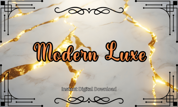
Modern Luxe is positioned for high-end branding, and the font pairing reflects that—it has the kind of restrained sophistication that luxury brands tend to favor over anything flashy. The description points to fashion and luxury designs, which is the right context for this aesthetic.
It is not a font that will work for every project, but for a brand that wants to communicate quality and exclusivity, it sets the tone before the copy is even read.
Best for: Luxury branding, fashion labels, and high-end commercial designs.
Why I like it: It understands that luxury typography is often about restraint rather than decoration.
Pairing idea: Use it as a complete system for a premium brand and avoid adding other decorative fonts.
- Sophisticated font pairing
- Suited to luxury and fashion branding
- Commercial use allowed per description
37. Fox Love 3d Font — Bold Dimensional Impact
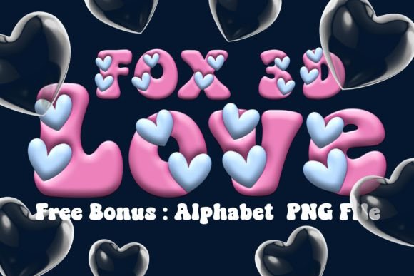
3D effect fonts are a specific tool—they work best when the goal is to stop a scroll or make a graphic feel larger than life. Fox Love 3D is positioned for social media graphics, posters, and advertising, and that is the right context because those formats reward boldness.
It is not a font for body text or subtle branding, but for a single headline that needs to hit hard, the dimensional quality does work that flat type cannot. Use it sparingly and it will land.
Best for: Bold social media graphics, posters, and advertising headlines.
Why I like it: It delivers visual impact without requiring additional effects or layer styles.
Pairing idea: Use it as the only bold element in the design and keep everything else flat and minimal.
- 3D dimensional letterforms
- Suited to bold social and advertising graphics
- Commercial use allowed per description
38. Fox Irish Font — Celtic-Inspired Tradition
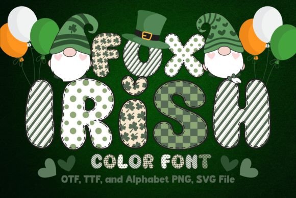
Fox Irish draws on Celtic lettering traditions without being a direct historical imitation. The description positions it for St. Patrick’s Day templates and cultural designs, and that is the right use case—it brings a sense of heritage to seasonal graphics that a generic decorative font cannot.
For sellers who want to create St. Patrick’s Day products that feel a bit more grounded, this font offers a way to nod to the cultural side of the holiday rather than just the leprechaun side.
Best for: St. Patrick’s Day graphics, Celtic-themed designs, and cultural merchandise.
Why I like it: It feels traditional without being costume-like, which is a more respectful approach to cultural design.
Pairing idea: Pair with a simple serif for a complete St. Patrick’s Day design.
- Celtic-inspired lettering
- Suited to St. Patrick’s Day and cultural designs
- Commercial use allowed per description
39. Fox Diane Font — Graceful and Feminine
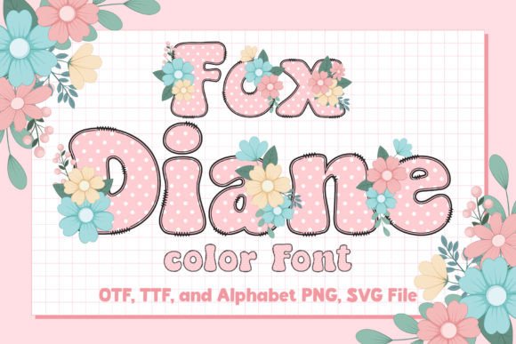
Fox Diane is a script with a graceful, feminine quality that suits beauty and wellness brands particularly well. The description positions it for those categories, and the letterforms support that—they are soft and flowing without being overly delicate.
For a skincare line, a yoga studio, or a boutique that wants to feel approachable and elegant, Diane offers the right balance of personality and readability. It is not a font that demands attention; it earns it quietly.
Best for: Beauty and wellness branding, boutique logos, and feminine designs.
Why I like it: It feels soft and refined, which is the right tone for brands selling self-care and beauty.
Pairing idea: Pair with a clean sans for ingredient lists or product details.
- Graceful feminine script
- Suited to beauty and wellness brands
- Commercial use allowed per description
40. Fox Thanksgiving Font — Warm Autumn Invitation
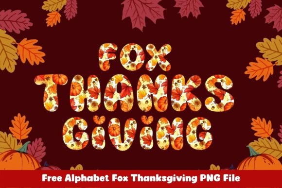
Fox Thanksgiving is a holiday-specific font that understands the assignment: warm, inviting, and autumnal without being overly decorative. The description points to Thanksgiving Canva designs and commercial holiday graphics, which is a clear enough brief.
It works for invitations, social posts, and seasonal products, and it pairs easily with the other fall-themed fonts in this list. If you build seasonal collections, this is a practical addition that will get used every November.
Best for: Thanksgiving invitations, fall social graphics, and seasonal products.
Why I like it: It feels warm and welcoming, which is exactly the tone Thanksgiving designs need.
Pairing idea: Pair with Fox Harvest for a complete fall typography system.
- Warm autumnal styling
- Suited to Thanksgiving designs
- Commercial holiday use positioning
41. Fox Love Font — Romantic Flowing Script
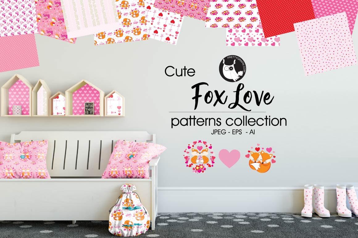
Fox Love is a romantic script that feels like it was made for wedding stationery. The flow is smooth and the letterforms have a softness that suits anniversary designs, love-themed products, and any project where the goal is to evoke warmth rather than formality.
The description positions it for wedding Canva templates and commercial love-themed products, which is a useful range because it means the font can work across an entire wedding suite rather than just one piece.
Best for: Wedding templates, anniversary designs, and romantic branding.
Why I like it: It feels genuinely romantic rather than performatively so, which is a subtle but important difference.
Pairing idea: Pair with Charlotte for a complete wedding stationery system.
- Romantic flowing script
- Suited to weddings and love-themed designs
- Commercial use allowed per description
42. Ginger Coffe Font — Cozy Café Branding
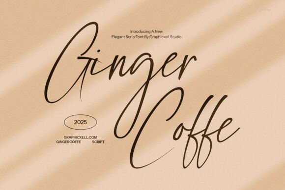
Ginger Coffe is hand-drawn in a way that feels personal—the kind of font that would look right on a chalkboard menu or a coffee bag label. The description positions it for coffee shop branding, menus, and café designs, and that is exactly where this style belongs.
It is cozy and unpretentious, which suits small businesses that want to feel like a neighborhood spot rather than a chain. For café owners and food bloggers, it is a natural choice.
Best for: Coffee shop branding, menus, and cozy food-related designs.
Why I like it: It feels handmade and warm, which is what small cafés want their branding to communicate.
Pairing idea: Pair with Fox Bread for a complete bakery or café brand system.
- Hand-drawn cozy styling
- Suited to cafés and food branding
- Commercial use allowed per description
43. Marker Brush Font — Authentic Brush Texture
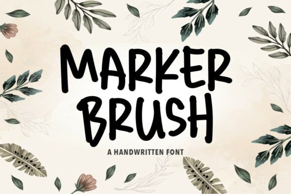
Marker Brush has the texture of a real marker on paper—the edges are slightly irregular, the strokes have variation, and the overall effect is casual and immediate. The description points to casual Canva designs, quotes, and streetwear, which makes sense because this style works best when it feels spontaneous.
It is not a font for formal documents, but for social graphics, merchandise, and any design that wants to feel hand-made, it delivers the right texture.
Best for: Casual social graphics, quote posts, and streetwear designs.
Why I like it: The brush texture feels authentic rather than digitally simulated, which makes casual designs look more genuine.
Pairing idea: Use it for the main quote or headline and keep the rest of the design minimal.
- Authentic brush marker texture
- Suited to casual and streetwear designs
- Commercial use allowed per description
44. Fox Chick Font — Spring-Inspired Cuteness
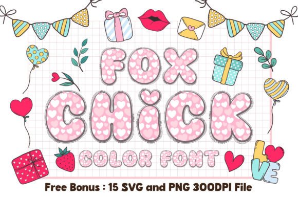
Fox Chick is built for spring and Easter designs, with a cute quality that suits baby products and seasonal crafts. The description positions it for Easter Canva templates and commercial seasonal crafts, which is a clear lane.
It is not a font for serious corporate work, but for the spring season and children’s products, it communicates the right mood immediately. If you sell seasonal designs, this is a useful addition to your Easter collection.
Best for: Easter designs, spring crafts, and baby-related products.
Why I like it: It feels light and cheerful, which is exactly what spring designs need after a long winter.
Pairing idea: Pair with a simple handwritten font for a soft, seasonal look.
- Spring-inspired cute styling
- Suited to Easter and baby designs
- Commercial seasonal use positioning
45. Fox Cutie Font — Playful Rounded Lettering
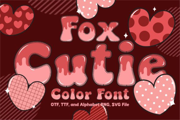
Fox Cutie is playful and rounded, with the kind of soft letterforms that work well for children’s brands and toys. The description positions it for kids’ Canva projects and commercial kids’ branding, which is the right context because the style communicates friendliness before anything is read.
It is not a font for a law firm, but for a toy brand or a children’s book, it sets the right tone and makes the design feel approachable.
Best for: Children’s branding, toy packaging, and playful designs.
Why I like it: It feels genuinely playful rather than trying too hard, which matters for kids’ brands.
Pairing idea: Pair with Abcd Ref Dotted for a complete children’s educational design system.
- Playful rounded letterforms
- Suited to children’s brands and toys
- Commercial use allowed per description
46. Fox Heart Font — Sweet Romantic Details
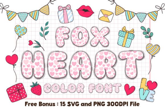
Fox Heart is a Valentine’s font with heart details built into the letterforms—a literal touch that works because the context calls for it. The description positions it for Valentine’s Canva designs and greeting cards, which is exactly where this font belongs.
It is not subtle, and that is fine for a holiday that is about explicit expressions of affection. For sellers who create Valentine’s products, this font makes the theme clear from the first glance.
Best for: Valentine’s cards, love-themed graphics, and romantic merchandise.
Why I like it: The heart details are integrated rather than added as separate elements, which keeps the design cleaner.
Pairing idea: Use it for the main phrase and keep everything else simple to avoid visual clutter.
- Heart details in the letterforms
- Suited to Valentine’s and romantic designs
- Commercial use allowed per description
47. Fox Rosie Font — Vintage Floral Romance
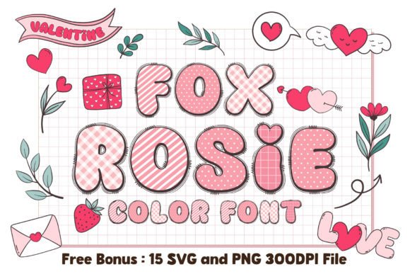
Fox Rosie has a vintage floral quality that makes it feel like it belongs on a boutique’s branding or a romantic invitation. The description points to boutique branding and commercial designs, and the style supports that—it is decorative without being overly ornate, which means it can carry a logo without overwhelming it.
For brands in the wedding, floral, or boutique fashion space, this font offers a way to feel romantic and established at the same time.
Best for: Boutique branding, romantic invitations, and floral designs.
Why I like it: It feels vintage without looking dated, which is a tricky balance for decorative fonts.
Pairing idea: Pair with a clean sans for details and let the vintage character lead.
- Vintage floral-inspired styling
- Suited to boutique and romantic designs
- Commercial use allowed per description
48. Fox Admire Font — Refined Luxury Script
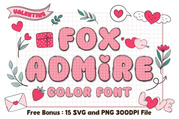
Fox Admire is a script that leans into refinement—the letterforms are elegant and controlled, without the excessive flourishes that can make a script feel fussy. The description positions it for luxury Canva templates and high-end branding, which is the right context for this level of restraint.
For a jewelry brand, a high-end salon, or any business that wants to communicate quality, Admire offers sophistication without shouting. It is the kind of font that makes a design look more expensive than it is.
Best for: Luxury branding, high-end salon branding, and refined templates.
Why I like it: It feels expensive in a quiet way, which is usually more effective than overt luxury cues.
Pairing idea: Use it as the brand name and a minimal sans for everything else.
- Refined luxury script
- Suited to high-end branding
- Commercial use allowed per description
49. Luxury Minimal Font — Clean and Sophisticated Sans
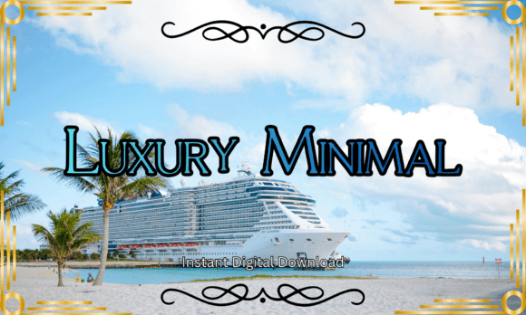
Luxury Minimal is a sans-serif that understands the “less is more” principle. The description positions it for minimalist branding, fashion, and commercial web design, and that is exactly where this style of font belongs—it is the kind of clean, neutral typeface that lets the product or message carry the weight.
It is not a font that will get compliments on its own, but it is the font that makes everything around it look more considered. For minimalist brands, that is the point.
Best for: Minimalist branding, fashion labels, and commercial web design.
Why I like it: It is the quiet backbone of a sophisticated brand system—unshowy but essential.
Pairing idea: Pair with Fox Admire or Modern Luxe for a complete luxury brand typography system.
- Clean sophisticated sans-serif
- Suited to minimalist and fashion branding
- Commercial use allowed per description
50. Emanie Font — Chic Display with Confidence
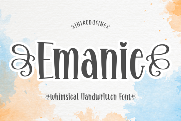
Emanie is a display font that manages to feel confident without being aggressive. The description notes stylish alternates and ligatures, which means the font has some flexibility built in—you can adjust the lettering to fit a specific design rather than accepting whatever the default setting gives you.
It is positioned for projects that need a strong visual voice, and the chic quality makes it suitable for fashion, beauty, and modern lifestyle brands. It is a strong note to end this list on.
Best for: Fashion branding, lifestyle logos, and confident display headlines.
Why I like it: The alternates and ligatures give it more range than a standard display font, which makes it more useful over time.
Pairing idea: Use Emanie for the headline and a neutral sans for supporting text to keep the focus on the display type.
- Chic display styling
- Includes alternates and ligatures per description
- Suited to fashion and lifestyle branding
How to Choose the Right Canva Fonts
Choosing a font is not about finding the prettiest option—it is about matching the type to the job. After working through dozens of brand projects, I have learned that the right font usually reveals itself once you answer a few practical questions. Here is what actually matters when you are scrolling through font options.
Start With the Job, Not the Style
Before you look at a single font, decide what the text needs to do. Is it a headline that needs to stop a scroll? Body copy that needs to be read for paragraphs? A logo that needs to work at small sizes? A decorative accent that sets a mood?
Each of those jobs calls for a different type of font. A script that looks beautiful as a wedding invitation headline will fail as product description text. A bold display font that crushes a poster headline will overwhelm a paragraph. Match the font category to the function first, then narrow down by style.
Scripts Are Accents, Not Workhorses
Almost every script font in this list works best when it carries a small amount of text—a brand name, a single phrase, a name on an invitation. Scripts lose legibility at small sizes and in long passages, and even the cleanest ones require generous spacing to read comfortably.
If you need body text, choose a sans-serif or serif from this list. If you need a headline that feels personal or elegant, that is where the scripts earn their place.
Check the License Before You Sell
Every product on this list is positioned for commercial use, but “commercial use” can mean different things depending on the seller. Some fonts allow unlimited commercial projects; others have restrictions on merchandise or print-on-demand.
Before you build a product line around a font, read the license on the individual product page. Canva’s own font library has separate licensing rules, and uploaded fonts carry the license from the original foundry. This is the one step you should never skip.
Pair Contrast, Not Similarity
The easiest way to make a design look amateur is to pair two fonts that are too similar—two scripts, two rounded sans-serifs, two decorative display fonts. Good pairing comes from contrast: a script with a clean sans, a bold display with a neutral body font, an elegant serif with a minimal sans.
If you are unsure, choose one font that has personality and one that stays quiet. Charlotte, Dept, and Luxury Minimal are the quiet options in this list; everything else can play the personality role.
Test at Actual Size
A font that looks great in a large preview can fall apart at the size it will actually be used. Scripts with fine hairlines can disappear on a phone screen. Display fonts with tight spacing can become illegible when scaled down for a product tag.
Before you commit, set the font at the size it will appear in the final design—a social post, a printed label, a website header—and check whether it still reads clearly. This is especially important for anything that will be viewed on mobile.
Where These Canva Fonts Shine
The fonts in this list are tools, and like any tool, they work best when they are used for the right job. Here are the contexts where these styles consistently deliver.
Etsy and Small Business Branding
For shop owners, a font is often the first visual decision that makes a brand feel real. The Fox fonts—Gloria, Naomi, Diane, Admire—offer a range of scripts that can carry a logo without requiring a full design system. Pair one with Charlotte or Dept for product descriptions, and you have a cohesive brand that looks intentional across listings, packaging, and social media.
Social Media Graphics That Need to Stop the Scroll
Platforms like Instagram and Pinterest reward boldness. Caskford Stacked, Agrolik, and Fox Love 3D are built for headlines that need to land in under a second. These are the fonts you use for carousel covers, pin titles, and promotional graphics where the text itself is the visual hook.
Wedding and Event Stationery
Scripts like Boston Angel, Fox Marie, and Fox Love are designed for the kind of stationery where elegance matters more than readability at small sizes. They work for names, dates, and short phrases on invitations, save-the-dates, and menus. Pair them with a clean serif or sans for the practical information.
Seasonal and Holiday Products
The seasonal fonts in this list—Pumpkin, Fox Grinch, Fox Harvest, Fox Clover, Fox Chick—are not year-round workhorses, and that is fine. They exist to make holiday campaigns feel immediate. If you sell seasonal products, having a few of these in your library means you are not scrambling to find something festive every time the calendar turns.
Canva Frame Templates for Custom Personalization
The frame-based products (Sewy, Pearl, Magic Frame, Gwen Mark, Night Sky, Canva Letters) are a different category entirely. They are not fonts you type with; they are design assets that turn letters into containers for images. For designers offering personalized products—monograms, custom quotes, branded initials—these templates reduce the production time significantly.
💬 Frequently Asked Questions
Are these Canva fonts free to use?
Not all of them. The products in this list are sold through Creative Fabrica and are not free downloads. However, many are priced affordably, and the Ultimate 500+ bundle offers a large collection for a single purchase.
Canva also includes a library of free fonts built into the editor, but those are separate from the products listed here. Always check the individual product page for pricing and licensing.
Can I use these fonts for commercial projects?
Most of the products in this list are positioned for commercial use, and several descriptions explicitly mention commercial licenses. However, “commercial use” can vary by product and by seller.
Before you use a font for client work, merchandise, or print-on-demand products, read the license terms on the product page. If the license is unclear, contact the seller directly.
How do I upload a font to Canva?
Canva supports OTF, TTF, and WOFF file formats for uploaded fonts. You need a Canva Pro, Business, or qualifying plan to upload custom fonts through the Brand Kit.
Once uploaded, the font appears in your font dropdown under Brand Kit and can be used like any other font in the editor. Free Canva users cannot upload custom fonts.
What is the difference between a script font and a serif font?
A script font mimics handwriting or calligraphy, with connected or flowing letterforms. A serif font has small decorative strokes at the ends of letters and is typically used for body text or formal headlines.
In practice, scripts are accents and serifs are workhorses. This list includes both because a complete brand usually needs both.
Which font is best for beginners?
If you are new to design, start with Charlotte or Dept for body text and Fox Gloria or Fox Naomi for headlines. These fonts are forgiving, legible, and pair easily with other styles. Save the more decorative display fonts and frame templates until you are comfortable with basic layout and hierarchy.
Can I use these fonts in Cricut or Silhouette?
Several product descriptions in this list mention Cricut and Silhouette compatibility, including Pixo and Pumpkin. However, compatibility can depend on the file format and how the font is installed on your system.
If cutting-machine compatibility is essential for your project, check the product description or contact the seller before purchasing.
The Bottom Line on Canva Fonts for Commercial Use
The best font is not the one with the most downloads or the flashiest preview—it is the one that solves the problem in front of you. If you need a complete library so you never have to think about buying fonts again, the Ultimate 500+ bundle is the practical choice.
If you want one script that can carry a brand across invitations, logos, and social graphics, Fox Gloria is the safest bet in this list. And if you are building personalized products, the frame templates—Sewy, Pearl, Magic Frame—offer a workflow that saves time and produces results that look custom.
Start with two or three fonts that cover the basics: one script, one clean sans, and one display option for when you need impact. Build from there as your projects demand. The right Canva fonts do not just make a design look better—they make the design process faster, because you stop second-guessing the type and start focusing on the layout, the message, and the product itself.
👉 Get Unlimited Downloads on Creative Fabrica Today!
Ready to transform your next project?
Browse all Canva Fonts on Creative Fabrica
You may also like:
Disclosure: This post contains affiliate links. If you make a purchase through my links, I may earn a small commission at no extra cost to you. Thank you for supporting my site! ♥️