Best Canva Font Pairings That Always Work: A Designer’s Guide
I still remember the first time a client asked me why her Canva design looked “off.” She had picked two beautiful fonts, both gorgeous on their own, and the layout fell apart. That moment taught me more about pairing than any tutorial ever did.
Font pairing is hard because Canva gives you thousands of options and almost no guidance. Most people choose fonts by gut feeling, then wonder why the result feels busy or flat. The truth is that pairing follows rules, not luck.
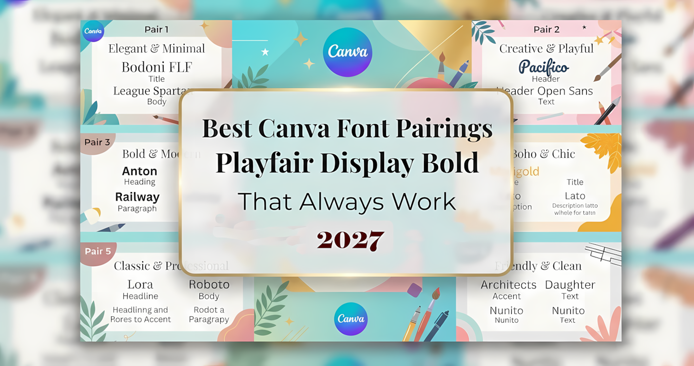
This guide gives you 30 proven Canva font pairings I keep coming back to, organized by mood and use case. Whether you need elegant script and sans-serif pairings or bold retro font combinations, you will find a matching set here that works for branding, logos, and client projects.
Below you will find the rules I follow, the pairings themselves, and a simple workflow for uploading custom fonts into Canva.
⚡ Quick Navigation: Jump to Any Pairing Style
- Elegant & Luxury Pairings (1–5)
- Modern & Minimalist Pairings (6–10)
- Fun, Playful & Handwritten (11–18)
- Retro, Vintage & Bold (19–24)
- Seasonal & Thematic Pairings (25–30)
The Golden Rules of Font Pairing
Contrast is king. I always pair a highly decorative font with a simple, clean font. Two decorative fonts fight for attention, and the reader loses. One loud voice plus one quiet voice always reads better.
Match the mood, not just the shape. A wedding invitation and a sports flyer need different emotional tones. Before you pick a pairing, decide whether the design should feel elegant, playful, retro, or minimal, then choose fonts that share that feeling.
Limit yourself to two fonts. More than two typefaces in one design almost always looks amateur. If you need variety, use different weights and sizes from the same family instead of adding a third font.
Test at real sizes. A script that looks stunning at 80pt can become unreadable at 14pt. Always preview your pairing at the exact sizes it will appear in the final design, especially for body text.
Elegant & Luxury Pairings
These pairings suit wedding invitations, high-end branding, and anything that needs a refined, expensive feel. Each one balances a decorative script with a clean supporting font.
1. Goldeny Battiely Font — Expressive Brush Calligraphy
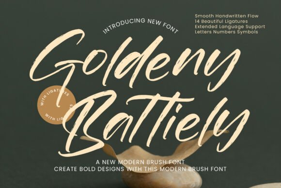
Goldeny Battiely brings expressive brush strokes and a calligraphic feel to any layout. Its personality is bold enough to carry a headline on its own, which makes it a natural partner for a neutral sans-serif.
Best for: Event promotions, wedding signage, and boutique branding.
Why I like it: The brush texture adds warmth that clean scripts often lack, so the design feels handmade rather than templated.
Pairing idea: Set your headline in Goldeny Battiely and keep all supporting text in a clean sans-serif like The Serene Notes.
- Expressive brush lettering
- Strong headline presence
- Warm, artistic mood
2. Adorable Memories Font — Chic Retro Serif
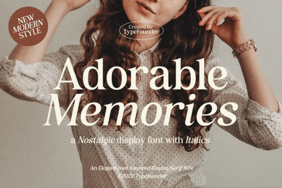
Adorable Memories is a chic serif with italics that nods to 70s and 80s typography. It carries a nostalgic editorial feel without becoming kitsch, which makes it surprisingly versatile.
Best for: Editorial layouts, lookbooks, and body text in branded designs.
Why I like it: The italic variant gives you contrast inside a single family, so you can create hierarchy without adding another font.
Pairing idea: Combine it with a modern script for headings while Adorable Memories handles the supporting copy.
- Retro serif character
- Built-in italic contrast
- Editorial mood
3. Mistle Goose Font — Tidy Holiday Script
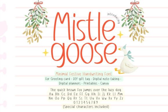
Mistle Goose is a cheerful, tidy handwritten script built for winter and holiday designs. It stays legible at small sizes, which is rare for scripts with this much charm.
Best for: Holiday cards, gift tags, and seasonal social posts.
Why I like it: The tidy letterforms mean you can use it for more than headlines, including short supporting lines.
Pairing idea: Pair it with a bold sans-serif for strong contrast between festive and modern.
- Cheerful handwritten style
- Holiday-ready mood
- Good small-size legibility
4. Ballards of Heaven Font — Classic Aesthetic Typeface
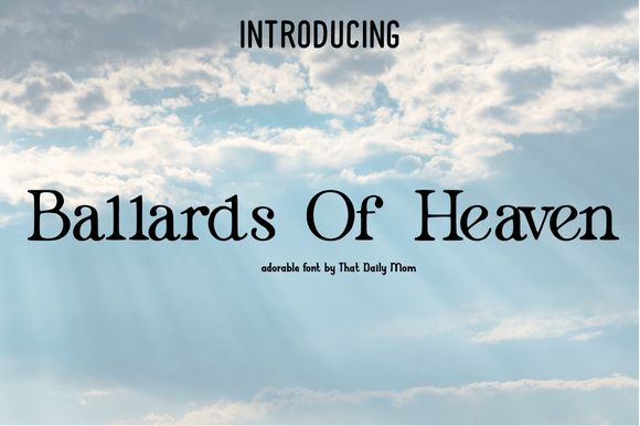
Ballards of Heaven has a classic, aesthetic feel that works across digital art and branding. It feels considered rather than trendy, which helps designs age well.
Best for: Digital aesthetics, art prints, and refined brand identities.
Why I like it: It holds its character even when paired with very plain fonts, so the contrast stays elegant instead of noisy.
Pairing idea: Set it against a minimalist sans-serif and let generous whitespace do the rest.
- Classic custom typeface
- Refined visual tone
- Ages well over time
5. Splurge Carmage Font — Dynamic Brush Script
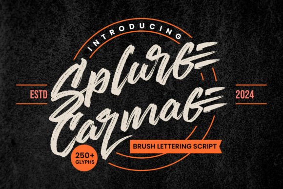
Splurge Carmage is dynamic brush lettering with a distinct clothing-brand energy. It feels confident and slightly edgy, which suits fashion-forward projects.
Best for: Cocktail menus, apparel graphics, and boutique labels.
Why I like it: The brush energy reads as premium when it is given room to breathe next to a condensed sans-serif.
Pairing idea: Pair it with a condensed sans-serif so the script stays the hero of the layout.
- Dynamic brush strokes
- Fashion-oriented mood
- Strong visual personality
Modern & Minimalist Pairings
Minimalist font pairings live or die on spacing and restraint. These combinations keep things clean while still giving your design a clear voice.
6. The Serene Notes Font — Clean Editorial Sans
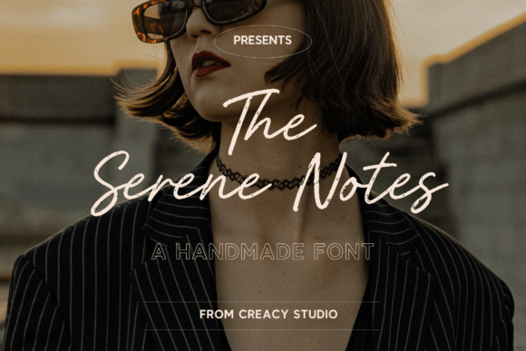
The Serene Notes is a clean, modern sans-serif designed for editorial layouts. It is the supporting font I reach for most often because it never competes with a decorative partner.
Best for: Body copy, captions, and minimalist brand systems.
Why I like it: It disappears in the best way, letting the headline font carry the personality.
Pairing idea: Use it underneath any decorative script or display font for instant balance.
- Clean modern sans-serif
- Excellent supporting font
- Editorial legibility
7. Lucky Days Font — Cheerful Casual Script
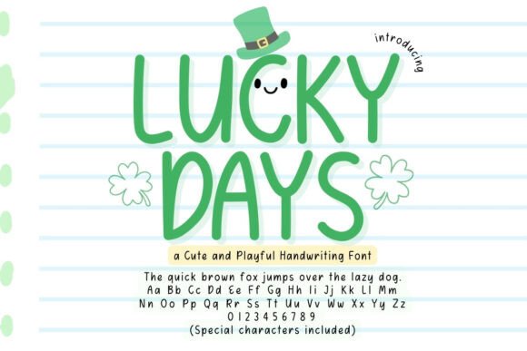
Lucky Days is a clean, cheerful script with uppercase options that add flexibility. It suits casual commercial designs without feeling childish.
Best for: USA-themed designs, casual branding, and social graphics.
Why I like it: The uppercase option lets you build contrast within one font, which keeps the pairing simple.
Pairing idea: Pair it with a simple geometric sans-serif for a friendly, modern result.
- Cheerful script style
- Uppercase flexibility
- Casual commercial mood
8. Liquid Lines Font — Cozy Craft Script
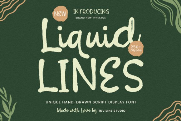
Liquid Lines is a cozy display script with an eco-friendly, craft vibe. It feels handmade and approachable, which makes it a strong fit for product packaging.
Best for: Coffee packaging, artisan labels, and craft branding.
Why I like it: The craft feel pairs naturally with sturdy slab serifs, creating a texture contrast that looks intentional.
Pairing idea: Pair it with a slab serif for a warm, grounded combination.
- Cozy display script
- Eco-friendly craft mood
- Packaging-friendly character
9. Retro Script Font — Colorful Vintage Script
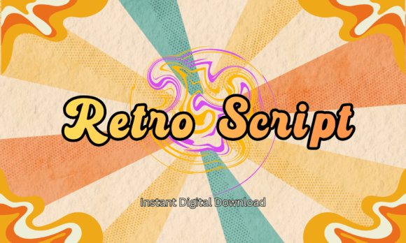
Retro Script is a creative, colorful script with a vintage vibe that suits nostalgic branding. It brings energy without needing extra decoration.
Best for: Cricut projects, nostalgic branding, and retro posters.
Why I like it: It pairs cleanly with retro block fonts, which keeps the vintage theme consistent across the whole design.
Pairing idea: Pair it with a retro block font for headlines and let the script handle accents.
- Colorful vintage script
- Nostalgic mood
- Cricut-friendly personality
10. Fall Thankfully Font — Bouncy Autumn Display
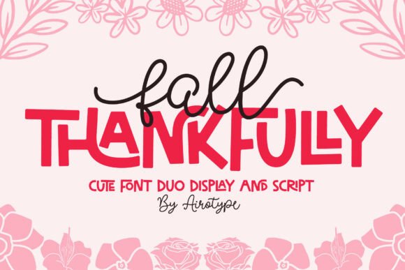
Fall Thankfully is a bold, bouncy all-caps display font with a clear autumn personality. It brings movement and warmth to seasonal layouts.
Best for: Seasonal crafts, birthday designs, and fall promotions.
Why I like it: The bouncy baseline adds energy, so the supporting font can stay quiet and readable.
Pairing idea: Pair it with a flowing cursive font to soften the bold all-caps look.
- Bold all-caps display
- Bouncy, energetic baseline
- Autumn seasonal mood
Fun, Playful & Handwritten
Playful pairings work best when one font carries the personality and the other stays practical. These combinations suit social content, kids’ designs, and friendly brands.
11. Halloween Wish Font — Casual Autumn Display
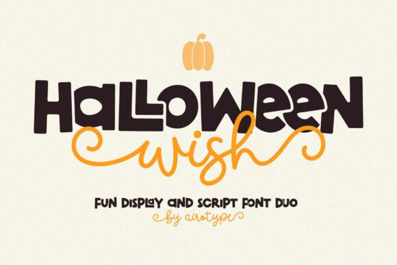
Halloween Wish is a cool, casual autumn display font with a relaxed seasonal feel. It is versatile enough for templates beyond a single holiday.
Best for: Seasonal Canva templates, craft projects, and fall social posts.
Why I like it: It pairs well with spooky handwritten fonts, which lets you build a theme without overcomplicating the type.
Pairing idea: Pair it with a handwritten script for a friendly, seasonal contrast.
- Casual autumn display
- Seasonal template friendly
- Relaxed visual mood
12. Gistesy Font — Elegant Script with Ligatures
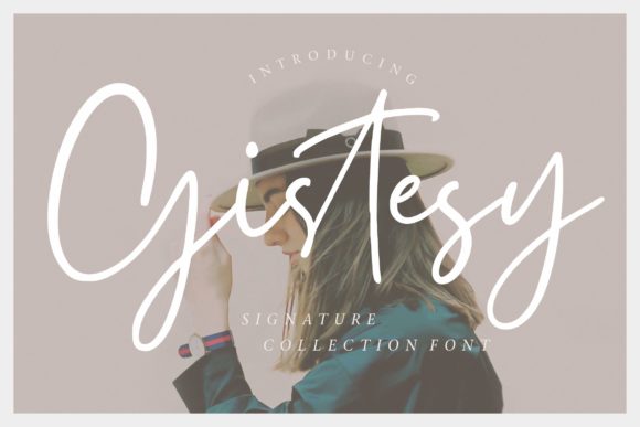
Gistesy is a highly popular, elegant script with beautiful ligatures and a 5.0 rating. It has become a go-to choice for weddings and luxury branding for good reason.
Best for: Wedding invitations, luxury branding, and elegant logos.
Why I like it: The ligatures give the script a fluid, hand-lettered quality that photographs beautifully in print.
Pairing idea: Pair it with a clean, modern sans-serif so the script’s elegance stays the focus.
- Elegant script with ligatures
- 5.0 rating and high favorites
- Wedding and luxury appeal
13. Easy Handwriting Font — Natural Relaxed Handwriting
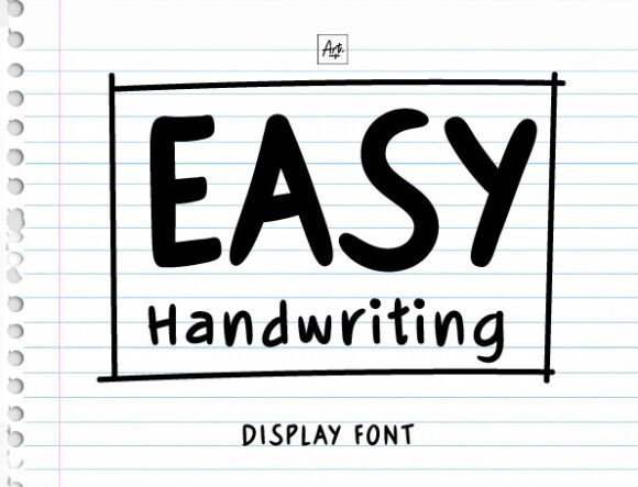
Easy Handwriting is a natural, relaxed handwritten font that feels genuinely human. It brings approachability to designs that might otherwise feel stiff.
Best for: Personal branding, quotes, and friendly social content.
Why I like it: It balances structured serif fonts beautifully, creating a look that is warm but still professional.
Pairing idea: Pair it with a structured serif so the handwriting reads as a deliberate accent.
- Natural handwritten feel
- Approachable personality
- Balances structured fonts
14. Coastal Honey Font — Breezy Beach Script
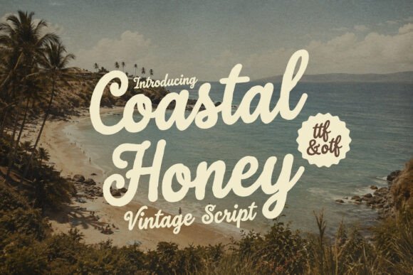
Coastal Honey is a smooth, breezy script with a beachy aesthetic. It feels light and airy, which makes it ideal for summer-focused work.
Best for: Summer campaigns, travel branding, and lifestyle designs.
Why I like it: The smooth strokes pair naturally with light sans-serifs, keeping the whole layout feeling open.
Pairing idea: Pair it with a light, airy sans-serif to reinforce the summer mood.
- Smooth breezy script
- Beachy aesthetic
- Summer-friendly character
15. Clean Notes Font — Minimalist Supporting Sans
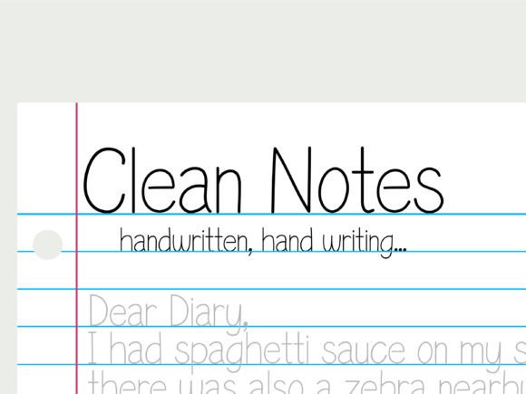
Clean Notes is a minimalist, highly legible sans-serif built specifically to support bold decorative fonts. It does one job and does it well.
Best for: Body copy, captions, and any layout with a loud headline font.
Why I like it: It is deliberately neutral, which means it never fights the font it is paired with.
Pairing idea: Pair it with any bold display font where readability matters most.
- Minimalist sans-serif
- High legibility
- Purpose-built supporting font
16. Honey Biscuit Font — Sweet Rounded Display
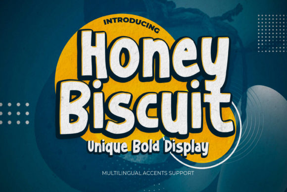
Honey Biscuit is a sweet, rounded display font with a playful touch. It feels friendly and edible, which makes it a natural for food branding.
Best for: Bakery logos, children’s templates, and sweet packaging.
Why I like it: The rounded forms pair wonderfully with delicate scripts, creating contrast without harshness.
Pairing idea: Pair it with a delicate script for a bakery logo that feels both playful and refined.
- Sweet rounded display
- Playful personality
- Food branding friendly
17. Perfect Lemonade Font — Fresh Casual Handwriting
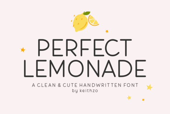
Perfect Lemonade is a fresh, zesty handwritten font with a casual vibe. It brings a light, approachable energy to lifestyle content.
Best for: Food blogs, lifestyle branding, and casual social posts.
Why I like it: It pairs well with classic serifs, giving the handwriting a polished context instead of a messy one.
Pairing idea: Pair it with a classic serif for a balanced food-blog aesthetic.
- Fresh handwritten style
- Casual zesty mood
- Lifestyle-friendly character
18. The Cute Handwriting Bundle — Versatile Handwriting Set
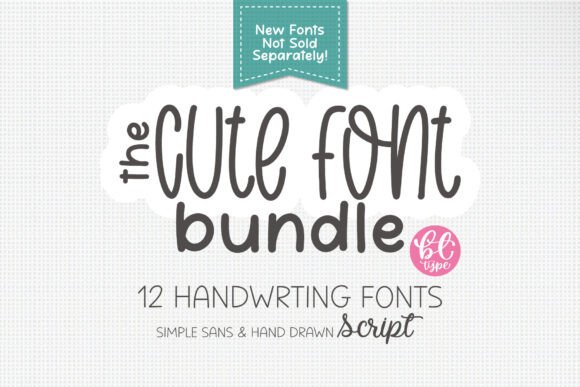
The Cute Handwriting Bundle offers multiple cute handwriting fonts in one set. With 201 favorites, it is clearly a popular pick for cohesive designs.
Best for: Cohesive Canva projects, planner designs, and cute branding.
Why I like it: You get pairing possibilities inside the same family, which keeps a multi-font design feeling unified.
Pairing idea: Pair two styles from the bundle together for headings and accents.
- Multiple handwriting fonts
- Cohesive family pairing
- High favorites count
Retro, Vintage & Bold
Bold and retro pairings need strong contrast to avoid looking heavy. These combinations bring personality while staying readable.
19. Theodore and Scarlett Font — Pre-Matched Font Duo
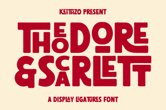
Theodore and Scarlett is a perfectly matched font duo featuring a bold serif and a complementary script. It removes the guesswork from pairing entirely.
Best for: Effortless Canva projects, branding kits, and event designs.
Why I like it: It is pre-paired for a professional look, so beginners can get a polished result without design experience.
Pairing idea: Use the serif for headlines and the script for accents within the same layout.
- Pre-matched serif and script
- 5.0 rating
- Beginner-friendly pairing
20. Sunkissed Sunday Font — Warm Weekend Script
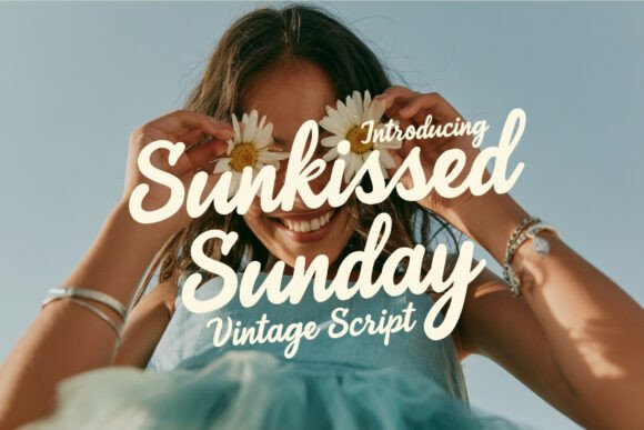
Sunkissed Sunday is a warm, glowing script with a relaxed weekend vibe. It feels like a sunny afternoon in type form.
Best for: Social media quotes, lifestyle posts, and casual branding.
Why I like it: It pairs beautifully with clean uppercase sans-serifs, which keeps the warm script from feeling too soft.
Pairing idea: Pair it with a clean uppercase sans-serif for social quote graphics.
- Warm glowing script
- Relaxed weekend mood
- Social media friendly
21. Elegant Handwriting Font — Refined Cursive
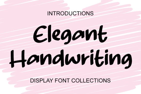
Elegant Handwriting is a refined, sophisticated cursive font with a luxury feel. It suits formal designs where subtlety matters more than flash.
Best for: Luxury Canva templates, invitations, and formal branding.
Why I like it: It pairs perfectly with minimalist sans-serifs, creating an expensive look with very little effort.
Pairing idea: Pair it with a minimalist sans-serif and keep the layout sparse.
- Refined cursive style
- Luxury invitation mood
- Minimalist pairing partner
22. Abcd Varsity Font — Collegiate Display
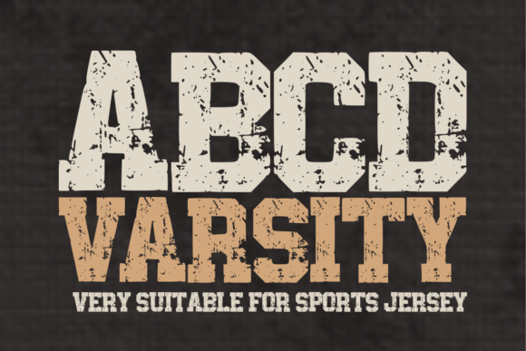
Abcd Varsity is a bold, collegiate-style display font with strong sports energy. It brings instant team spirit to any layout.
Best for: Sports designs, school projects, and retro-themed graphics.
Why I like it: It pairs excellently with simple, clean scripts, which softens the blocky look without losing impact.
Pairing idea: Pair it with a clean script for a sports poster that still feels designed.
- Collegiate display style
- Bold sports energy
- Retro-friendly character
23. Boldmove Font — Strong Modern Sans
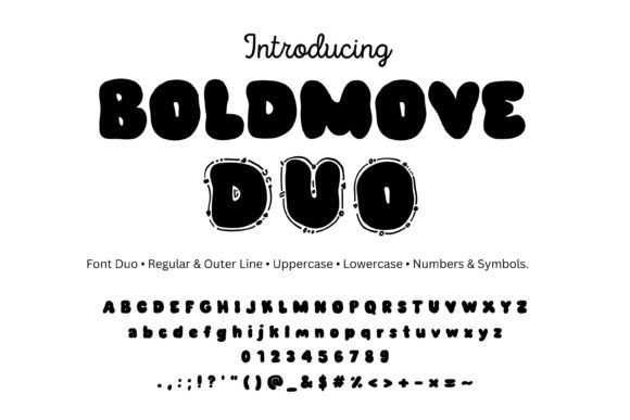
Boldmove is a strong, impactful sans-serif with a modern edge. It gives headlines weight without needing extra decoration.
Best for: Modern branding, posters, and bold social graphics.
Why I like it: It creates striking contrast with delicate handwritten fonts, which makes both fonts look more intentional.
Pairing idea: Pair it with a delicate handwritten font for maximum visual contrast.
- Strong modern sans-serif
- Impactful headline weight
- High-contrast partner
24. Warix Font — Futuristic Geometric Sans
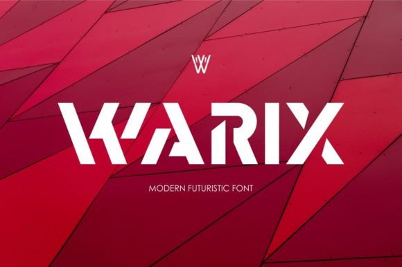
Warix is a futuristic, geometric sans-serif with a high-tech feel. It brings a modern, technical edge to brand systems.
Best for: Tech branding, modern posters, and forward-looking identities.
Why I like it: It pairs well with organic, fluid scripts, balancing the geometric rigidity with a human touch.
Pairing idea: Pair it with a fluid script for a high-tech yet human aesthetic.
- Futuristic geometric sans
- High-tech mood
- Balances fluid scripts
Seasonal & Thematic Pairings
Seasonal pairings need to feel festive without becoming clichéd. These combinations bring the right mood while staying versatile enough to reuse.
25. Vintage Canva Font — Nostalgic Retro Display
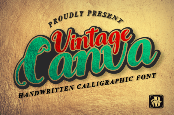
Vintage Canva is a nostalgic, retro-inspired display font with strong commercial appeal. It has the kind of look that works across posters and packaging.
Best for: Vintage posters, labels, and commercial Canva projects.
Why I like it: It pairs perfectly with classic serif fonts, creating a consistent retro language across a whole project.
Pairing idea: Pair it with a classic serif for a vintage poster or product label.
- Retro-inspired display
- Vintage commercial mood
- Strong favorites count
26. Cheer Font — Upbeat Joyful Display
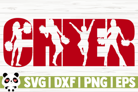
Cheer is an upbeat, joyful display font with a friendly vibe. It is designed to make people smile before they even read the words.
Best for: Party invitations, craft projects, and celebratory designs.
Why I like it: It pairs excellently with simple, rounded sans-serifs, which keeps the cheerful mood consistent.
Pairing idea: Pair it with a rounded sans-serif for a friendly party invitation.
- Upbeat display style
- Joyful friendly mood
- Party-ready personality
27. Amazing Saturday Font — Relaxed Weekend Script
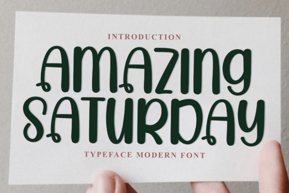
Amazing Saturday is a casual, relaxed script that mimics natural weekend handwriting. It brings an easy-going feel to lifestyle branding.
Best for: Lifestyle branding, casual quotes, and weekend promotions.
Why I like it: It pairs wonderfully with structured block fonts, giving the relaxed script a solid foundation.
Pairing idea: Pair it with a structured block font for a balanced lifestyle brand.
- Casual script style
- Natural handwriting feel
- Lifestyle-friendly mood
28. Vibes October Font — Moody Autumnal Display
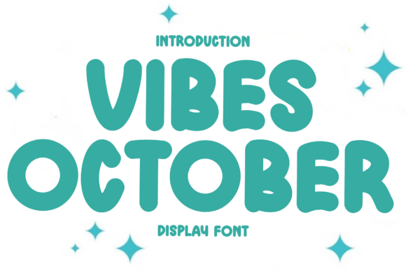
Vibes October is a moody, autumnal display font with a cozy feel. It captures the atmosphere of fall without relying on obvious seasonal clichés.
Best for: Fall templates, seasonal promotions, and moody brand campaigns.
Why I like it: It pairs well with elegant scripts, which adds a touch of sophistication to the autumn mood.
Pairing idea: Pair it with an elegant script for a sophisticated fall promotion.
- Moody autumnal display
- Cozy seasonal mood
- Elegant script partner
29. Blockton Font — Solid Geometric Block
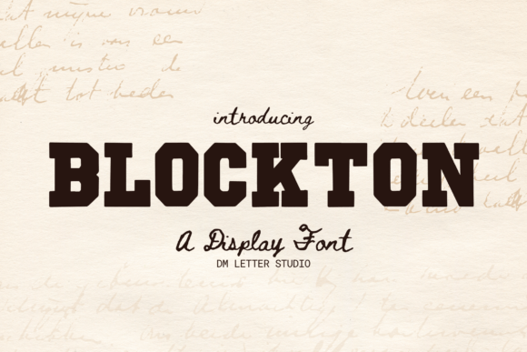
Blockton is a solid, geometric block font with a modern, sturdy appearance. It is built to anchor a design and hold its ground.
Best for: Foundation typography, bold posters, and modern branding.
Why I like it: It is the perfect foundational font for ornate, decorative scripts, giving them something stable to sit against.
Pairing idea: Pair it with an ornate decorative script for a striking contrast.
- Solid geometric block
- Modern sturdy look
- Ideal foundational font
30. Jubilee Nocturne Font — Premium Nocturnal Display
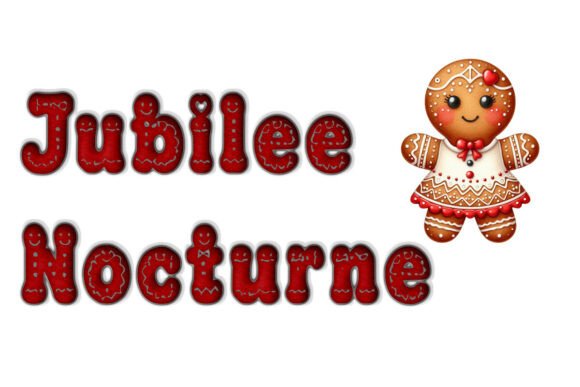
Jubilee Nocturne is a mysterious, elegant display font with a nocturnal, premium aesthetic. It feels high-end and slightly dramatic, which suits luxury brands.
Best for: High-end branding, evening events, and premium packaging.
Why I like it: It pairs beautifully with light, airy sans-serifs, which keeps the dramatic display font from overwhelming the layout.
Pairing idea: Pair it with a light sans-serif for a premium, high-end brand identity.
- Elegant nocturnal display
- Premium mysterious mood
- High-end branding fit
How to Use These Fonts in Canva
Uploading custom fonts into Canva takes a few minutes, and once they are in your Brand Kit they are available across every design. Here is the workflow I follow.
Check the file format first. Canva accepts common font files like OTF and TTF. If your download arrives as a ZIP archive, unzip it and upload the font file inside.
Upload through the Brand Kit. From the Canva homepage, open Brand, select your Brand Kit, then click Upload a font. This keeps your fonts organized and available to your whole team.
Refresh the editor if needed. After uploading, refresh your Canva editor. New fonts sometimes take a moment to appear in the text panel.
Build your pair in a test design. Drag your headline font and supporting font into a blank canvas and preview them at real sizes before committing to a layout.
💬 Frequently Asked Questions About Canva Font Pairings
What are the best Canva font pairings for logos?
Contrast matters most in logos. Pair a bold display or serif font with a clean, simple sans-serif so the logo stays readable at small sizes. Pre-matched duos like Theodore and Scarlett also work well for beginners.
Do Canva font pairings work for commercial projects?
Check the license for each font before publishing. Most fonts from Creative Fabrica include commercial licensing options, but always confirm the specific license terms on the product page for your intended use.
How many fonts should I use in one Canva design?
Stick to two fonts whenever possible. One font for headlines and one for body text creates clear hierarchy. If you need more variety, use different weights and sizes from the same family instead of adding a third typeface.
What is the difference between script and sans-serif pairings?
Script fonts carry personality while sans-serifs provide clarity. A script headline paired with a clean sans-serif body is the most reliable combination because the two fonts contrast without competing.
Can I use these font pairings for wedding invitations?
Yes, elegant script pairings work beautifully for weddings. Gistesy, Elegant Handwriting, and Jubilee Nocturne are especially strong choices for formal invitations when paired with minimalist sans-serifs.
How do I know if two fonts will pair well together?
Look for contrast in style, not conflict in mood. Pair a decorative font with a simple one, match the emotional tone of both fonts, and always test them at the exact sizes they will appear in the final design.
Conclusion
Good Canva font pairings are not about collecting the most beautiful fonts. They are about contrast, mood, and restraint, and the 30 combinations above give you a reliable starting point for almost any project.
Start with one category that matches your project, test the pairing at real sizes, and adjust only when the design demands it. With the right pairing, your Canva designs will look intentional and professional every time.
👉 Get Unlimited Downloads on Creative Fabrica Today!
Ready to transform your next project?
Browse all Canva Fonts on Creative Fabrica
You may also like:
Disclosure: This post contains affiliate links. If you make a purchase through my links, I may earn a small commission at no extra cost to you. Thank you for supporting my site! ♥️