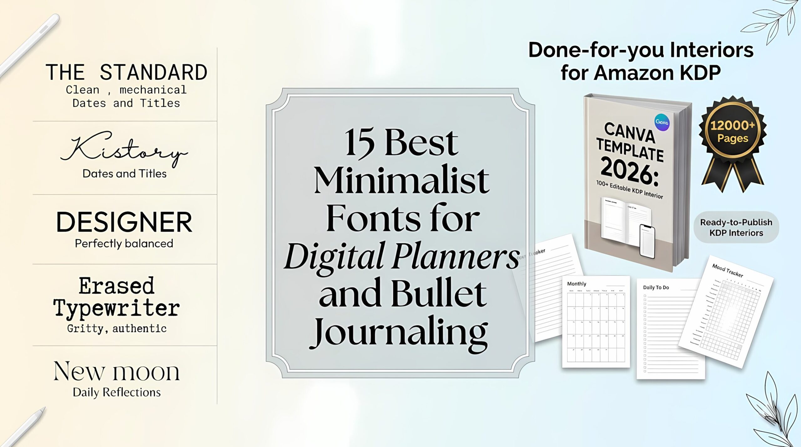
15 Best Minimalist Fonts for Digital Planners and Bullet Journaling
Intro: The Art of Digital Minimalist Planning
In 2026, our digital planners are more than just schedules; they are our quiet spaces for focus in a loud world. But have you ever noticed how the wrong font can make a beautiful layout feel cluttered and overwhelming?
When it comes to Digital Planning and Bullet Journaling, the “minimalist” approach isn’t just an aesthetic—it’s a productivity hack. The right typography reduces visual noise, allowing your tasks and thoughts to take center stage. Today, we’re diving into the 15 Best Minimalist Fonts that balance clean lines with a touch of personality, helping you create a digital journal that feels as organized as it looks.
Expert Insight: Why Typeface Choice is Your Planning Superpower
As a designer, I’m often asked why I mix different font styles in a single digital planner. It’s not just for looks; it’s about Visual Hierarchy. Here is why these three specific categories are the “Holy Trinity” of functional journaling:
1. Typewriter Fonts: The Anchor of Structure
Typewriter fonts (like The Standard or Intellecta) provide a mechanical, rhythmic feel. In a digital planner, they act as the perfect “anchor” for dates, headers, or fixed logs. They give that satisfying, old-school feel of a physical planner but with the pixel-perfect precision of a digital one.
2. Monoline Script Fonts: The Human Connection
Minimalism doesn’t have to be cold. Monoline Scripts (like Kistory) mimic the consistent stroke of a ballpoint pen or a fine-liner. They add that essential “handwritten” soul to your bullet journal without the messy, uneven lines of traditional calligraphy. They are the best choice for quotes, affirmations, and personal reflections.
3. Sans Serif Fonts: The King of Legibility
When you’re quickly checking your to-do list on a small screen, you need zero distractions. Clean Sans Serif fonts (like Designer) offer high legibility and open spacing. Because they lack decorative “serifs” (the little feet on letters), they are the most accessible choice for body text, ensuring you can read your notes at a single glance, even on the go.
Quick Comparison Table: Typewriter & Script Fonts
| Font Name | Style / Category | Best For | Key Vibe |
| Erased Typewriter 2 | Gritty / Distressed | Vintage posters, grunge art | Authentic messy ink & broken letters. |
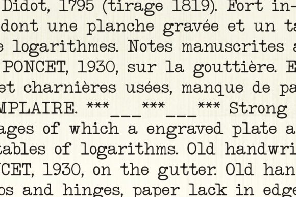
| Intellecta Typewriter | Classic Mechanical | Formal retro documents | Clean, traditional typewriter look. |
| Shine Typewriter | Artistic / Decorative | Creative branding, cards | A unique, stylized spin on old typing. |
| The Standard | Minimalist Sans | Web headers, modern tech | Clean “machine strike” without the mess. |
| Baltimore Pack | Full Collection | Brand identity, film props | Versatile toolkit with multiple weights. |
| Starkey | Bold Display | Impactful logos, covers | Strong, flowing, and high-contrast. |
| Backline | Simple Handwriting | Teaching, chalkboards | Human, approachable, and realistic. |
| Outbreak | Bold Script | Instagram, DIY crafts | Friendly, thick calligraphy strokes. |
| Beloved | Elegant Script | Weddings, luxury brands | Sophisticated with PUA encoded swashes. |
| Kistory | Monoline Script | T-shirts, crafty logos | Smooth, uplifting, and very legible. |
| Strawberry Milk | Playful Duo | Kids’ products, desserts | Sweet balance of Sans and Script. |
| Barbie Vintage | Retro Display | 70s aesthetics, posters | Playful nostalgia with bold personality. |
| Designer | Clean Display | Professional stationery | Perfectly neat and arranged letters. |
| Back To School | Retro Fun | Headlines, magazines | Cool varsity and yearbook energy. |
| New moon | Decorative Note | Diaries, personal cards | Intimate, quiet, and handcrafted feel. |
Typewriter Fonts
Discover premium typewriter fonts perfect for any creative endeavor—from digital designs to printed materials and merchandise. Enjoy instant access to versatile typefaces ideal for event invitations, brand identity, product packaging, custom merchandise, and downloadable prints. Both personal and commercial licenses included.
1. Erased Typewriter 2 Font
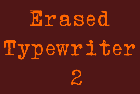
I love using this when I need to ditch perfection. It’s a distressed Typewriter Font design that’s great for mimicking that sloppy, heavy-ink effect of vintage machines.
I usually grab this for organic branding or quirky food packaging—it has this “bright and fun” energy that feels human rather than mechanical.
- Best for: Logos, candy wrappers, and indie zines.
- The Edge: It captures the unpredictable “mess” of real ink beautifully.
2. Intellecta Typewriter Font: The Soul of the Old Office
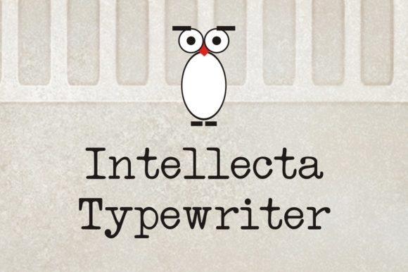
When I want a project to feel like a genuine artifact found in a dusty attic, Intellecta Typewriter is my top choice. Among all the Typewriter Fonts I use, this one feels the most “honest.” It’s a classic serif that doesn’t try too hard to be pretty; it captures that raw, mechanical soul of a real vintage machine.
I love using it for labels on high-end organic products or for adding a “classified document” vibe to a website hero section. Its main advantage is its authentic spacing and rhythmic imperfections—it’s perfect for storytelling through design.
- Best for: Authentic labels, editorial layouts, and historical branding.
- The Edge: It avoids the “fake” digital look, giving you pure analog nostalgia.
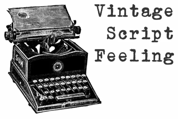
3. Shine Typewriter Font: The Creative Rebel
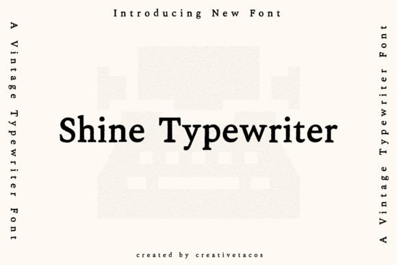
Whenever I’m bored with the “corporate” look, I reach for Shine Typewriter. It’s a funky, handmade spin on traditional Typewriter Fonts that feels more like a piece of art than a standard typeface.
It has this cool, creative energy that works wonders for retro-themed posters or even a gritty forensics-style layout where you want things to look a bit “off-the-grid.”
The beauty of this font is its versatility—it’s an incredible asset because it doesn’t just sit there; it actually elevates the mood of the entire page. It feels alive, tactile, and intentionally imperfect.
- Best for: Forensics-style visuals, indie album covers, and creative social media headers.
- The Edge: A unique handmade feel that adds instant “cool factor” to any project.
4. Standard Typewriter Font
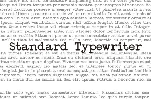
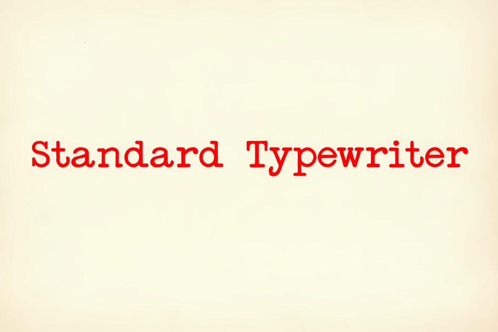
Building a collection of Typewriter Fonts often leads us to messy, ink-stained territory, but The Standard is where I go when I need to strip it all back.
As a designer, I appreciate this one for its restraint. It’s a clean, simple sans-serif that manages to mimic that distinct “mechanical strike” effect without the typical grunge. It feels like a mid-century office document—orderly, functional, and strangely nostalgic.
I find it’s the perfect choice for minimalist web layouts or modern editorial pieces where you want that monospaced rhythm without the heavy serif baggage.
- Best for: Technical manuals, minimalist branding, and clean website headers.
- The Edge: It offers the soul of a machine with the clarity of a modern typeface.
5. Baltimore Typewriter Pack Font
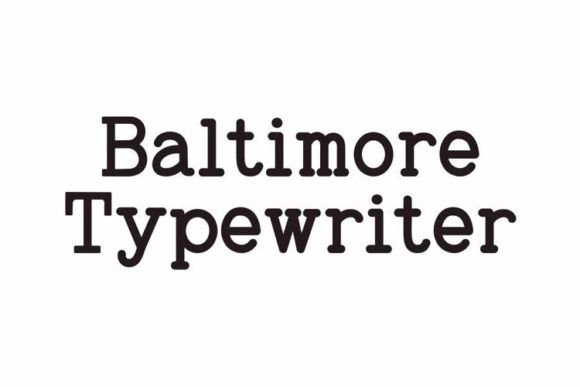
When I need to build an entire world around an analog concept, I go for the Baltimore Typewriter PACK. As a designer, I appreciate that this isn’t just a single font—it’s a complete toolkit that captures every nuance of the vintage typing experience.
While many Typewriter Fonts give you one look, this collection offers a variety of weights and styles that are perfect for creating that layered, authentic charm.
Whether I’m designing a complex set of historical props or a full branding system for a coffee shop, this pack lets me mix and match styles while maintaining a consistent, retro flavor that feels genuinely timeless.
- Best for: Complex editorial layouts, historical prop design, and cohesive branding packages.
- The Edge: A complete, versatile system of weights and textures for ultimate design control.
Monoline Script Fonts
Browse exquisite monoline script fonts ready for download. Perfect for projects of any scale, these versatile typefaces will elevate your web and print designs.
6. Starkey Monoline Script Font
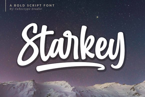
When a project calls for a powerful, eye-catching title with a touch of nostalgia, I grab Starkey. While it isn’t a traditional mechanical typeface, it’s one of those essential Typewriter Fonts-adjacent designs that reimagines the classic monospaced structure with bold, flowing strokes.
As a designer, I see it as a “display” version of the typewriter aesthetic—it has that structured rhythm but is designed to make an impact. Its incredibly versatile style makes it spectacular for headers or branding where you want the “written by a machine” feel but with a lot more muscle and flow.
- Best for: Impactful website headers, book covers, and bold logo marks.
- The Edge: A bold, flowing display font that bridges the gap between structured monospacing and striking, modern design.
7. Backline Monoline Script Font
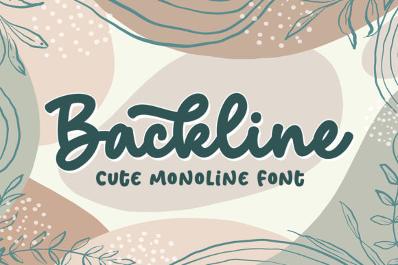
As a designer, I sometimes find that traditional Typewriter Fonts can feel a bit too rigid or mechanical for certain projects. That’s when I reach for Backline. It’s a beautifully simple, handwritten font that captures the rhythm of a typewriter but with a warm, human touch.
I absolutely love using this for chalkboard-style quotes or educational materials where I want things to look approachable and realistic. It adds that “hand-lettered” soul to a design, making it feel like someone actually sat down and crafted the message just for you.
- Best for: Chalkboard art, teaching materials, and personal stationery.
- The Edge: Provides an authentic, personal feel that bridges the gap between machine-typed and hand-drawn.
8. Outbreak Monoline Script Font
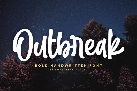
When I’m looking to break away from the stiff, mechanical lines of traditional Typewriter Fonts, Outbreak is exactly what I reach for. As a designer, I see it as the “friendly rebel” of my collection. It’s a bold script font that feels incredibly approachable and alive.
I find it perfect for social media—especially Instagram—where you want that handmade, calligraphy touch without losing legibility. It turns a simple quote or a DIY project into a genuine piece of art, giving your digital designs a warm, “written by hand” soul that feels miles away from a cold computer screen.
- Best for: Instagram stories, DIY craft projects, and friendly brand identities.
- The Edge: A thick, flowing script that balances bold impact with an incredibly welcoming vibe.
🔥 Get unlimited downloads on
Creative Fabrica
The #1 option for designers, crafters & AI creatives
Access a massive library of high-end fonts, professional mockups, and trending design assets. Fresh creative resources are added every single day to keep your toolkit ahead of the curve!
⚡ PRO TIP: Loving these styles? Instead of buying them individually, you can get unlimited downloads of all these fonts in this list with a Creative Fabrica All-Access Subscription. It’s the ultimate hack for designers in 2026!
(Top-Rated by Creators)
Join a global community of millions. Trusted by professional graphic designers, crafters, and digital artists for reliable quality and industry-standard licensing.
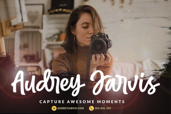
9. Beloved Monoline Script Font
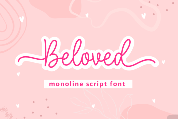
There are moments in a project where I need to soften the industrial edges of traditional Typewriter Fonts, and that’s when I turn to Beloved. As a designer, I’m drawn to its delicate, flowing rhythm—it’s incredibly elegant and has this beautifully balanced character set that feels effortless.
Because it’s PUA encoded, I can easily play with all those extra glyphs and swashes to make a layout feel truly custom. It’s my “secret weapon” for high-end designs that need to look sophisticated yet deeply personal, like a hand-penned letter tucked inside a vintage envelope.
- Best for: Wedding invitations, luxury branding, and sophisticated editorial headers.
- The Edge: Professional-grade elegance with easy-to-access decorative flourishes for a bespoke look.
10. Kistory Monoline Script Font
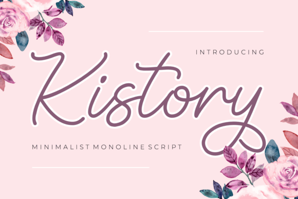
When I want to capture that structured, monospaced rhythm of Typewriter Fonts but with a much softer, modern edge, I reach for Kistory. As a designer, I appreciate how this monoline font manages to be both crafty and incredibly clean. It’s smooth, legible, and has a “friendly neighbor” vibe that instantly uplifts a layout.
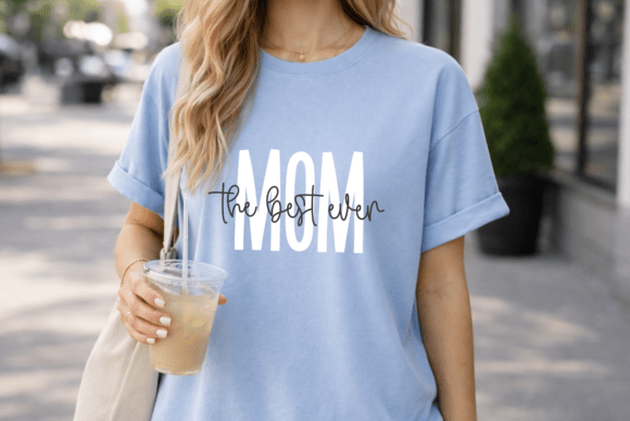
I’ve found it works wonders for t-shirt designs and social media quotes where you want that organized typewriter feel but with a huge dose of cuteness. Plus, since it’s PUA encoded, I can easily grab those extra glyphs and ligatures to give a logo or an invitation that “finished” professional touch without any technical headaches.
- Best for: Crafty logos, t-shirt prints, and upbeat social media graphics.
- The Edge: A perfect balance of monoline consistency and playful, handmade character.
This font looks incredible when paired with our KDP 2026 Templates, creating a seamless professional look.
Sans Serif Fonts
Browse sleek, modern sans serif typefaces ready for instant download. Perfect for projects of any scale, these versatile fonts will elevate your web interfaces and print layouts. Searching for a clean, professional look? You’ve found it. Explore our curated collection and find the perfect match for your next design.
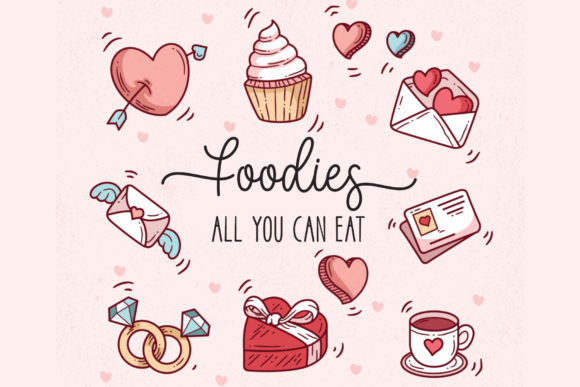
11. Strawberry Milk Candy Sans Serif Font
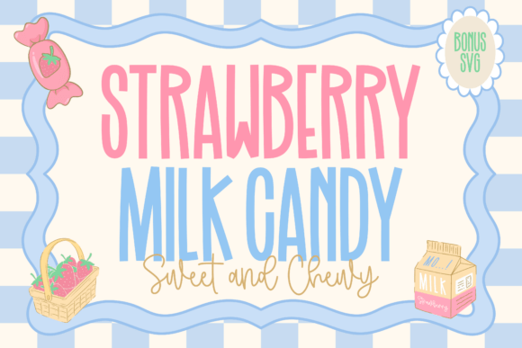
Sometimes, as a designer, you need to break away from the monochromatic look of traditional Typewriter Fonts and add a splash of color and joy. That’s where Strawberry Milk Candy comes in. It’s a brilliant font duo that balances a tall, hand-drawn sans-serif with a creamy, flowing script.
I love using this pairing because it does the hard work of font matching for you. The slim, whimsical uppercase letters feel youthful and “candy-coated,” while the script adds that smooth, hand-penned swirl.
It’s my go-to for kids’ products or dessert packaging where I want a nostalgic, sweet aesthetic that feels more like a cheerful memory than a mechanical document.
- Best for: Kids’ merchandise, dessert branding, Valentine’s Day cards, and sticker design.
- The Edge: A perfectly balanced duo that provides instant “sweetness” and professional pairing in one click.
12. Barbie Vintage Sans Serif Font
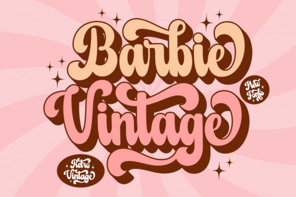
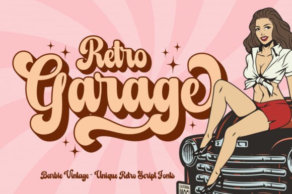
When I want to inject a massive dose of personality into a layout, Barbie Vintage is the first thing I pull from my digital drawer. As a designer, I see this as the glamorous, high-energy cousin of traditional Typewriter Fonts. It takes that structured, monolinear base and gives it a playfully nostalgic makeover that feels like a technicolor dream from the 60s or 70s.
I find it masterfully designed for headers that need to pop. It has this incredible potential to take a simple creative idea and elevate it to a professional, “finished” level instantly. While it delivers a bold retro punch on its own, I often use the shadow extrude version when I want that extra depth for posters or merchandise that needs to stand out in a crowded feed.
- Best for: Retro-themed branding, vibrant social media headers, and high-impact posters.
- The Edge: A flawless blend of nostalgic charm and bold display presence that feels both classic and fresh.
13. Designer Sans Serif Font
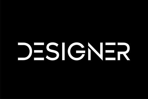
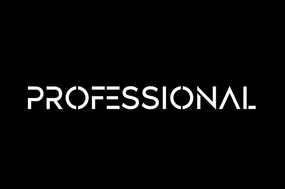
As a professional designer, I often find that some Typewriter Fonts can feel a bit too cluttered with ink splatters and grit. That’s why I keep Designer in my toolkit for those moments when I need a “clean machine” look.
It’s a beautifully simple and casual display font that strips away the noise, leaving you with a neat, organized arrangement of letters.
I love its versatility—it has that structured, monospaced rhythm we associate with typewriters, but it’s clean enough to look outstanding in formal branding or modern, minimalist social media layouts. It’s the kind of typeface that doesn’t scream for attention but instead provides a sophisticated, “well-typed” foundation for any creative idea.
- Best for: Minimalist logos, professional stationary, and clean web headers.
- The Edge: An undeniably clean and beautiful letter arrangement that balances formal structure with a casual soul.
This font looks incredible when paired with our KDP 2026 Templates, creating a seamless professional look.
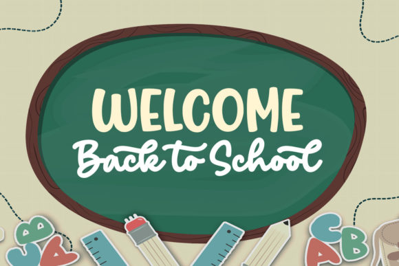
14. Back to School Sans Serif Font
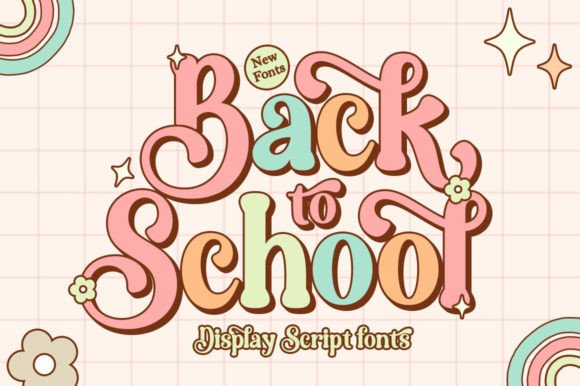
When I’m working on a project that needs to feel energetic and a bit nostalgic, Back To School is my top pick. As a designer, I see this as a high-energy alternative to standard Typewriter Fonts. It keeps that structured, rhythmic feel but injects a “cool and fun” retro vibe that reminds me of vintage yearbooks and varsity jackets.
I find it looks absolutely stellar on bold headlines or magazine covers where you want to grab attention immediately. Plus, because it’s PUA encoded, I can easily swap in alternates and glyphs to make a logo feel custom-made. It’s that perfect mix of structured design and playful personality that instantly levels up a branding project.
- Best for: Magazine headlines, school-themed branding, and bold logos.
- The Edge: Easy access to creative alternates that give your headlines a bespoke, professional finish.
15. New Moon Decorative Font
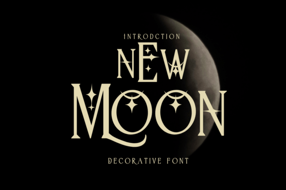
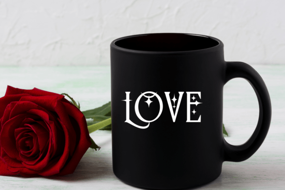
When I’m designing something that needs to feel intimate and personal—like a secret tucked away in a journal—I reach for New moon. As a designer, I see this as a “softer” relative to traditional Typewriter Fonts. It’s a decorative typeface that captures the quiet, steady rhythm of someone sitting down to write a diary or a heartfelt greeting card.
What I love about it is its versatility. While it has that “note-taking” soul, it’s sturdy enough to look fantastic on a physical product like a mug or a t-shirt. It adds a handcrafted, thoughtful layer to social media posts or stationery that mechanical fonts just can’t replicate. It’s less about the machine and more about the person behind the words.
- Best for: Personal diaries, greeting cards, and cozy social media content.
- The Edge: A decorative, intimate feel that brings a sense of calm and personality to digital and print designs.
Frequently Asked Questions about Typography & Fonts
1. What is the difference between a Script font and a Display font?
Script fonts are designed to look like organic, fluid handwriting or calligraphy, often used for invitations and personal branding. Display fonts, like Starkey or Back To School, are specifically crafted for large sizes (headings and posters) to grab attention through bold, unique, or decorative shapes.
2. What does “PUA Encoded” mean for fonts like Beloved or Kistory?
PUA (Private Use Areas) encoding allows you to access special characters, extra swashes, and decorative ligatures without needing professional design software like Adobe Illustrator. In apps like Canva or Cricut Design Space, you can simply copy and paste these “extra” beautiful glyphs directly into your project.
3. Can I use these fonts for my Amazon KDP covers and interiors?
Yes! Using unique fonts like Strawberry Milk Candy or New moon for your KDP book covers and journal interiors helps your products stand out from the competition. Always ensure you have the correct commercial license for “Print on Demand” (POD) or digital sales before publishing.
4. Why should I use a Font Duo for my branding?
A Font Duo, such as Strawberry Milk Candy, provides a professionally paired set of typefaces (usually a Sans Serif and a Script). This ensures visual harmony in your design, saving you time on font matching while creating a cohesive, high-end look for packaging or social media.
5. Are typewriter fonts still trendy for modern web design?
Absolutely. Modern Typewriter Fonts like “The Standard” or “Designer” are highly popular in minimalist and “dark academia” aesthetics. They provide a structured, rhythmic feel that adds a touch of nostalgia and authenticity to digital blogs and portfolios.
Conclusion: Choosing the Right Font for Your Vision
The right typography is more than just letters on a page; it’s the voice of your brand. Whether you’re leaning into the nostalgic charm of Barbie Vintage, the clean professionalism of Designer, or the whimsical sweetness of Strawberry Milk Candy, your choice of font sets the entire mood for your project.
Remember, great design isn’t just about picking one pretty font—it’s about how that font works within your layout to tell a story. Don’t be afraid to experiment with font duos or PUA encoded glyphs to give your work that bespoke, high-end feel that stands out in a crowded digital world.
Ready to Level Up Your Design Game?
Now that you’ve found the perfect typography, it’s time to put it into action! If you’re looking to turn your design passion into a profitable business, we’ve made the next step incredibly easy for you.
Pro Designer’s Toolkit
Master Your KDP Business
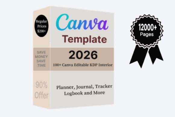
100+ Editable Templates | KDP 2026
Perfect for beginners looking to scale their KDP business without design experience.
Launch your profitable passive income journey with these done-for-you interiors for low content books. No design experience needed.
Don’t let your creative ideas stay just ideas. With our 100+ KDP Editable Templates, you can combine these stunning fonts with professional layouts to launch your passive income journey today.
— and start creating something extraordinary!
Ready to Create Something Beautiful?
Don’t let your design projects stay “ordinary.” Give them the luxury spark they deserve.
👉 Download the Full Sans Serif Font Collection Here!
Instant Download | Secure Payment | 100% Satisfaction Guarantee
Ready to transform your next project?
👉 Browse all Sans Serif Fonts on Creative Fabrica
🔥 Get unlimited downloads on
Creative Fabrica
The #1 option for designers, crafters & AI creatives
Access a massive library of high-end fonts, professional mockups, and trending design assets. Fresh creative resources are added every single day to keep your toolkit ahead of the curve!
⚡ PRO TIP: Loving these styles? Instead of buying them individually, you can get unlimited downloads of all these fonts in this list with a Creative Fabrica All-Access Subscription. It’s the ultimate hack for designers in 2026!
(Top-Rated by Creators)
Join a global community of millions. Trusted by professional graphic designers, crafters, and digital artists for reliable quality and industry-standard licensing.
You may also like:
Disclosure: This post contains affiliate links. If you make a purchase through my links, I may earn a small commission at no extra cost to you. Thank you for supporting my site! ♥️