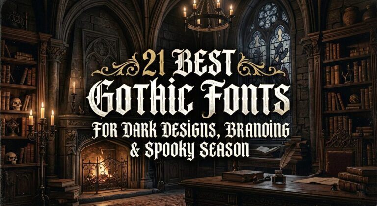
27 Gothic Fonts Every Designer Needs in Their Library
Introduction: Why Gothic Fonts Still Hit Different
There’s something about blackletter that stops you mid-scroll. Always has, always will. Maybe it’s the centuries of history baked into every stroke—monks illuminating manuscripts, old English proclamations, the weight of tradition pressed into paper. Or maybe it’s just that sharp angles and dramatic contrast grab attention in a way clean sans-serifs never can.
I’ve been a designer long enough to know that trends come and go. But Gothic Fonts? They stick around. They evolve, sure—picking up Victorian ornamentation here, biker edge there, even some Western ruggedness along the way—but that core DNA remains intact. Bold. Authentic. Unapologetic.
I put this collection together because I kept reaching for the same few blackletters and wondering what else was out there. Turns out, a lot. From dark academia elegance to punk-inspired chaos, from medieval authenticity to playful modern twists—there’s a whole world of gothic typefaces waiting to find their way into your projects.
So I spent real time with each of these fonts. Tested them on logos, posters, packaging, the works. And now I’m sharing what I found—honest thoughts from one designer to another, no fluff, just what works.
Here are the Gothic Fonts that earned a permanent spot in my library.
1. Old English Bundle Font


Why I Always Come Back to Gothic Fonts for Bold Projects
As a designer, I’m constantly searching for typefaces that have real personality, and for me, nothing beats the raw energy of good Gothic Fonts. When I started working with The Old English Bundle, it felt like opening a treasure chest of history. These aren’t just letters; they’re statements. The sharp angles and dramatic serifs instantly give a project that hand-crafted, medieval feel that you just can’t get from standard, clean fonts.
I recently used the “Demon” style variation for a band’s merch design, and the heavy, blackletter weight added exactly the hardcore edge we needed. It’s perfect for logos, tattoo flash, or even a vintage poster where you want that gritty, authentic texture.
What I love most is the versatility—one day I’m evoking old-world mystique for a craft brewery, and the next, I’m using the “Black” style for a bold editorial headline.
If your project needs to shout with historic flair and timeless impact, diving into this collection of Gothic Fonts is the best shortcut to getting that dark, dramatic vibe just right.
2. Brother Gothic Font


Brother Gothic: Where Victorian Class Meets Biker Grit
You know that feeling when you find a font that just fits everywhere? That’s how I felt when I got my hands on Brother Gothic. It starts with that classic Victorian bones—the kind of typeface you’d see on an old apothecary sign—but we’ve stripped it down and given it a dark, mechanical soul. It has the sharpness of Gothic Fonts, but it’s not so rigid that it feels stuck in a history book.
I’ve been using it for everything. One day, it’s perfect for a craft beer label where you need that vintage vibe with a modern, biker edge. The next, it’s carrying the bold title on a editorial spread or adding grit to a logo for a custom garage.
What makes Brother Gothic special is that versatility—it bridges the gap between old-world elegance and raw, road-worn attitude. It doesn’t just sit on the page; it rumbles. If you need a font that brings both class and chaos, this is the one to keep in your back pocket.
3. Taylor Gothic Font


Taylor Gothic: The Bold Blackletter You Can Always Trust
Let’s be real—finding a blackletter that actually works without a ton of fuss is rare. But Taylor Gothic? This one’s a keeper. It’s bold, it’s authentic, and it has that classic gothic structure that just feels solid. Whenever I need to add serious weight to a project, this is the font I grab without overthinking it.
I recently used it for a friend’s leathercraft logo, and the sharp letterforms cut through the design exactly how I imagined. It’s perfect for branding, posters, or anything that needs that traditional blackletter punch without looking like a cliché. What I appreciate most is its confidence—it doesn’t try to be fancy; it just delivers.
If you’re building a collection of go-to Gothic Fonts, Taylor Gothic deserves a permanent spot. Add it to your layouts, trust the process, and you’ll see what I mean. It simply works.
4. Metal Gothic Font


Metal Gothic: Blackletter That Plays Nice with Everything
I’ll be honest—I judged Metal Gothic by its name at first, thinking it might be a one-trick pony for band posters. But after spending some time with it, I realized this font has serious range. Yeah, it’s got that bold blackletter backbone, but the typographic harmony here is real. The letters just flow together without those awkward spacing issues you sometimes get with gothic styles.
I’ve been reaching for it constantly lately. Last week it was the backbone of a whiskey brand’s logo, and today I’m dropping it into social media ads where it needs to pop on a tiny mobile screen. It pulls weight in product packaging too—there’s something about those confident strokes that makes physical products feel more substantial.
What wins me over is how it keeps that edgy blackletter soul but doesn’t fight with other design elements. If you’re looking for Gothic Fonts that actually adapt to whatever you throw at them—logos, branding, ads, you name it—Metal Gothic deserves a spot in your library.
5. Blacker Gothic Font


Blacker Gothic: The Entrancing Blackletter with Secret Details
You know that moment when you download a font and immediately start playing with all the alternate characters? That’s been my entire week with Blacker Gothic. This one caught me off guard—it’s got that bold, elegant blackletter structure, but the distinctive character forms are what keep pulling me back in. There’s this unexpected fluidity to it that makes everything feel less rigid and more alive.
The real magic happened when I dug into the PUA encoding. Suddenly I had all these swashes and glyphs at my fingertips without jumping through hoops. I used a ligature for a boutique coffee package that completely elevated the whole vibe—looked like custom lettering, took me minutes. For branding projects where you need that handcrafted feel without the handcrafted price tag, this font delivers.
Whether it’s packaging, logos, or editorial headers, Blacker Gothic brings that extra layer of detail that clients notice but can’t quite name. If you’re hunting for Gothic Fonts with hidden depth and typographic surprises, this one’s worth your time.
6. The Gothic Rite Font


The Gothic Rite: Dark Academia Distilled into Letterforms
Some fonts are just tools. The Gothic Rite feels more like a find—something discovered in the dusty corner of a university library, hidden between pages nobody has touched in decades. I opened this blackletter and immediately got chills.
The sharp, geometrical construction mirrors cathedral arches and ancient manuscript margins, but it moves beyond mere imitation into something that feels alive with ritual and mystery.
I’ve been using it for a friend’s poetry collection—the one with themes of alchemy and transformation—and the letters themselves became part of the storytelling. The 202 glyphs mean you’re never hunting for the right character, and with 67 languages supported, it travels well across projects.
Book covers, obviously, but I’m also eyeing it for fashion editorial headers and maybe even some occult-inspired branding work. What gets me is the weight each letter carries; nothing feels accidental here.
If your design language leans into shadows, intellect, and that dark academia aesthetic, this collection of Gothic Fonts offers something rare—a typeface that doesn’t just sit on the page but performs a ritual every time you use it.
7. Gothic Garbage Font


Gothic Garbage: The Beautiful Mess You Need
Yeah, the name says it all—and I mean that as a compliment. Gothic Garbage is exactly what happens when classic blackletter structure decides to go live in a dumpster behind a punk venue for a few weeks. I stumbled across this grunge blackletter while looking for something that didn’t try so hard to be perfect, and honestly? It’s been my secret weapon ever since.
The letters carry that gorgeous decay—rough edges, texture that feels printed through a broken press, all that good stuff. But here’s what got me: underneath the grime, the bones are actually solid. You can still read it. That’s rare with distressed fonts, right?
I used it for a friend’s garage band logo and another time for a zine about forgotten city spaces. It works for posters, merch, anything that needs to feel like it’s been through something.
If your collection of Gothic Fonts is looking too clean, too polished, too safe—Gothic Garbage is the antidote. It’s messy on purpose and absolutely owns it.
8. Gothic Woman Font


Gothic Woman: Where Darkness Meets Delicate
I remember opening this font for the first time and just staring at those tall, graceful letterforms. Gothic Woman does something I don’t see often—it balances elegance and darkness without letting either side tip over.
The fine contrast between the thick strokes and those thin, dramatic terminals? Pure poetry. It reminds me of Victorian lace collars and the architecture of old chapels, but filtered through a modern gothic fashion lens.
I’ve been using it for a luxury candle brand that leans into mysterious, midnight florals, and the packaging suddenly felt like it belonged in a boutique hotel lobby. But here’s the thing—it’s not just for pretty stuff. I dropped it into a theatrical poster for a dark period piece and the letters carried all that moody weight on their own.
Book covers, mystical quote prints, fashion editorials with a dark edge—this font moves gracefully between all of them.
If you’re curating Gothic Fonts that bring sophistication rather than just shock value, Gothic Woman deserves space in your library. It’s haunting, it’s beautiful, and it works.
9. Demons Gothic Font


Demons Gothic: The Bold Blackletter That Refuses to Blend In
Some fonts are polite. Demons Gothic is not one of them. I grabbed this bold display font for a metal show poster last month and it immediately did exactly what I needed—commanded attention without apology.
The blackletter structure is authentic and heavy, the kind of weight that makes words feel like they’re carved rather than printed. But what surprised me? How far it stretches beyond the obvious dark stuff.
Yeah, it kills it for gothic and metal projects. But I tested it on a sport concept and suddenly the letters had this athletic aggression that worked. Logo work? Absolutely—those sharp forms lock into place and stay there.
The real win is the PUA encoding though. I’m lazy about glyph access usually, but Demons Gothic makes it painless. All those alternates and ligatures are right there when you need them, no wrestling with character maps.
If you’re building a toolkit of versatile Gothic Fonts that can slide from dark branding to bold display work without missing a beat, this one’s a workhorse in disguise. It looks like trouble but delivers like a pro.
10. Gothic Font


Gothic: The Handcrafted Blackletter That Actually Reads
Here’s the thing about medieval-inspired fonts—half of them look amazing but try reading a full sentence and you’re lost. Gothic solves that. I’ve been reaching for this calligraphy-inspired display font when I need that old-world drama without sacrificing clarity.
The strong strokes and slightly flared terminals catch light like they were drawn with a real quill, but the letterforms stay friendly enough that your audience actually sticks around to read what you made.
I used it for a dark academia book cover last month and the designer I was collaborating with actually stopped to ask what font that was. That never happens. It’s perfect for fantasy maps, Halloween event posters, game titles that need weight, album artwork with moody vibes—anything really that calls for that vintage gothic soul.
The handcrafted character comes through in every letter without veering into unreadable territory. In a world of Gothic Fonts that prioritize style over function, this one finds the sweet spot. It’s dramatic but it’s useful. And honestly? That’s harder to find than you’d think.
11. Western Gothic Font


Western Gothic: Vintage Soul in a Sans-Serif Frame
I’ll be honest—when I first saw “Gothic” in the name, I expected blackletter. Western Gothic surprised me, and sometimes those surprises become the fonts you actually use. This is a sans-serif that somehow bottles up the simplicity of an old Western aesthetic and delivers it in a clean, retro silhouette that works everywhere. The balanced proportions give it that vintage perfection without feeling like a costume.
I grabbed it for a coffee shop rebrand recently—place with rustic vibes but a modern crowd—and it bridged that gap effortlessly. Logos, obviously. But I’ve also been testing it in web design where you need personality without sacrificing readability on screens.
The old-world charm is there, but the contemporary edge keeps it from feeling like a museum piece. If you’re tired of Gothic Fonts that only do one thing, Western Gothic offers something different: versatility with a point of view. It’s minimal but not boring, retro but not dated. That sweet spot is real.
12. Hellios Gothic Font


Hellios Gothic: Victorian Soul with Daring Attitude
I stumbled across Hellios Gothic while hunting for something with authentic Victorian bones but a modern nerve, and wow—this one delivers. The blackletter structure is rooted in that classic era, all sharp angles and dramatic presence, but there’s something daring in how the letters carry themselves. They’re not just sitting there looking old; they’re challenging you to use them in interesting ways.
Last week I dropped it into a spirits label concept—small batch whiskey with a fictional backstory—and the font instantly gave it that shelf presence you can’t manufacture. Vintage product packaging is where it shines, obviously. But I also tested it on apparel mockups and realized this would kill on a hoodie. Something about those bold strokes translates beautifully to fabric.
Exquisite feels like the right word here. The letters have weight, history, and that subtle Victorian ornamentation that makes everything feel more considered.
If you’re curating Gothic Fonts with authentic period appeal that still feel fresh, Hellios Gothic deserves your attention. It elevates everything it touches.
13. Big Fat Gothic Font


Big Fat Gothic: When You Need Letters That Yell (Beautifully)
Look, sometimes you need a font that doesn’t whisper. Big Fat Gothic is the font you grab when subtlety isn’t part of the conversation. This blackletter is thick, weighty, and absolutely unapologetic about taking up space.
The strokes have this robust confidence that makes titles and headlines feel like they’re carved from stone rather than rendered in vectors. I used it for a festival poster header and it dominated the composition exactly how I wanted.
But here’s where it gets interesting—I expected bold, but I didn’t expect all these extras. The swashes and alternates caught me off guard. Suddenly I’m not just setting text, I’m customizing every letter, tweaking ligatures, adding flair to something that already had plenty of personality.
Logos, branding materials, even website headers—Big Fat Gothic adapts without losing that heavyweight presence.
The intricate detailing keeps it sophisticated while the weight does the heavy lifting. If your collection of Gothic Fonts needs a true heavyweight that still knows how to dress up, this one’s a knockout. It commands attention, but it also plays nice with the details.
14. Imperial Gothic Font


Imperial Gothic: Blackletter That Commands Respect
Some fonts you use. Others you feature. Imperial Gothic falls firmly into that second category. I opened this blackletter and immediately noticed how the letters carry themselves—there’s a regal confidence here, a daring structure that feels both historically rooted and freshly drawn.
The stylish features aren’t just decoration; they’re integral to how the font communicates.
I tested it on a high-end spirits label last week and watched the whole package elevate instantly. The letters have that rare ability to feel bold without screaming, sophisticated without fading into the background. Product packaging is an obvious win—anything on a shelf needs this kind of presence.
But I’ve also been experimenting with it for boutique branding projects where clients want typography that signals quality before they read a single word. Imperial Gothic delivers that signal every time.
If you’re curating Gothic Fonts with genuine presence and stylish bones, this one deserves a spot in your rotation. It impresses without trying too hard. That’s the sweet spot.
15. Gothic Blackletter Font


Gothic Blackletter: Medieval Bones with Modern Readability
Here’s the challenge with authentic old English inspired fonts—they look incredible but try reading a paragraph and your eyes cross. Gothic Blackletter solves that tension beautifully. The sharp angles and strong vertical strokes give you all that medieval drama you’re chasing, but the letterforms stay clean enough that your audience actually reads your message instead of just admiring the shapes.
I grabbed this for a craft brewery label recently—place wanted that vintage monastery vibe without confusing customers—and it hit exactly right. Logos, obviously. Album covers where you need instant mood.
Tattoo flash sheets that demand authentic blackletter weight. Even book titles that need to signal historical depth before anyone reads a word. What impresses me is how Gothic Blackletter delivers that powerful vintage feel without sacrificing function. The dramatic letterforms do their job, but the headlines remain readable. That balance is rare.
If you’re building a toolkit of Gothic Fonts that actually work across dark-themed projects and commercial work alike, this one deserves attention. It’s authentic, it’s bold, and it reads.
16. Gothic Font


Gothic: The Classic Blackletter That Does the Heavy Lifting
You know those fonts that just feel like they’ve always been there? That’s Gothic for me. It’s a classic blackletter with all the medieval bones you’d expect—sharp edges, strong vertical strokes, that authentic old English character—but here’s the thing: it actually works in real projects. Sometimes traditional gothic typefaces get so caught up in drama that you can’t use them for much. Not this one.
I threw it on a book cover last month, something historical fiction with dark themes, and the letters carried the whole mood without overwhelming the design. Logos, obviously. Posters where you need instant gravitas.
Album artwork for bands that want that vintage metal vibe without the cliché. Even packaging for a small-batch hot sauce that wanted “monk’s recipe” energy. What wins me over is the clean readable structure underneath all that drama.
The headlines hit hard but your audience actually reads them. If you’re looking for Gothic Fonts that deliver authentic historical weight without sacrificing function, this one’s a workhorse. Classic, bold, and reliably good.
17. Gothic Pen Font


Gothic Pen: Drawn from the Hand of History
There’s something about a font that feels like it was written by hand centuries ago and somehow survived. Gothic Pen gave me that feeling immediately. This isn’t just another digital blackletter—it’s dramatically ornate in a way that suggests actual pen strokes, real pressure on real parchment.
The Gothic era inspiration runs deep here, with all that mystery and grandeur captured in every curve and terminal.
I used it for a gallery invitation last month, something for an exhibition about medieval manuscripts reimagined, and the response was immediate. People kept asking about the lettering. That’s the effect Gothic Pen has. It injects antique sophistication without feeling like a museum replica.
The dark aesthetic is present but not overwhelming—there’s elegance woven through all that drama. Book titles, obviously. Packaging for products that want to signal heritage. Any project really that needs to capture that poignant Gothic spirit.
If you’re hunting for Gothic Fonts with genuine historical soul and hand-drawn warmth, Gothic Pen deserves your attention. It’s ornate. It’s moody. And it writes itself into your memory.
18. Gothic Bamliero Font


Gothic Bamliero: Where Medieval Meets the Mosh Pit
I didn’t know I needed a font that bridges 14th century manuscripts and punk show flyers until Gothic Bamliero landed in my library. This blackletter hits different—sharp ornamental letterforms with dramatic contrast that somehow feels both ancient and freshly rebellious. The medieval bones are there, but the attitude is pure underground subculture.
Last week I tested it on a streetwear concept and immediately understood where it belongs. Music branding, obviously—bands that want that gothic punk energy without looking like everyone else.
Tattoo flash sheets where the letters need to feel like they’ve always been on skin. Horror festival posters that demand attention from across the room. What gets me is the intricate style never sacrifices impact. Every ornament, every sharp edge serves the overall presence.
If you’re curating Gothic Fonts with genuine subcultural credibility, Gothic Bamliero delivers that medieval intensity with a modern middle finger. It’s bold. It’s ornamental. And it absolutely refuses to be ignored.
19. Gothic Creative Font


Gothic Creative: When Blackletter Saddles Up
Here’s a combination I didn’t see coming but now can’t live without—blackletter structure with Western soul. Gothic Creative takes the dramatic bones of traditional gothic letterforms and runs them through a rugged Old West filter. The result? Something that feels simultaneously like a cathedral manuscript and a wanted poster from 1880s Arizona. That fusion shouldn’t work but absolutely does.
I grabbed it for a friend’s branding project—dude runs a leather workshop that does both saddles and journals—and the font captured his whole deal in one wordmark. Book covers with historical Western themes? Perfect. Movie posters where the landscape is as important as the story? Gothic Creative carries that weight.
What impresses me is how the adventurous spirit never overwhelms the typographic tradition. The letters stay readable while evoking all that strength and frontier energy.
If you’re looking for Gothic Fonts that tell a different story—one with dust and horizon and old pine saloons—this one’s your partner. It’s dramatic, it’s rugged, and it’s ready to ride.
20. Gothic Trashed Font


The Gothic Trashed: A Classic, Digitized from History
There’s something special about fonts with a backstory, and The Gothic Trashed has a good one. It’s a classic Gothic typeface that was remastered by Intellecta Design . I love that this Brazilian foundry actually digs through old churches, museums, and antique books to revive lost typefaces, and this one came out of that kind of historical detective work .
It has that authentic distressed character—not fake grunge applied as an afterthought, but genuine texture that feels like it was printed centuries ago and survived something.
The traditional blackletter structure is all there—sharp angles, dramatic strokes, that medieval soul—but the worn appearance gives it this incredible vintage weight .
I used it for a book cover set in 14th century Europe and the letters alone sold the period. Posters, album covers, branding that needs bold historical presence—The Gothic Trashed delivers all that.
If you’re building a collection of Gothic Fonts with genuine antique soul and scholarly credentials, this one carries stories with it. It’s classic, it’s distressed, and it’s been remastered for right now.
21. Gothic Rapsody Font


Gothic Rapsody: Blackletter That Brings the Noise
Some fonts look great but only work in one context. Gothic Rapsody isn’t that font. I grabbed this bold display blackletter for a metal band’s merch design and it delivered exactly the weight I needed—those strong strokes and authentic gothic structure hit hard without any fuss.
But then I tested it on a sports concept and suddenly the letters had this athletic aggression that worked completely differently. That’s the magic here.
Music projects are an obvious win. Posters where you need instant drama. Logos that demand attention without screaming for it. What impresses me is how Gothic Rapsody adapts across contexts while keeping its bold personality intact. Dark themes, obviously.
But I’ve also used it for branding that needed historical weight without looking stuck in the past. The authentic display quality means it stands out whether you’re setting a headline or building a full identity.
If you’re looking for Gothic Fonts that actually work across poster, logo, music, and sports applications without losing their soul, this one’s a versatile weapon. It’s bold. It’s authentic. And it plays everywhere.
22. Gothic Mightier Font


Gothic Mightier: Blackletter That Packs a Punch
You know those fonts that just feel substantial in your hands? Gothic Mightier is exactly that. The letters are thick, weighty, unapologetically bold—this is blackletter that takes up space and owns it. I grabbed it for a branding project last week and immediately appreciated how the heavy strokes carry confidence without any extra effort. The results? Exactly what I hoped for.
But here’s where it gets better—the PUA encoding means all those glyphs and swashes are right there when you need them. No digging through character maps, no frustration. I’m lazy about that stuff usually, but Gothic Mightier makes customization painless.
Logos, headlines, packaging that needs physical presence—this font delivers all that. The thick lettering reads clean from distance while the details reward closer looks.
If you’re building a collection of Gothic Fonts that actually work hard for you, Gothic Mightier deserves that confidence. Add it to your toolkit. You’ll love the results. I did.
23. Danger Gothic Font


Danger Gothic: Blackletter That Doesn’t Take Itself Too Seriously
Here’s something you don’t see every day—blackletter that actually feels playful. Danger Gothic takes those Old English bones and gives them a modern, casual spin that completely changes the vibe.
The unique shapes caught me off guard at first, but now I can’t stop finding uses for them. It’s elegant without being stuffy, playful without being silly. That balance is rare.
I used it for a magazine headline last month and the letters brought energy without overwhelming the spread. Custom logos where you want historical nods but contemporary feel? Perfect.
Packaging that needs personality, quotes that deserve attention, merchandise that shouldn’t look like everything else—Danger Gothic slides into all of them. What wins me over is how easily it combines with other styles. It’s not demanding attention; it’s just offering something fresh.
If you’re looking for Gothic Fonts that break the mold while honoring the tradition, this one’s your answer. It’s unique. It’s playful. And it actually works with what you’re already doing.
24. Wobbly Gothic Font


Wobbly Gothic: Blackletter with Character That Wanders
I’ll be honest—the name made me smile before I even opened the font. Wobbly Gothic delivers exactly what it promises and somehow more.
This is elegant, highly detailed blackletter, but the uniquely shaped letters have this organic movement that feels almost hand-drawn. They’re not perfectly rigid. They wander slightly, curve unexpectedly, keep you looking longer than you planned.
I tested it on a quote poster for a friend’s art show and immediately understood where it belongs. Projects that need a distinct touch—that’s the sweet spot. The imposing presence is there, but the wobble softens it into something approachable.
Packaging for artisanal products. Editorial headers where you want curiosity. Branding for clients who don’t want to look like everyone else. What gets me is how the detailed letterforms reward close attention while reading clearly from across the room.
If you’re hunting for Gothic Fonts with genuine personality and hand-drawn warmth, Wobbly Gothic deserves your time. It’s elegant. It’s detailed. And it walks its own path.
25. Gothic Font


Blackletter Gothic: Medieval Handwriting Brought to Life
Some fonts reference history. Blackletter Gothic feels like it was pulled directly from a 14th century monastery, ink still wet on parchment. This classic-style typeface captures exactly what I love about European medieval handwriting—the bold, sharp, angular forms that seem carved rather than drawn. The strong vertical lines draw your eye down the page with authority, and those distinctive ornamental details reward anyone who looks close.
I used it for a historical society’s event poster and the letters alone communicated the weight of the subject. Dark, dramatic, authoritative—all those words fit. But what impresses me is how Blackletter Gothic delivers that authentic Gothic atmosphere without becoming unreadable.
The drama serves the message instead of overwhelming it. Book covers that need instant gravitas. Packaging for products with heritage stories. Logos where tradition matters.
If you’re building a collection of Gothic Fonts with genuine historical soul, this one carries centuries with it. It’s bold. It’s sharp. And it means what it says.
26. Gothic Castle Font


Gothic Castle: Blackletter with Fortified Character
I’m always drawn to fonts that make me look twice, and Gothic Castle did exactly that. This blackletter has something slightly different going on—a little edgy, a little unexpected, with letterforms that feel both ancient and freshly drawn.
The unique shapes caught my attention immediately. There’s a structural quality here, like each letter was built rather than written, which makes sense with that castle name.
I tested it on a fantasy book cover and suddenly the title had this fortified presence that carried the whole design. But here’s what surprised me—it adapts. I threw it into a modern branding concept and the edge worked there too.
Posters, logos, packaging that needs distinction—Gothic Castle slides into all of them without losing its personality. The interesting shapes reward attention while the blackletter bones keep it grounded.
If you’re hunting for Gothic Fonts with genuine character and unexpected angles, this one deserves a look. It’s unique. It’s edgy. And it works in places you wouldn’t expect.
27. Gothic Vampire Font


Gothic Vampire: Blackletter That Drips with Drama
Look, sometimes you need a font that doesn’t just suggest horror but fully commits. Gothic Vampire is that font. This bold blackletter takes those sharp, medieval letterforms and adds blood-like drips that feel organic rather than gimmicky.
The first time I used it for a Halloween event poster, the client actually gasped. That’s the effect we’re talking about here.
What impresses me is how the gothic drama never overwhelms the readability. Those sharp forms carry all that vampire energy while keeping the message clear.
Horror posters are an obvious win—instant atmosphere. But I’ve also used it for gothic apparel concepts and eerie wedding invitations (yes, that’s a thing) and it delivers every time. The OTF and TTF formats mean it works wherever you need it.
If you’re building a collection of Gothic Fonts with supernatural flair and genuine horror credibility, Gothic Vampire brings the blood without the mess. It’s bold. It’s dramatic. And it’s ready for your darkest projects.
Conclusion: Find Your Dark Muse
Building a solid type library is personal. You’re not just collecting files—you’re gathering voices, moods, and collaborators that help you say what needs saying. This collection of Gothic Fonts offers something rare: range without compromise. From the Victorian elegance of Hellios Gothic to the punk energy of Gothic Bamliero, from the medieval authenticity of Blackletter Gothic to the playful edge of Danger Gothic, there’s a tool here for every dark mood and every bold brief.
I’ve spent real time with each of these fonts, tested them across logos, posters, packaging, and beyond. They’ve delivered every time. Whether you’re chasing dark academia sophistication, horror-fueled drama, Western ruggedness, or something that simply refuses to blend in—you’ll find your match here.
Ready to Bring the Darkness to Your Next Project?
Don’t just take my word for it. Explore the full collection and see which of these Gothic Fonts speaks to your creative instincts. Each one is PUA encoded, fully accessible, and waiting for your vision.
You may also like:
Disclosure: This post contains affiliate links. If you make a purchase through my links, I may earn a small commission at no extra cost to you. Thank you for supporting my site! ♥️