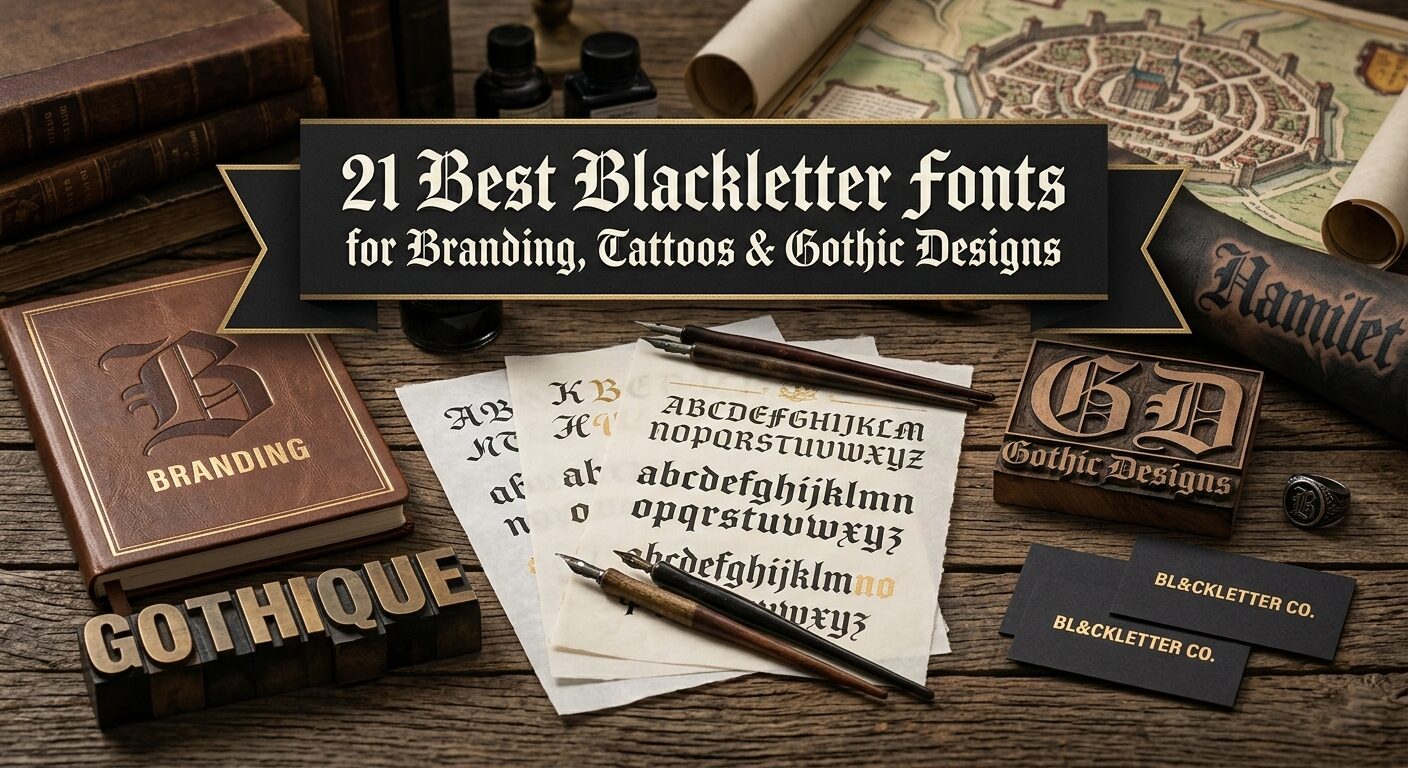
21 Best Blackletter Fonts for Branding, Tattoos & Gothic Designs
You know that feeling. You’re deep in a project, everything’s clicking — but the font feels off. Not bad, just… not it. You scroll. You preview. You try one more. Nothing hits.
I’ve been there more times than I can count. That’s why I put this collection together.
Twenty one blackletter fonts. Each with its own voice, its own history, its own reason to exist. Some are elegant. Some are dark. Some look like they belong on a cathedral door or a metal album cover. But all of them? Built to make your work unforgettable.
Let’s dive in.
1. Blitch Blackletter Font


When I first tested Blitch Modern Blackletter Tattoo Font, I knew this one was special. As a designer, I’ve seen plenty of Blackletter Fonts, but Blitch hits different — it’s got that raw, inked-up energy without trying too hard.

The letters feel alive. Thick, confident strokes that mimic real tattoo needles, sharp edges that catch your eye but still stay readable. Perfect for custom tattoo designs where you need that authentic flash art vibe, or for logos when a client wants something bold and a bit rebellious. Think barbershops, craft breweries, underground bands — Blitch gives them instant attitude.
What I genuinely love? It just works. Drag it into Procreate, drop it in Photoshop — no fuss, no weird spacing issues. The letters hold their shape whether you go big or small. For Blackletter Fonts, that kind of flexibility is gold. You can tweak colors, add textures, push it around, and it never falls apart.
Bottom line: if your project needs edge without looking like a history textbook, give Blitch a spin. It’s modern gothic done right.
2. Brother Gothic Blackletter Font
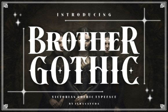

Let me introduce you to Brother Gothic — a font that started as a Victorian gentleman but ended up joining a motorcycle club. That’s honestly the best way to describe it.

As a designer, I’m always drawn to Blackletter Fonts that bring something unexpected to the table, and this one delivers. You can see the bones of classic Victorian typefaces underneath — that elegant, almost formal structure — but we roughed it up. Gave it attitude. Made it feel like it’s been on the road for a thousand miles.
The magic is in the mix. Those gothic edges cut sharp, but there’s a biker rawness running through every letter. It’s formal enough for a whiskey label, gritty enough for a metal band’s merch. That’s the whole point — Blackletter Fonts shouldn’t be stuck in one box. Brother Gothic moves between worlds naturally.
Use it for branding that needs heritage with an edge. Patch logos, dive bar signage, leather goods, craft distillery labels. It carries history on its shoulders but isn’t afraid to get its hands dirty. Victorian soul, biker heart. That’s Brother Gothic.
3. Nightmare Gothic Blackletter Font


Nightmare Gothic came to life when I wanted to create something dark but still inviting. You know those Blackletter Fonts that look intimidating from afar but reveal their beauty up close? That’s this one.
The letters carry that classic gothic weight — tall, dramatic, with those signature sharp details — but there’s a softness hiding in the curves. It’s elegant without being fussy, dark without feeling heavy. Honestly, it might be one of the most versatile Blackletter Fonts I’ve worked with recently.
Throw it on a wedding invitation? Works beautifully. Splash it across a metal band T-shirt? Absolutely.
Greeting cards, packaging, posters, hoodies — I’ve tested it everywhere, and it just keeps delivering. The balance is right: readable enough for body text when sized down, punchy enough for logos when blown up.
What gets me every time? Those little details in the letterforms. They catch the light differently depending on what you’re designing. If you need Blackletter Fonts that pull double duty — gritty enough for the streets, polished enough for print — Nightmare Gothic is your pick. Dark elegance, done right.
4. Underdove Blackletter Font


Underdove is the kind of typeface that stops you mid-scroll. As a designer, I’m picky about Blackletter Fonts — many try too hard to look old. This one? It just is.
The Victorian soul runs deep here. Those letters carry the weight of 19th-century engravings, like something pulled from an old nautical map or a heraldic document. But here’s the thing — it doesn’t feel like a museum piece. The flourishes are intentional, the swashes feel ceremonial without being messy. Sharp terminals meet soft curls in a way that feels balanced, not chaotic.
I keep coming back to Underdove because it straddles two worlds beautifully. Gritty enough for steampunk posters or tattoo flash, elegant enough for wine labels and book covers. That’s rare in Blackletter Fonts — that ability to look authoritative on a spirits bottle and still feel inviting on an editorial spread.
The texture sells it. You can almost feel the hand-engraving beneath your fingers, those tiny imperfections that make vintage design breathe. If your project needs nobility with an edge, dignity with detail — Underdove delivers. Victorian bones, modern flexibility.
5. Velthoven Black Blackletter Font


Velthoven Black walks that perfect line between old-world craft and modern edge. As someone who spends way too much time studying Blackletter Fonts, I can tell you — this one’s different.
It takes the bones of classic Fraktur calligraphy, all those historic echoes, then sharpens everything up with geometric precision. High stroke contrast, angular terminals that cut clean, but then — surprise — soft rounded spurs that keep it from feeling cold. That contrast is what makes it breathe.
What I love most? It refuses to be boxed into one category. Drop Velthoven Black into music posters for that underground show energy. Let it run across high fashion editorials where you need attitude without shouting. Streetwear logos, book covers, product wrapping — it adapts without losing its voice. That’s rare for Blackletter Fonts with this much personality.
And yeah, it’s legible. Strong personality usually kills readability, but Velthoven Black figured out the trick. The letters hold their shape whether you’re reading close up or across the room. Gothic minimalism with a pulse. If your work needs audacity with polish, this is the one.
6. Achsara Blackletter Font


Archsara takes me straight back to the 9th century. Not in a stuffy, textbook way — more like walking down an old village street and looking up at those weathered hanging signs. The ones that have seen centuries of rain and sun but still stand proud. That’s the energy this font carries.
As a designer always hunting for authentic Blackletter Fonts, I appreciate when something feels both old and alive. Archsara delivers that. The shapes are deceptively simple — elegant decorative forms that don’t try too hard. But together? They hit different. Strong, brave, like something a Viking would carve into wood before heading out to sea.
Knight posters, dragon book covers, kingdom branding, sword-and-shield merch — Archsara was practically made for those fearless themes. But don’t box it in. I’ve seen it work magic on artsy logos and documents where you need that motivated, unshakable look.
Big win: it’s PUA encoded. So all those gorgeous glyphs and swashes? One click away. No digging, no fuss. For Blackletter Fonts this authentic, that kind of access is everything. Archsara brings the 9th century back — but lets you play with it today.
7. Mister Honey Blackletter Font


Mister Honey walks into the room and everyone notices. That’s just how it is with this font. Victorian bones, yes — but twisted into shapes you don’t see every day. As someone who digs through Blackletter Fonts constantly, I can spot the usual suspects from a mile away. Mister Honey? Not usual at all.
The letters feel imposing without being aggressive. There’s a confidence in how they’re built, those uniquely shaped forms that break just enough rules to keep things interesting. Perfect for when a project needs that distinct touch — the kind of detail that makes people stop and ask, “Wait, what font is that?”
I’ve thrown Mister Honey into all kinds of work. Branding that needs old-world charm with new-world attitude. Invitations where you want elegance but not stuffiness. Packaging that should feel special, not mass-produced. It adapts without losing its voice.
And thank goodness it’s PUA encoded. All those gorgeous glyphs and swashes? Easy access, no headaches. For Blackletter Fonts this characterful, that matters. Mister Honey brings Victorian distinction — but makes it feel fresh.
8. Arcanum Blackletter Font


Arcanum feels like something I’d find chained to a desk in a forgotten monastery library. You know those Blackletter Fonts that look designed? This one looks discovered.
The inspiration is clear — ancient spellbooks, arcane rituals, medieval manuscripts written by candlelight. But what gets me as a designer is the texture. That handcrafted distressed finish isn’t just decoration; it’s atmosphere. Every letter carries weight, like it’s been touched by generations of fingers seeking forbidden knowledge.
Sharp angular forms cut through, then soften into ornate curves. It’s that push and pull — dark but inviting, old but alive. Perfect for fantasy titles where you need instant credibility. Game logos that promise magic. Book covers that whisper “secrets inside.” Movie posters for stories set in worlds just left of ours.
Pair Arcanum with parchment textures, midnight black backgrounds, deep crimson accents — and watch it breathe. The PUA encoding means all those stylistic glyphs are right there, ready to use. For Blackletter Fonts chasing that authentic magical aesthetic, Arcanum isn’t just a choice. It’s a summoning.
9. Tattoo Blackletter Font


Sometimes you don’t need a long story. Sometimes you just need a font that punches hard and asks questions later. That’s Tattoo.
Bold. Thick. Unapologetic. The kind of Blackletter Fonts that feel like they’ve been carved into skin with a real machine, not drawn with a mouse. Each letter carries that weight — solid, grounded, impossible to ignore. No fancy flourishes trying to be cute. Just strong blackletter bones doing what they do best.
I’ve thrown Tattoo into all sorts of projects. Flash sheets where it needs to look authentic. Logo work for shops that want that street-level credibility. Apparel graphics that need to read from across the room. And yeah — it delivers every time. Simple as that.
Big win? PUA encoded. All those glyphs, all those swashes — one click away. No digging through character maps, no frustration. For Blackletter Fonts this straightforward and bold, that ease of use matters.
Add Tattoo to your toolbox. You’ll love the results. Promise.
10. Arkhaven Blackletter Font


Arkhaven stops me every time I open the file. There’s something about it — a presence that goes beyond just being another set of letters. As someone who studies Blackletter Fonts for hours (yes, really), I can tell when a typeface carries weight. This one carries cathedrals.
The inspiration comes from Old English manuscripts, stone inscriptions worn smooth by centuries, ancient tomes that weigh more than your laptop. But Arkhaven isn’t just old — it’s alive. Those refined serifs catch light like carved stone. The ornate curves soften what could feel rigid. Dramatic contrast gives it breath, movement, that sacred-and-sublime balance designers chase.
Fantasy book covers? Instant atmosphere. Historical branding that needs credibility. Gothic logos that should feel eternal, not trendy. Album artwork for music that lives in darker spaces. Elegant invitations that whisper instead of shout. Arkhaven does all of it without breaking a sweat.
And here’s the quiet win — 197 glyphs, 65 languages supported. That’s not just versatility; that’s respect for the craft. For Blackletter Fonts aiming for timeless, most fall short. Arkhaven? It’s a relic reborn. And it’s ready to work.
11. Cambridge Blackletter Font


Cambridge feels like walking through those old university halls — the ones with stained glass windows and wood panels that have soaked up centuries of stories. As a designer who never gets tired of Blackletter Fonts, I can tell you this one hits different.
It’s gothic at its core, sure. Those classic blackletter bones are all there — structure, weight, that unmistakable medieval soul. But Cambridge wears it lightly. Elegantly. Like it’s dressed for a formal dinner instead of a battlefield. That’s what makes it stand out.
I keep coming back to Cambridge for projects that need authenticity without intimidation. Wedding invitations where you want tradition but not stuffiness. Book covers for stories set in worlds with history. Branding that should feel established, like it’s been around longer than anyone remembers. Logos that need to command respect quietly.
And yeah — it dazzles. There’s a polish to these letters, a finish that catches the eye without screaming for attention. For Blackletter Fonts, that balance is everything. Cambridge turns ideas into standouts. Simple as that.
12. Sharp Shadow Blackletter Font

Sharp Shadow doesn’t mess around. You can feel it the moment you look at those letters — every angle calculated, every edge intentional. As someone who geeks out on Blackletter Fonts, I appreciate when a typeface commits to its concept fully. This one does.
The angular construction is the whole story here. Sharp terminals cut clean, no apologies. That rigid vertical rhythm keeps everything marching in formation. Compact spacing pulls the letters close, like they’re in on something together. It’s gothic structure dialed up to eleven — but here’s the trick: it still reads beautifully at display sizes. That’s not easy to pull off.
I’ve been reaching for Sharp Shadow on projects that need bold statements without the noise. Posters where every inch matters. Headlines that should hit first, ask questions later. Large compositions where structure can’t afford to wobble. The uppercase carries weight. The lowercase keeps things moving. Numerals, punctuation, alternates, ligatures — it’s all there, ready to work.
Multilingual support too, which matters more than most people realize. For Blackletter Fonts this precise, having that flexibility is a gift. Sharp Shadow brings the angles. You bring the ideas.
13. Grimersia Blackletter Font


Grimersia feels like it belongs in a ritual — just not sure if it’s a sacred one or something darker. That’s the beauty of it. As a designer always hunting Blackletter Fonts with real personality, this one stopped me cold.
The bones are serif, sure. But then the tribal aesthetics kick in — those aggressive ornamental swashes that turn letters into statements. Dark mythology lives in every curve. Gothic art runs through its veins. It’s sharp. Elegant. And yeah, slightly dangerous. That’s not easy to pull off.
Two styles here — Regular and Slant — which means double the options. Regular when you need structure, presence, that sacred-but-rebellious energy. Slant when you want movement, attitude, something that leans forward like it’s coming at you. Both packed with alternates and ligatures, so every wordmark can feel fresh.
Album covers for metal, rock, dark electronic? Grimersia was practically made for them. Gothic branding that needs to feel eternal. Tattoo-inspired work where authenticity matters. Streetwear labels that should look edgy without trying too hard. Posters, merch, tribal projects, fantasy visuals — it keeps delivering.
Multilingual support too, because great Blackletter Fonts shouldn’t be limited by language. Grimersia brings the drama. You bring the vision.
14. Black Crown Blackletter Font


Black Crown wears its name well. This is typeface royalty — bold, commanding, the kind of Blackletter Fonts that doesn’t ask for attention, just takes it. As a designer always on the lookout for that medieval-meets-modern energy, I keep coming back to this one.
The inspiration is classic. Medieval manuscripts, gothic cathedrals, old English lettering carved into stone and wood. Sharp edges cut clean. Strong contrast gives each letter depth, movement. Those classic letterforms carry centuries of history — but Black Crown presents them fresh, impactful, ready for today’s work.
What sells me? The range. Drop it into a logo and suddenly the brand feels established, like it’s been around longer than anyone remembers. Titles that need weight without shouting. Posters where drama serves the message, not the other way around. Tattoo flash that should feel authentic. Album covers for music that lives in darker spaces. Vintage projects, gothic themes, luxury touches — Black Crown adapts without losing its voice.
That traditional, historical, old-world atmosphere? It’s all there. But Black Crown isn’t stuck in the past. It’s just powerful. Just royal. Just dramatic enough to matter. For Blackletter Fonts chasing that balance, this one wears the crown for a reason.
15. Stackwin Blackletter Font


Stackwin walks in and the room goes quiet. That’s just what happens with Blackletter Fonts built like this — bold, modern, impossible to ignore. As a designer who’s seen way too many gothic typefaces fade into the background, I can tell you this one sticks.
It’s blackletter at its core, yeah. Those traditional bones are all there — mystery, power, that old-world sophistication. But Stackwin sharpens everything up for today. Modern edges. Clean execution. The kind of presence that works across everything without losing its voice.
Branding that needs weight? Stackwin delivers. Logos that should feel established from day one. Apparel graphics that read from across the room. Album covers for artists who want their music to look as deep as it sounds. Tattoo flash, packaging, posters, event invites, headlines, editorial spreads — I’ve thrown it at all of them. It keeps delivering.
What gets me? The balance. Our designers built it with real respect for traditional blackletter art — those impeccable details, that dramatic gothic aesthetic — but they also understood modern trends. Legibility stays strong even when you push it big. Versatility doesn’t sacrifice character.
For Blackletter Fonts chasing that sweet spot between old and now, Stackwin is the answer. Command attention. Emit power. Stay sophisticated.
16. Gifters Blackletter Font


Gifters surprised me. The name sounds warm, right? Like something wrapped in paper with a bow. But then you look at those letters and — nope. This one’s got teeth. As a designer always hunting Blackletter Fonts with unexpected twists, I was hooked immediately.
It’s bold. Almost gothic. That spooky flair creeps in through the edges, the angles, the way each letter stands just a little too confidently. But here’s the trick — there’s an exquisite style underneath all that darkness. Refined. Deliberate. Like something wearing a velvet cloak to a haunted ball.
I keep reaching for Gifters on projects where “creative and daring” is the whole brief. Halloween branding that deserves better than cartoon bats. Packaging for limited drops where the vibe should feel exclusive and just a little unsettling. Posters for events that promise something different after dark. Logos for artists, makers, weirdos who don’t want to look like everyone else.
That spooky-plus-exquisite balance? Hard to pull off. Most Blackletter Fonts lean too hard one way or the other. Gifters walks the line perfectly — dark enough to matter, elegant enough to last. For your most daring ideas, this is the one.
17. Black Kiyrand Blackletter Font


Black Kiyrand stops me every time. Not just because it’s beautiful — though it is — but because of what it represents. This is Blackletter Fonts as high art. As a designer who spends hours lost in glyph panels, I can tell you: 822 characters is serious. But it’s what those characters do that matters.
The soul here is medieval calligraphy. Those Gothic manuscript traditions run deep — you can feel the monks leaning over pages, candles flickering, years of patience baked into every stroke. But Black Kiyrand isn’t a museum piece. It’s alive. Bold modern presence wrapped in historical elegance.
Those ornamental flourishes? Perfection. Uppercase letters dressed for a coronation. Lavish details that turn headlines into statements, monograms into heirlooms. And the lowercase — that graceful flow — keeps everything readable when you need words to actually, you know, work.
I’ve been reaching for Black Kiyrand on projects that demand respect.
Vintage posters where authenticity matters. Book covers for stories that feel eternal. Certificates that should look important the moment someone unfolds them. Branding for clients who want old-world charm without feeling dusty. Packaging, apparel, anything that deserves a regal touch.
Alternates and ligatures give you room to play. 822 glyphs give you room to explore. For Blackletter Fonts chasing that historical grandeur, Black Kiyrand isn’t just a choice. It’s a masterpiece. Let your words echo.
18. Blistao Blackletter Font


Blistao feels like it walked straight out of a classic flash sheet — the kind you’d find in a dusty old shop, pinned to the wall next to faded eagles and crying hearts. As a designer who never gets tired of Blackletter Fonts with history, this one hit different immediately.
It’s a serif at its core, sure. But that tattoo DNA runs through every letter. Bold, decorative, built to last. The vintage and retro vibes aren’t forced — they’re just there, natural, like something that’s been around long enough to earn its character. Old-school lettering done right.
I keep coming back to Blistao for projects where timeless is the goal. Logos that need to feel established from day one — like the brand’s been around since your grandfather’s time. Posters that should grab attention without screaming for it. Creative work that wants that artistic, hand-drawn soul without losing professional polish.
The letters carry weight. You can almost feel the needle in those thick strokes, the confidence of a artist who’s been doing this for decades. Perfect for tattoo-inspired branding, sure. But also for any project chasing that authentic retro feel — the kind that doesn’t try to be vintage, just is.
For Blackletter Fonts blending old-school heart with modern versatility, Blistao delivers. Timeless look. Artistic soul. Ready to work.
19. Captain Victory Blackletter Font


Captain Victory feels like something pulled from a ship captain’s log — the kind of journal written by lantern light, recording storms survived and distant shores spotted. As a designer always hunting Blackletter Fonts with storytelling weight, this one grabbed me immediately.
The nautical soul runs deep here. Those strong, historical letterforms carry the weight of Victorian-era design — think old maritime documents, weathered maps, shipping manifests from when the world felt bigger. Every character stands tall, confident, like a captain at the helm watching horizon lines.
And here’s the timing thing — Captain Victory hits different in early autumn. That back-to-school energy? Sure. But also that shift when the light changes, when the air gets crisp, when projects start reaching for something deeper. The Victorian aesthetic matches those golden afternoons perfectly. Warm but substantial. Historic but alive.
I’ve been reaching for Captain Victory on branding that needs instant character. Labels for craft spirits that should feel aged from day one. Posters for events celebrating tradition. Logos for makers, brewers, creators who want their work to feel established, trustworthy, like it’s been around longer than anyone remembers.
For Blackletter Fonts chasing that nautical adventure vibe — weathered maps, distant ports, stories written in salt air — Captain Victory delivers. Strong letters. Historical soul. Ready for autumn.
20. Harry Poster Regular Blackletter Font

Harry Poster doesn’t whisper. It growls. As a designer who lives for Blackletter Fonts with attitude, I spotted this one immediately — it’s got that metal band energy, that classic horror poster soul, all sharp edges and eerie presence.
The inspiration is pure macabre. Think vintage horror movie posters from the drive-in era. Think album covers for bands that tour in October and mean it. Those sharp edges cut through the noise. That eerie character settles in your bones. It’s spooky without being cartoonish — the kind of dark that actually feels dark.
I’ve been throwing Harry Poster at everything seasonal and mystical. Halloween party invites that deserve better than comic sans. Stickers for laptop lids that should make people look twice. Wall art for apartments that lean into the dark aesthetic. Apparel designs for hoodies people actually want to wear. Cricut projects, keychains, print-on-demand — it keeps delivering.
Book covers for horror stories? Perfect. Film titles for projects that need instant atmosphere? Absolutely. Dark fantasy branding for creators who don’t do bright and bubbly? Harry Poster was basically made for it.
For Blackletter Fonts chasing that chilling, horror-inspired look — the kind that works on party invites and metal merch equally — this is the one. Bold. Atmospheric. Spooky as it needs to be.
21. Bundles Blackletter Font


Sometimes you don’t need one font. Sometimes you need an arsenal. This 12-font bundle is exactly that — a collection of Blackletter Fonts built for designers who refuse to be boxed in.
We’re talking Victorian blackletter with those ornate, gaslight-era details. Metal fonts that hit like a power chord. Gothic fonts carrying centuries of cathedral weight. Old English classics that never go out of style. Twelve distinct voices, one unified vibe — vintage, dramatic, unapologetically bold.
What I love about this bundle? The range. Need something elegant for a whiskey label? Grab the Victorian. Need raw power for a band poster? The metal fonts deliver. Wedding invitations chasing that dark romance? Gothic’s got you. Streetwear logos demanding instant credibility? Old English, always.
That dark, elegant touch runs through everything. Old-fashioned in the best way — like something pulled from a century-old print shop, but cleaned up for today’s workflows. Perfect for branding that needs weight. Packaging that should feel established. Posters, apparel, album art, merch — any project chasing that strong, dramatic presence.
For designers building their Blackletter Fonts library, this bundle isn’t just a purchase. It’s a foundation. Twelve ways to make your work unforgettable.
🎁 Before You Go — Grab These Bonuses.
Before you go — don’t miss the bonuses. A little something extra for your creative stash.
Bonus #1: Font Generator
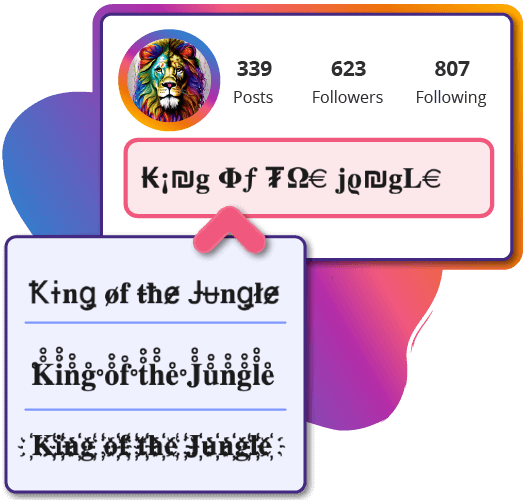
Sometimes you’re in the middle of a project and the font you have just doesn’t feel right. You know the moment — when the letters are technically fine but say nothing about who you are or what you’re making. That’s when I open the font generator.
Here’s how it works: type your message, then scroll. Bold. Playful. Elegant. Weird in the best way. One of them will click — that perfect match for your mood or your project’s vibe. Click it. Preview it. If it works? Copy, paste, done. The whole thing takes seconds.
What I love as a designer? It’s all Unicode under the hood. So whatever fancy font you fall for actually shows up everywhere — phones, laptops, even that one client who still uses an old tablet. No surprises. No “why does this look broken?” moments.
Finding fonts to copy and paste shouldn’t feel like work. This generator keeps it simple. Show up, experiment, grab what works. Whether you’re mocking up a logo, testing headlines, or just playing with ideas, it’s always good to have options.
And if you’re after actual font files for your collection? Check the free fonts section. But for quick inspiration, instant gratification, or just trying on different voices — the generator’s right here.
Bonus #2: Webfont Generator
You finally found the perfect font. The one. It’s sitting on your desktop as an OTF or TTF, ready to go. But then reality hits — it’s not a webfont. And now you’re staring at a client project that needs to work online. Been there, right?

Here’s the fix. Grab that file, drag it into the webfont generator, and let it work. A few seconds later? You’ve got a full webfont package — properly converted, ready to embed, no weird coding headaches. The generator handles the heavy lifting so you can get back to actually designing.
OTF. TTF. Doesn’t matter. Drop it in, grab the package, move on with your day.
For any designer juggling print and digital work, this tool lives in my bookmarks. When you need fonts to copy and paste across both worlds, clean conversion makes all the difference. Try it next time you’re stuck.
Conclusion
So here we are. Twenty one fonts, each with its own voice, its own history, its own reason to exist. From the Victorian elegance of Underdove to the raw tattoo energy of Blitch. From the ritual darkness of Arcanum to the nautical soul of Captain Victory. From the cathedral weight of Arkhaven to the street-level confidence of Stackwin.
As a designer, I’ve spent years building my collection of Blackletter Fonts. Some were gifts from fellow designers. Some were late-night discoveries. Some just showed up at the right time for the right project. But here’s what I know for sure: the right font changes everything.
It’s not just about letters on a page. It’s about feeling. Attitude. That moment when a client sees their logo for the first time and goes quiet — because it’s exactly what they didn’t know they wanted. That’s what these fonts are built for.
Whether you’re designing for metal bands or whiskey labels, wedding invitations or horror posters, streetwear drops or fantasy novels — there’s something here for you. Bold. Elegant. Dark. Dramatic. Timeless. Pick your energy and run with it.
And if you ever need more? The font generator‘s always ready. The webfont converter‘s got your back. Keep experimenting. Keep pushing. Keep making stuff that stops people mid-scroll.
That’s what this is all about.
Find your font. Make your mark.

Ready to transform your next project?
Browse all Blackletter Fonts on Creative Fabrica
You may also like:
Disclosure: This post contains affiliate links. If you make a purchase through my links, I may earn a small commission at no extra cost to you. Thank you for supporting my site! ♥️