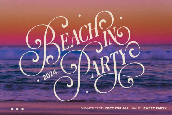
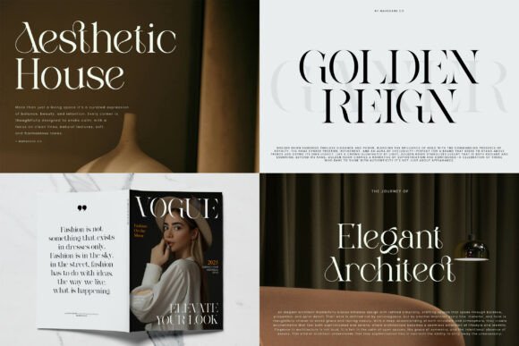
Display Fonts for Web Design: 20+ Elegant Serif & Retro Font Bundles for Branding
Let me tell you something honest.
I’ve spent hours — sometimes entire nights — scrolling through font after font, searching for that one. You know the feeling. The moment you see it, your heart does a little jump. You type out a word, and suddenly the whole design clicks.
That’s the power of Display Fonts.
They’re not here to be quiet background noise. They’re here to lead. To shout (or whisper) your message with personality, attitude, and style. Whether I’m crafting a bold logo, a dreamy wedding invitation, or a high-fashion magazine spread — the right display font turns good work into something people actually remember.
In this article, I’m sharing my personal collection of Display Fonts that I’ve used, loved, and tested in real projects. From elegant serifs with dramatic swashes to retro duos and modern ligature gems.
No boring descriptions. No robotic reviews.
Just me, my honest thoughts, and the fonts that made me stop and smile.
✨ Let’s find your next favorite typeface.
👇 Scroll down. Read. Fall in love with typography all over again.
1. Praise Serif Font
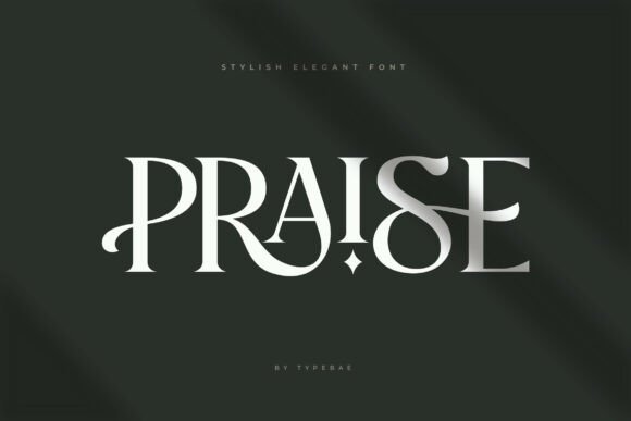
When I’m working on a high-end branding project, Praise is my secret weapon. It’s one of those Display Fonts that just feels luxurious the moment you type it out. I recently used it for a boutique skincare logo, and it gave the identity that timeless, sophisticated edge that’s hard to achieve with standard typefaces.
What I love most is that it’s not just pretty—it’s practical. The ligatures add that custom, hand-crafted touch that makes a logo feel exclusive, while the multilingual support saves me when I’m designing packaging for international clients.
Whether I’m crafting a wedding invitation or laying out a classy poster, this font handles it with grace. It’s the kind of typeface that makes your work look like you spent hours on the kerning, even when it came together naturally.
If you want your brand to feel elegant and professional without looking stiff, this one’s a keeper.
2. Thorny Roses Serif Font
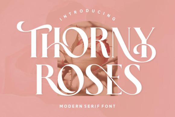
I stumbled across this one while looking for a serif that doesn’t take itself too seriously, and Thorny Roses surprised me. It’s one of those rare Display Fonts that balances old-world elegance with a fresh, modern edge. The moment I used it for a Valentine’s Day poster, I knew it was special—the strokes have this smooth, organic flow that feels almost handwritten, yet it’s clean enough for professional branding.
What really sold me is the versatility. I’ve used it for a wedding invitation suite and then later for a Christmas label design, and it worked beautifully for both. The swashes add that delicate charm when I need it, but the base typeface stands strong on its own for logotypes or magazine layouts. Having the PUA encoding means I don’t waste time hunting for glyphs—everything just works.
If you need a serif that feels romantic yet modern, this one will make your projects sing.
3. The Youth Serif Font
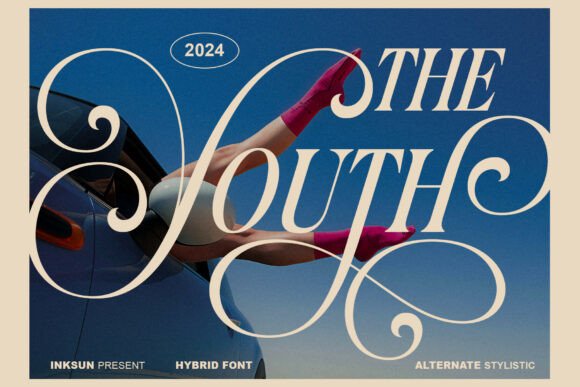
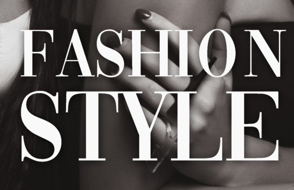
This one stopped me mid-scroll the first time I saw it. The Youth calls itself a “hybrid font,” and honestly, that’s the perfect description. It takes the structure you’d expect from a classic editorial serif, then twists it with these wild, gravity-defying swashes that feel completely avant-garde. I used it recently for a high-fashion lookbook overlay, and it instantly gave the images that bold, artistic signature I was chasing.
What excites me about Display Fonts like this is their ability to set a mood. The ultra-fine hairlines are delicate but confident—they create a sophisticated rhythm that works whether I’m designing for a luxury lifestyle brand or an experimental magazine spread. It’s not a font you hide in body copy; it’s meant to be seen, celebrated, and placed front and center.
If your project needs to feel nostalgic yet futuristic, or if you simply want your work to stand out as unapologetically artistic, this typeface delivers.
4. Poina Serif Font
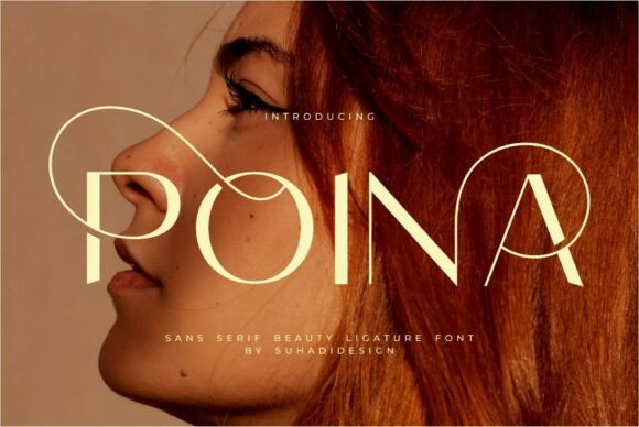
Some fonts just feel right the moment you start working with them, and Poina is one of those. It’s a modern serif that’s clearly earned its popularity—and I get why. The ligatures are smooth and intentional, giving that subtle touch of craftsmanship that turns a good design into something polished and professional.
I’ve reached for this one repeatedly for beauty and cosmetics branding. There’s something about its balance of elegance and approachability that makes it perfect for wordmarks, business cards, and even magazine layouts.
Whether I’m designing for a high-end skincare line or putting together a social media campaign for a lifestyle brand, Poina never feels out of place. It’s the kind of Display Fonts gem that quietly elevates everything around it without screaming for attention.
If you want your projects to look classy, modern, and effortlessly put together, this one deserves a spot in your toolkit.
5. Vintage Market Serif Font
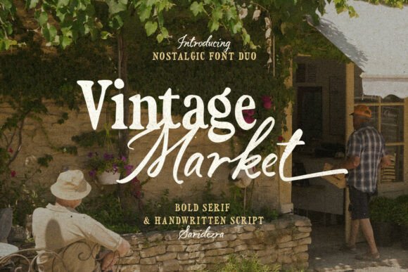
I’m a sucker for a good font duo, and Vintage Market is one of those pairs that just works. It combines a bold, confident serif with a handwritten script that actually feels like it belongs alongside it—not forced, just natural. The moment I used this for a retro-inspired poster, I knew I’d be coming back to it again and again.
What makes this stand out among Display Fonts is the versatility. The script comes with ending alternates, so I can give each word a slightly different, more expressive finish. It’s perfect for logotypes where I want that hand-crafted feel, or for branding projects that need a nostalgic, vintage soul.
I’ve also used it for quote designs and product packaging, and it always brings that warm, authentic vibe. Plus, multilingual support means I don’t have to stress when a client needs accents or special characters.
If you love that retro aesthetic but want a duo that feels polished and easy to work with, this one’s a real treat.
6. Fresh Mango Serif Font
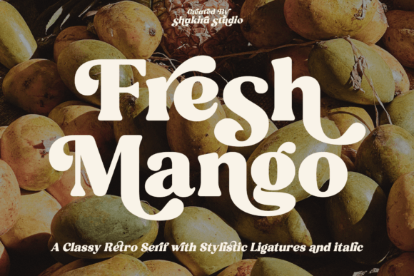
I’ll be honest—I picked this font because of the name, but I stayed for the personality. Fresh Mango is a retro serif that somehow manages to be bold and elegant at the same time. The contrasting lines and those lovely curved terminals give it a sleek, almost effortless charm that works beautifully for everything from holiday cards to wedding invitations.
What I appreciate most about Display Fonts like this is their ability to make headlines feel substantial without being overwhelming. I’ve used Fresh Mango for advertisement layouts and quote designs, and it consistently delivers that vintage flair while still feeling fresh.
The PUA encoding is a huge plus—I can access all the glyphs and ligatures without jumping through hoops, which means I spend less time troubleshooting and more time designing.
If you’re looking for a retro serif that brings warmth, elegance, and a little bit of playfulness to your projects, give this one a taste.
7. Ethereal Serif Font
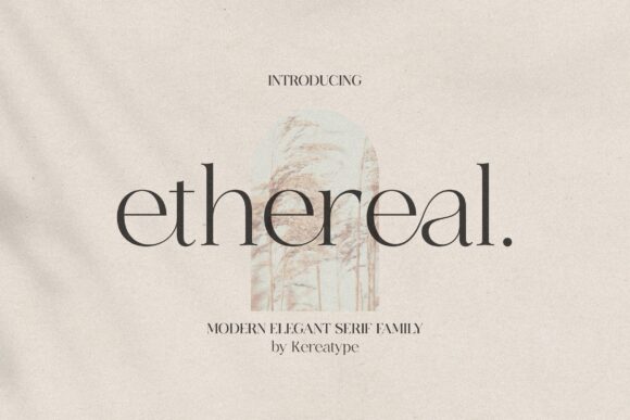
The name says it all with this one. Ethereal is a serif family that comes in multiple weights, and honestly, it’s become my go-to when a project needs to feel both modern and effortlessly elegant. I recently used it for a high-end branding project, and the client couldn’t stop raving about how the logos felt unique and sophisticated.
What makes this family stand out among Display Fonts is the flexibility. Having multiple weights means I can build hierarchy without switching typefaces—light for that airy, delicate look, bolder weights when I need presence. And those “sexy stylish extras” they mention? They’re not kidding.
The swashes and glyphs add just the right amount of flair for wordmarks and packaging designs. PUA encoding makes accessing all these extras a breeze, so I can focus on creating rather than hunting for characters.
If you want a serif that delivers elegance, versatility, and a touch of modern edge, this family is worth having in your collection.
8. Brown Serif Font
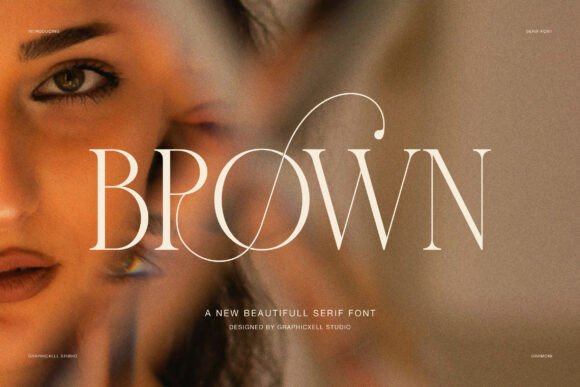
Sometimes a font just feels expensive, and Brown has that energy from the first letter. It’s an elegant serif that takes inspiration from fashion editorials and high-end branding—and you can absolutely tell. I used it for a luxury lookbook recently, and the long, sweeping terminals added this graceful movement to every headline that standard serifs just can’t match.
What I love about Display Fonts like Brown is how they balance classic structure with artistic charm. The smooth contrast between thick and thin strokes creates a natural rhythm that’s easy on the eyes but still commanding.
And those expressive alternates and ligatures? They let me shape each word so it feels custom-made for the project, whether it’s a logo, a magazine spread, or a refined brand identity.
If you want your work to whisper luxury and confidence without shouting, this font delivers that quiet, powerful voice.
9. Savage Roses Serif Font
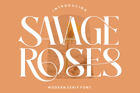
The name feels like a beautiful contradiction—and honestly, that’s exactly what this font delivers. Savage Roses takes the elegance of a classic serif and gives it this bold, playful energy that I haven’t found anywhere else.
I used it for a wedding invitation suite last month, and the delicate curls added just the right amount of enchantment without feeling overly fussy.
What surprised me most is how versatile it is. One day I’m using it for a romantic birthday card, the next for a fashion photography spread, and it works for both.
The Regular, Italic, and Ligature styles give me room to play, while the multilingual support means I don’t have to turn down international projects. Among Display Fonts, this one stands out because it balances sophistication with genuine joy—it makes words feel alive.
If you want typography that blooms with charm and confidence, Savage Roses will make your designs memorable.
10. Grandeur – Elegant Classic Serif Font
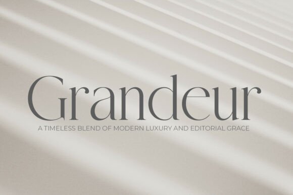
Some fonts whisper luxury instead of shouting it, and Grandeur is the definition of quiet confidence. It’s a classic serif inspired by timeless print traditions, but it doesn’t feel dusty or old—it feels poised, clean, and incredibly sophisticated. I recently used it for a luxury real estate brand, and the high-contrast stems gave every piece that editorial grace I was chasing.
What draws me to Display Fonts like Grandeur is their restraint. The clean lines let content breathe while still providing a beautiful frame for the message. It pairs stunningly with black-and-white photography and minimalist layouts.
Whether I’m designing a premium wine label, hotel signage, or a fashion magazine spread, this font brings a sense of prestige without ever trying too hard.
If you value simplicity, balance, and that “quiet luxury” aesthetic, Grandeur will become your trusted foundation.
11. Emerale Serif Font
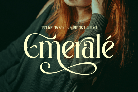
I remember the first time I typeset “Emerale” and just stared at that capital “E” for a solid minute. The sweeping upper curve, the graceful underline swash beneath the word—it felt like something from a couture fashion house. This is a sophisticated serif that doesn’t just sit on the page; it dances across it.
What draws me to Display Fonts like Emerale is the attention to detail. The high contrast between thick and thin strokes gives it that polished, editorial quality that’s hard to fake. And those ornamental flourishes? They’re dramatic but never crowded.
I’ve used it for perfume packaging and a boutique café brand, and both times, the client asked, “What font is that?” The lowercase letters are slightly elongated with soft curves, which keeps things readable even when the swashes are showing off.
If you’re doing luxury branding, fashion labels, or wedding invitations that need to feel romantic yet refined, Emerale will make your work unforgettable.
12. Strong Serif Font
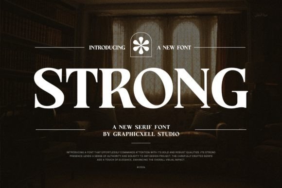
Don’t let the name fool you—Strong is elegant, not aggressive. It’s one of those serifs that feels both classy and modern at the same time, which is surprisingly hard to find. I’ve reached for it again and again for branding projects, logos, and even wedding designs because it just never lets me down.
What I love about Display Fonts like Strong is how effortlessly they adapt. One day I’m using it for a product packaging mockup, the next for social media posts or photography watermarks, and it always looks polished without trying too hard.
The readability is top-notch—no squinting or awkward spacing issues. And the PUA encoding means I can grab all those beautiful glyphs and ligatures in seconds, not hours.
If you need a reliable, elegant serif that works across print, packaging, and digital, this one will quickly become your everyday favorite.
13. Refined Society Serif Font
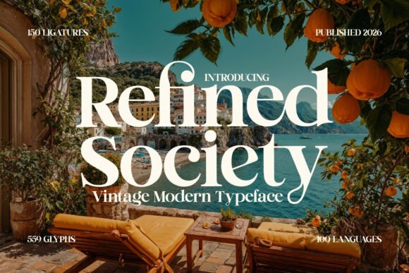
The name alone made me curious, but the moment I saw those high-contrast serifs, I was sold. Refined Society has this breathtaking vintage soul that instantly transports you to Mediterranean luxury—think Amalfi Coast hotels and high-end travel editorials.
I used it for a premium resort branding project, and the client said it looked like it belonged in a luxury magazine.
What stands out about Display Fonts like this is the timelessness. Despite its vintage inspiration, it never feels old or dusty. The contrast between thick and thin strokes is dramatic but elegant, making it perfect for editorial layouts, wedding stationery, and logos that need to whisper exclusivity. Every letter feels carefully crafted, like it was made for couture invitations rather than mass printing.
If you’re working on luxury travel brands, high-end lifestyle designs, or anything that needs that refined, old-world charm, this font will elevate your work instantly.
14. The Lancher Shine Serif Font
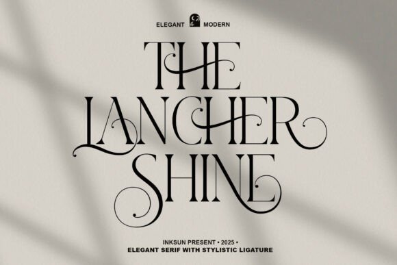
Some fonts just feel like they belong on a luxury magazine cover, and The Lancher Shine is exactly that. It’s an elegant serif that manages to feel both timeless and fresh—like classic sophistication got a modern upgrade. I recently used it for a high-end branding project, and the client immediately said it looked “expensive” in the best way possible.
What draws me to Display Fonts like this is how effortlessly they elevate everything around them. Editorial mastheads, wedding stationery, chic logos—it handles them all with the same graceful confidence.
The letterforms are polished and refined, but there’s warmth underneath, so it never feels cold or distant. Every time I use it, my work just looks more professional.
If you’re crafting a boutique identity, a premium lifestyle magazine, or anything that needs to radiate class, The Lancher Shine will deliver that sophisticated finish every single time.
15. Casmera Serif Font
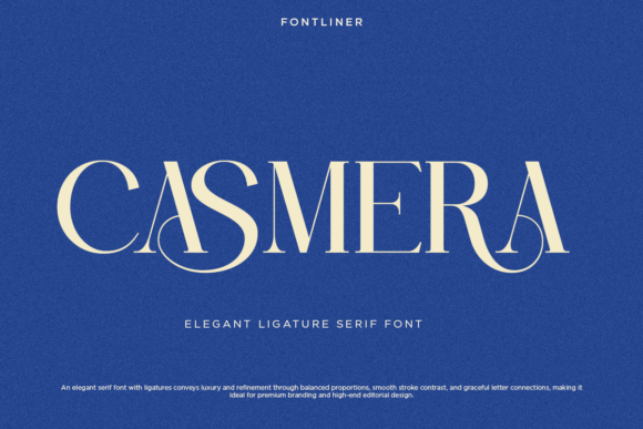
I have a soft spot for fonts that feel like they were made for fashion campaigns, and Casmera fits that description perfectly. It’s an elegant ligature serif that caught my attention the first time I saw those graceful curve connections—they add this seamless flow to words that standard serifs just can’t replicate. I used it recently for a luxury beauty brand’s packaging, and the result felt instantly premium.
What excites me about Display Fonts like Casmera is the balance. The stroke contrast is smooth, not jarring, so it maintains that classic elegance while still feeling fresh enough for modern editorial layouts.
I’ve used it for wedding invitations and magazine headlines, and it always brings a sense of refinement without looking stiff. The ligatures are genuinely beautiful—they make logotypes feel custom-crafted rather than typed. Plus, PUA encoding means I can access all those special characters without any headaches.
If you’re working on high-end branding, fashion identities, or anything that needs that quiet luxury feel, Casmera will give your work a sophisticated foundation that stands out.
16. Modern Serif Bundle Font
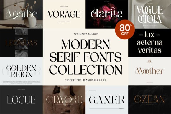
I’ll be honest—I’m picky about font bundles. Too often they feel like leftovers, just random typefaces thrown together. But this Modern Serif Fonts Collection? It’s different. Eight premium serifs, each with its own personality, and not a single weak link in the bunch.
Let me walk you through what caught my eye. Agathe has that sleek, minimalist elegance perfect for clean logos. Clarita brings a bold, character-rich energy that works beautifully for editorial layouts.
Vorage and Vogue Chola both have that fashion-forward sophistication I’m always hunting for. Ganer, Ozean, Glavore, and Logue round things out with versatility—I’ve already used one for packaging and another for social media templates.
What I love about Display Fonts in a collection like this is having options. One project needs quiet refinement? Got it. Another needs bold presence? Covered. And because all eight are PUA-encoded, I can access every glyph, swash, and alternate without jumping through hoops. It’s like having a mini type foundry at my fingertips.
If you’re building out your toolkit for branding, editorial, or luxury design work, this bundle is genuinely worth grabbing—especially at 80% off.
17. Wildflower Apothecary Serif Font
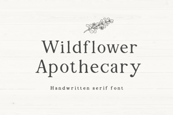
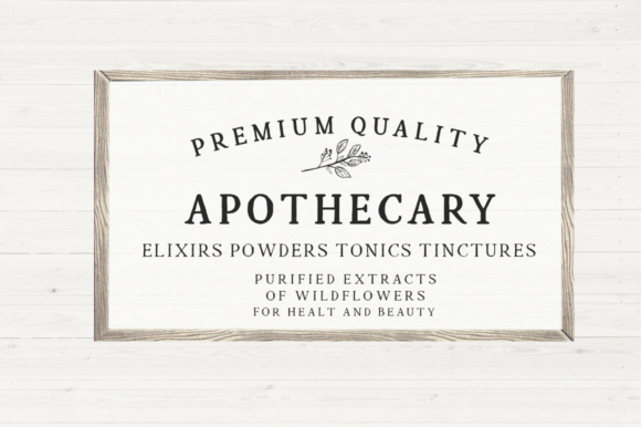
There’s something about handwritten fonts that feel genuinely organic, and Wildflower Apothecary captures that perfectly. It’s a serif with soul—two variations, regular and bold, both carrying those lovely little imperfections that make text look like it was lovingly hand-drawn rather than typed out.
I’ve used this one extensively for farmhouse decor projects and quote signs. There’s a warmth to it that mass-produced fonts just can’t replicate. The bold variation gives me punch for branding logos and t-shirts, while the regular keeps things soft and approachable for invitations and personalized products.
If you’re working with Cricut or any DIY projects, this font is an absolute gem—it cuts beautifully and looks handcrafted without being messy.
What I appreciate about Display Fonts like this is their authenticity. It doesn’t try to be perfectly polished, and that’s exactly why it works. For boutique brands, farmhouse aesthetics, or any project that needs that genuine, handmade feel, Wildflower Apothecary delivers every time.
18. Drose Serif Font
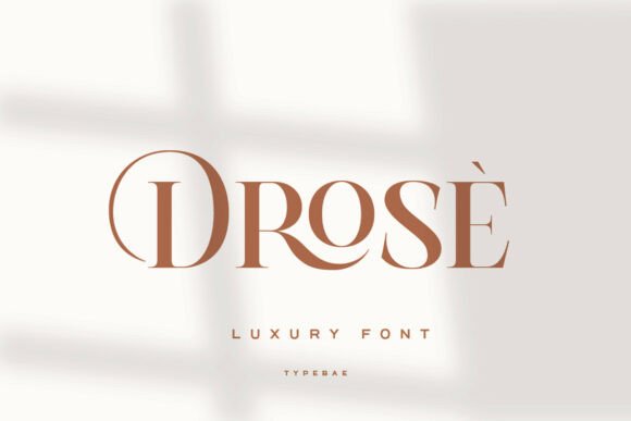
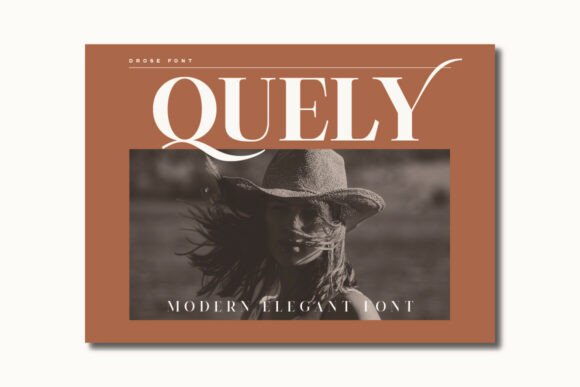
Some fonts try too hard to look expensive. Drose doesn’t. It just is. This modern luxury serif caught my eye with its stylish curves and that gorgeous high-contrast detail that makes every letter feel intentional. I recently used it for a fashion branding project, and the allcaps with ligatures gave the logotype that bespoke, custom-made look clients love.
What works so well about Display Fonts like Drose is the balance. It’s classy and clean but still expressive enough to have personality. The refined contrast between thick and thin strokes creates this elegant rhythm that looks stunning in editorial layouts, magazines, and premium packaging.
I’ve also used it for wedding invitations, and the multilingual support came in handy when the couple needed accents for their guest list. Plus, everything’s PUA-encoded, so accessing those beautiful characters takes zero effort.
If you want a serif that brings timeless beauty to contemporary design—without any fuss—Drose will make your brand look and feel luxurious.
19. Things Serif Font
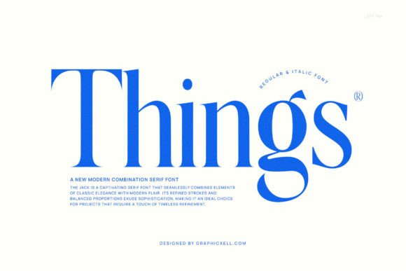
I picked up Things Serif Font expecting just another modern serif, but it surprised me with how effortlessly it blends classic elegance with a fresh, contemporary feel. The refined strokes and balanced proportions give it that sophisticated foundation, while the subtle modern flair keeps it from feeling like something my grandmother would use.
What I value most about Display Fonts like this is the readability. The letterforms are simple without being boring, so it works beautifully for formal projects—magazines, journals, product designs, you name it.
I’ve used it for editorial layouts where text needs to be both elegant and easy to read, and it delivered every time. The timeless refinement means I can reach for it again and again across different projects without it ever feeling out of place.
If you need a reliable, classy serif that helps your work look polished and professional, Things Serif Font is a solid addition to your toolkit.
20. Rosemode Serif Font
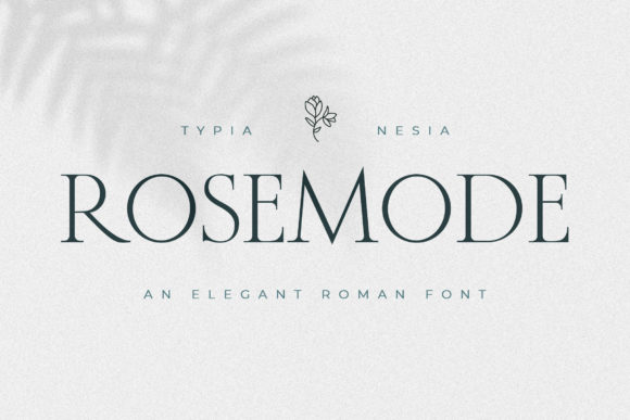
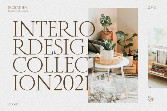
Sometimes you just need a font that feels delicate without disappearing, and Rosemode hits that sweet spot perfectly. It’s an elegant, thin-lettered serif that brings an instant romantic vibe to whatever I’m working on. I recently used it for a greeting card design, and the lightness of the strokes made the whole piece feel airy and heartfelt.
What I appreciate about Display Fonts like Rosemode is how versatile something so delicate can be. Yes, it’s beautiful for wedding invitations and love notes, but I’ve also used it for magazine headlines and branding projects that needed a soft, feminine touch.
The thin letterforms are surprisingly readable even at smaller sizes, which isn’t always the case with lighter fonts. And that romantic feel? It’s not overwhelming—just a gentle warmth that makes people stop and linger on the words.
If your next project needs elegance, lightness, and a little bit of heart, Rosemode will deliver beautifully.
21. Chatos Original Serif Font
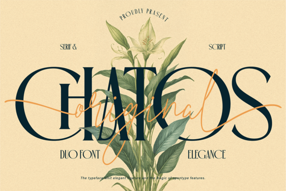
I’m always cautious with font duos—they either work in perfect harmony or fight for attention. Chatos Original is the rare one that just clicks. It pairs an elegant serif with a flowing handwritten script, and together they create this timeless, romantic energy that feels like it belongs in a high-end floral design studio.
What makes Display Fonts like this duo so useful is the flexibility. I use the serif for bold headlines and logos—its graceful curves and stylish alternates give it that premium, editorial feel. Then I bring in the script for signatures, branding accents, or anything that needs a personal, expressive touch. The ligatures and OpenType features help everything flow smoothly, so compositions never feel disjointed.
I’ve used Chatos Original for wedding invitations, beauty branding, and social media graphics. Every time, it delivers that polished, well-crafted look without feeling stiff. If you love classic elegance with a modern floral twist, this duo belongs in your collection.
22. Vogue Serif Font
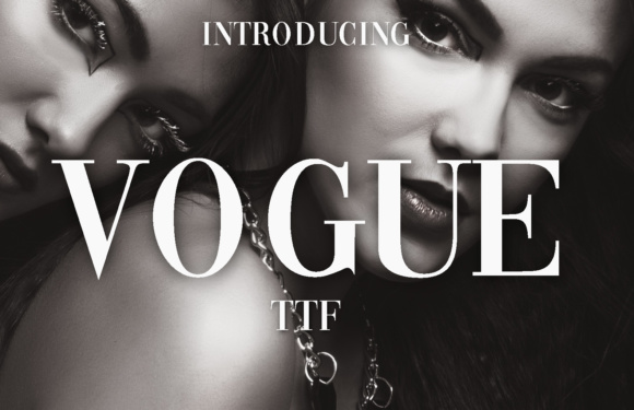
I mean, the inspiration is right there in the name—and yes, it absolutely delivers that iconic, high-fashion energy. Vogue is a fancy, elegant font that captures the bold, sophisticated spirit of a certain legendary magazine logo we all know and love. The moment I typeset a headline with it, my design instantly felt more editorial, more confident, more fashion.
What I love about Display Fonts like Vogue is their sheer presence. This isn’t a font that fades into the background. It commands attention on covers, posters, and logos.
I’ve used it for creative projects that needed that glamorous, unapologetically stylish vibe, and it never disappoints. The letterforms are sleek and dramatic—perfect for when you want your work to feel like it belongs on a newsstand next to the biggest names in fashion.
If you need a font that brings instant sophistication and magazine-worthy flair, Vogue will make your headlines shine.
23. Rethena Serif Font
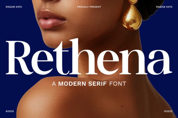
When I need a font that doesn’t just speak but announces itself, I reach for Rethena. It’s a bold modern serif with dramatic thick-and-thin contrast that commands attention immediately. I used it recently for a luxury jewelry brand’s website header, and the result was pure glamour.
What makes Display Fonts like Rethena so effective is the balance between power and refinement. The thick strokes give it presence, while those sharp, precise serifs with subtle curved terminals keep it sophisticated. The generous x-height means even at large sizes, it’s readable and striking.
I’ve also used it for fashion editorial layouts and cosmetic packaging, and it always delivers that polished, assertive voice that high-end projects need. Despite its bold personality, it never feels harsh—there’s a contemporary minimalism underneath that keeps it timeless.
If your branding, editorial design, or corporate identity needs to feel exclusive and confident, Rethena will give your work that luxurious visual punch.
24. Exclusive Serif Retro Bundle Font
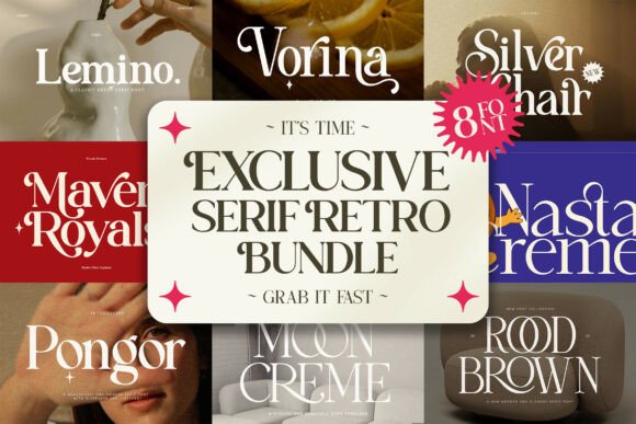
I’m a sucker for vintage aesthetics, so when I stumbled across this retro bundle, I knew I had to dig in. Eight fonts—each with its own personality—capturing everything from elegant high-contrast serifs to groovy, bold display faces. Lemino, Vorina, Silver Chair… they’re not just fonts; they’re time machines.
What I love about Display Fonts in a collection like this is the range. One day I’m working on a sophisticated editorial layout for a fashion magazine, and the next I’m designing a psychedelic poster for a nostalgic brand campaign.
This bundle lets me switch between those worlds effortlessly. The 1960s and 70s vibes are authentic without feeling like costumes. I’ve used it for premium packaging, social media graphics, and even emblem designs, and every time, the vintage charm shines through.
If you want to evoke retro elegance or groovy nostalgia, this bundle gives you all the tools—plus PUA encoding so those special characters are easy to grab. A genuine treasure trove.
25. Kaviera Serif Font
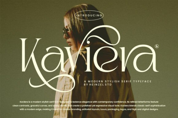
Some fonts play it safe. Kaviera doesn’t. It’s a modern stylish serif that balances timeless elegance with real confidence—and that’s harder to pull off than most people think. The moment I used it for a fashion branding project, I noticed how the refined letterforms and sharp contrast gave everything a polished, almost editorial feel.
What draws me to Display Fonts like Kaviera is that it’s expressive without being loud. The graceful curves keep it sophisticated, while the bold contrast gives it impact. I’ve used it for luxury logos, magazine layouts, and packaging design, and it always delivers that perfect blend of classic beauty and modern edge.
It’s not a font that hides in the background—it steps forward and says something, but does it with elegance rather than shouting.
If you’re a designer who wants elegance with impact, Kaviera will make your work feel both refined and confidently contemporary.
26. Sherly Kitchen Serif Font
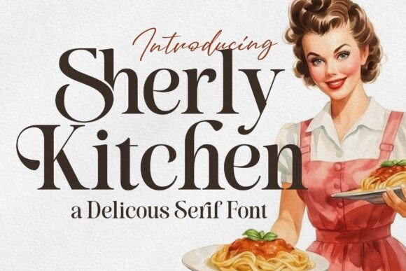
This one feels like a warm hug in font form. Sherly Kitchen is a charming serif that blends vintage warmth with modern elegance—and honestly, it’s become my secret weapon for anything food-related. The moment I used it for a bakery logo, I knew it was special. Those soft curves and high-contrast strokes give it that retro diner feel without looking kitschy.
What I love about Display Fonts like Sherly Kitchen is the personality. It’s not just another elegant serif—it tells a story. Inspired by retro food packaging and classic menus, it brings a homemade, cozy vibe that’s perfect for restaurant branding, recipe books, and packaging design.
I’ve used it for a jam label and a coffee shop sign, and both times, people commented on how “friendly” and “inviting” it looked. The elegant letterforms keep it tasteful, while the vintage soul makes it memorable.
If your brand needs to feel timeless, warm, and full of character, Sherly Kitchen will serve up something delicious.
27. Arches Serif Font
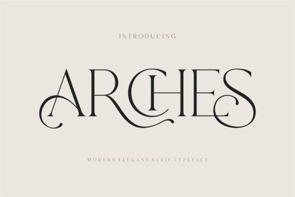
I spotted Arches while hunting for something clean, minimal, and a little unexpected. It’s a modern ligature serif inspired by that famous minimalist logo aesthetic—you know the one: simple, confident, unforgettable. The moment I used it for a branding project, the ligatures gave the wordmark this seamless, custom-crafted feel that standard fonts just can’t replicate.
What works so well about Display Fonts like Arches is the versatility. I’ve used it for brochure layouts, video titles, advertising, and even beauty packaging. The design is elegant but never fussy, so it fits both high-end invitations and everyday branding materials.
The PUA encoding means I can grab all those gorgeous ligatures and glyphs without jumping through hoops—just open and go.
If you need a serif that’s minimalist, modern, and packed with thoughtful details, Arches will make your templates, logos, and layouts look effortlessly polished.
Conclusion
Each of these Display Fonts is like a different brush in my creative kit. Praise for luxury branding, The Youth for avant-garde covers, Vintage Market for retro vibes, Sherly Kitchen for warm, homemade stories. I don’t just choose a font for its looks — I choose it for how it feels in action, how it breathes on a poster or a logo.
The best Display Font doesn’t shout over your idea — it makes your idea unforgettable.
So go ahead. Experiment. Mix elegant serifs with messy scripts. Break the rules a little. That’s where the magic happens.
✨ Trust your eyes. Trust your gut. And always kern with love.
🎨 See All Fonts in Action
Want to see how these typefaces behave in real layouts? Explore the full collection — from elegant serifs to bold retro gems. Each font comes with ligatures, alternates, and multilingual support.
👉 Browse all Serif Fonts on Creative Fabrica
You may also like:
Disclosure: This post contains affiliate links. If you make a purchase through my links, I may earn a small commission at no extra cost to you. Thank you for supporting my site! ♥️