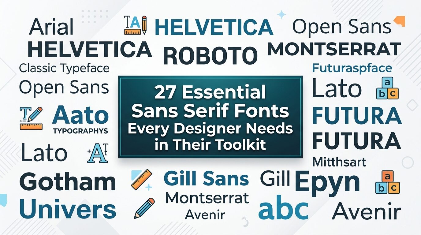
27 Essential Sans Serif Fonts Every Designer Needs in Their Toolkit
There’s something magical about finding the perfect typeface. You know the feeling—you’re deep into a project, layering elements, refining details, and then you land on that one font that just clicks. Everything falls into place. The hierarchy feels right. The personality shines through. The design finally breathes.
As a designer who spends countless hours experimenting with letterforms, I’ve learned that Sans Serif Fonts are often the unsung heroes of our craft. They’re versatile enough to handle serious branding, playful enough for creative projects, and clean enough to let the content take center stage. Whether I’m crafting a bold logo, designing a digital book, or building a website that needs to feel modern and approachable, my go-to collection of sans serifs is always where I start.
In this article, I’m pulling back the curtain on some of my personal favorites—fonts that have earned permanent spots in my toolkit. Some are bold and commanding. Others are minimalist and elegant. A few are quirky and unexpected. But all of them share one thing: they’re reliable, beautiful, and ready to elevate your next project.
So grab your favorite beverage, open up your design software, and let’s explore the world of Sans Serif Fonts together. Whether you’re a seasoned designer or just starting to build your collection, I’m confident you’ll discover some new favorites along the way. Let’s dive in.
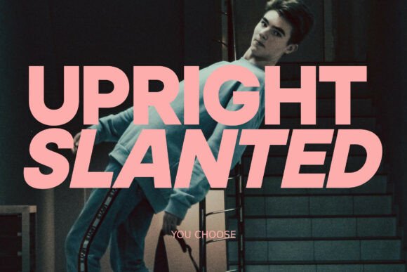
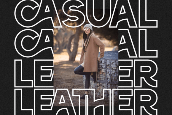
1. Salty Beach Sans Serif Font
As a designer, I’m always on the hunt for that perfect typeface that can make a project sing. When I’m working on a web design article, the right font choices are crucial, especially for headings. Here is my personal, hands-on take on Sans Serif Fonts that are absolute gems for the digital space.
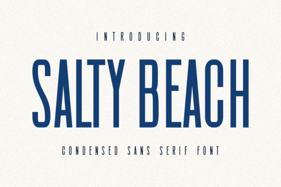
Salty Beach instantly caught my eye for bold web headers. This isn’t your basic, default sans serif; it’s a sleek and stylish condensed Sans Serif Fonts option. I love its tall, narrow letterforms—they create a strong visual impact without taking up too much horizontal space.
For a website, that means your H2 can be nice and big, commanding attention, but the condensed style keeps the line length tidy. It feels both modern and a bit edgy. I can totally see using this for a film studio’s landing page, a minimalist brand’s “About” section, or even for eye-catching blog titles in a digital magazine.
Its clean aesthetics are very much in line with contemporary Sans Serif Fonts trends, giving a project that professional, crafted feel. It’s versatile enough for the screen but also has that printed quality, making it a reliable workhorse in my digital toolkit.
2. TRT Burn Sans Serif Font
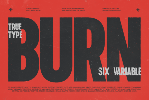
When a project calls for a typeface that means business, I immediately think of TRT Burn. This is one of those modern Sans Serif Fonts built from the ground up for impact. Its condensed, upright structure is incredibly efficient—it lets me pack a lot of typographic punch into a tight space, which is a lifesaver when designing for responsive web layouts or busy magazine spreads.
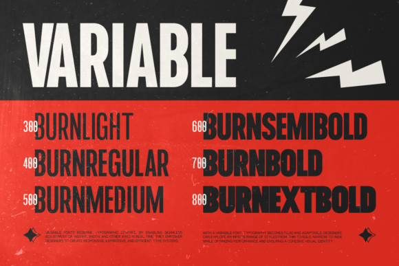
The vertical proportions give it a confident, assertive stance that feels both professional and contemporary. I’ve used it for bold website headers where I needed to maximize size without creating awkward line breaks, and it performs beautifully.
It’s not just about being compact, though; the letterforms are crafted with a clean geometry that remains perfectly legible, even when used in UI elements or smaller digital text. For branding projects, advertising, or any design that demands a strong, clear voice, TRT Burn is a go-to choice among Sans Serif Fonts. It’s assertive, reliable, and has a focused energy that’s hard to beat.
3. Hoodie Sans Serif Font
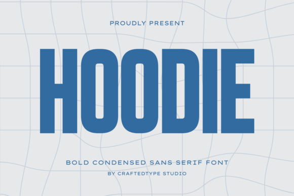
Sometimes a project just needs to feel powerful, and that’s exactly when I reach for Hoodie. This is one of those bold condensed Sans Serif Fonts that doesn’t whisper—it shouts. The tall, compact letterforms with thick strokes give it this raw, urban energy that feels tailor-made for streetwear brands, gym apparel, or anything with a sporty edge.
I recently used it for a series of social media graphics promoting a limited-edition hoodie drop, and it grabbed attention instantly. What I appreciate most is how it balances aggression with cleanliness—it’s bold without being messy. The condensed structure allows me to fit big, impactful headlines into tight spaces, which is perfect for mobile layouts or product packaging.
Whether I’m working on a film title that needs cinematic weight or a sports team’s branding that demands authority, Hoodie delivers. Among Sans Serif Fonts with attitude, this one sits at the top of my list. It’s powerful, versatile, and has that professional edge that turns a good design into something memorable.
4. Mango Dream Sans Serif Font
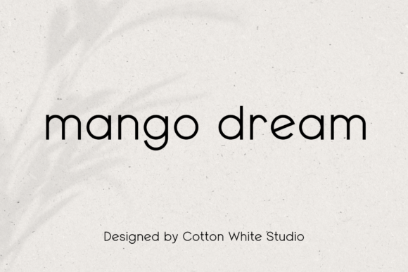
There are days when a project needs to feel approachable, clean, and effortlessly modern—and that’s when Mango Dream becomes my absolute favorite. This is one of those Sans Serif Fonts that just feels friendly. The round, minimalistic letterforms have a softness to them that makes any design feel more inviting, whether I’m working on a wellness brand’s website, a startup’s marketing materials, or a cozy coffee shop menu.
It’s the kind of typeface that whispers professionalism without being cold or corporate. What I truly love is its multilingual support—as someone who designs for global clients, that feature saves me so much time and ensures consistency across different languages.
Mango Dream has this versatile quality that lets it shine in digital spaces just as beautifully as in print. It’s become a regular in my toolkit for branding projects where I want to balance a clean aesthetic with a human touch. If you’re looking for Sans Serif Fonts that combine simplicity with warmth, this one deserves a permanent spot in your collection.
5. Think Loved Sans Serif Font
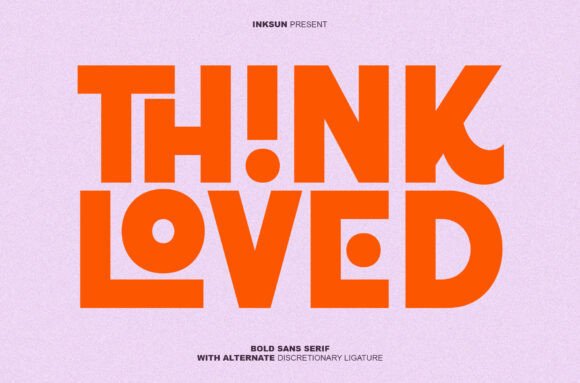
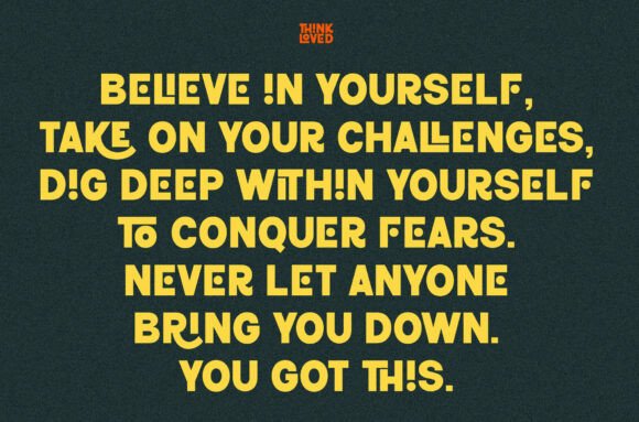
When I want to turn a simple headline into a conversation starter, I grab Think Loved. This isn’t just another bold Sans Serif Fonts option—it’s a statement piece. The ultra-heavy weight alone commands attention, but what really gets me excited are the alternate discretionary ligatures.
These playful interlocking characters and circular cutouts add this unexpected layer of creativity that makes every project feel custom. I recently used it for a streetwear brand’s digital ad campaign, and those ligatures turned ordinary product titles into eye-catching graphic elements that stopped scrollers in their tracks. It’s built for the modern attention economy—designed to grab eyes and hold them.
Whether I’m working on high-contrast social media graphics, cutting-edge brand identities, or limited-edition merchandise, Think Loved delivers that bold, geometric impact with a playful twist. Among Sans Serif Fonts that balance raw power with personality, this one stands in a league of its own. It’s bold, it’s creative, and it makes my work feel fresh.
6. Mismatched Socks Sans Serif Font
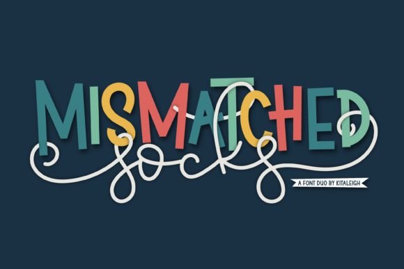
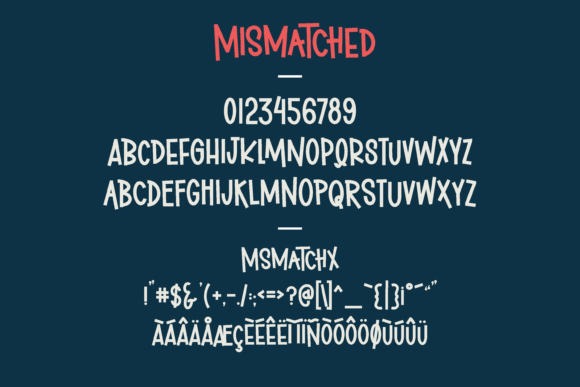
Some projects just need to feel fun, and that’s exactly where Mismatched Socks comes in. This playful font duo pairs bold uppercase Sans Serif Fonts with a flowing script, and honestly, the combination is pure magic. I love how the structured, confident sans serif anchors the design while the whimsical script adds personality and movement. It’s like having two fonts that were meant to be together, even though they’re delightfully mismatched.
I’ve used this duo for children’s book covers, craft brand packaging, and quirky wedding invitations—it brings a cheerful energy that clients absolutely adore. The alternates and bonus swashes give me room to play, letting me customize every detail so nothing looks cookie-cutter.
Whether I’m working on branding for a small artisan shop or creating social media graphics that need a dose of joy, this set delivers. For anyone looking for Sans Serif Fonts that play well with others and bring warmth to every project, Mismatched Socks is a total delight to work with.
7. Perfect Lemonade Sans Serif Font
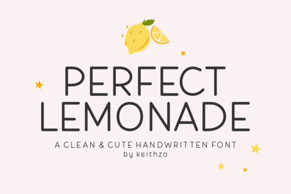
Sometimes a project needs warmth, and that’s when I reach for Perfect Lemonade. This cheerful handwritten font has this smooth, bubbly quality that instantly makes any design feel more personal. I’ve used it for planner pages, sticker packs, and greeting cards—anywhere I want to add that hand-crafted touch without sacrificing polish.
What I love most is how naturally each letter flows; it captures the feeling of calm journaling sessions and creative expression. While this isn’t technically a Sans Serif Fonts pick, I often pair it with clean, simple sans serifs to create beautiful contrast. The combination gives my layouts structure while keeping that warm, approachable vibe. For digital posts, it adds softness without losing clarity.
Perfect Lemonade has become my go-to when I want to balance a clean aesthetic with genuine personality. It’s the kind of font that makes people smile, and honestly, that’s something I look for in every project. If you’re building a toolkit that blends handwritten charm with Sans Serif Fonts, this one deserves a spot in your collection.
8. Metha Sans Serif Font
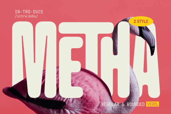
When I need a typeface that feels both modern and genuinely welcoming, Metha is my immediate choice. This rounded Sans Serif Fonts gem has this wonderful duality—it’s bold enough to command attention yet soft enough to feel approachable.
I love that it comes in Regular and Rounded styles, giving me flexibility depending on the mood I want to set. The wide letterforms are a dream for readability, whether I’m setting bold headlines or longer body text for a brand’s website.
Those smooth curves and rounded edges give designs a playful, inviting appearance that works beautifully for everything from children’s product packaging to friendly tech startups. I recently used Metha for a local café’s branding, and the rounded style captured their warm, community-focused vibe perfectly.
What I appreciate most is its versatility—it holds its own in advertising and creative applications just as well as it does in functional digital interfaces. Among Sans Serif Fonts that balance professionalism with personality, Metha hits that sweet spot every designer looks for. It’s modern, it’s friendly, and it’s become a trusted staple in my toolkit.
9. Gunken Sans Serif Font
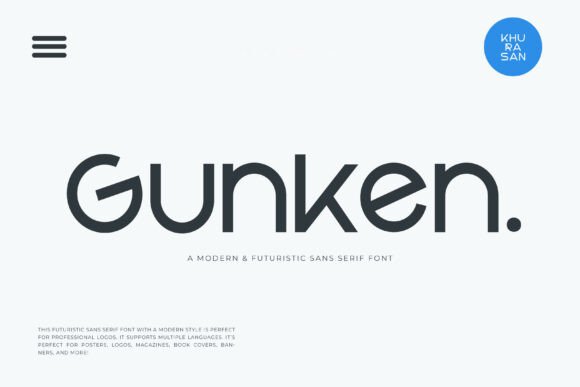
There’s something about a clean, futuristic typeface that just clicks for certain projects, and Gunken delivers that effortlessly. This is one of those sleek Sans Serif Fonts that feels like it belongs in a sci-fi film title or a cutting-edge tech brand’s identity. The smooth, light execution gives it this elegant, almost weightless quality that makes designs feel modern and sophisticated without being cold.
I’ve used it for magazine layouts, book covers, and high-end poster designs where I wanted that minimalist, forward-looking vibe. What I appreciate most is its versatility—it plays beautifully with bold imagery, letting the typography shine without competing. Whether I’m working on a futuristic branding project or a sleek banner for a design conference, Gunken adds that polished, professional finish.
Among Sans Serif Fonts, it stands out for its ability to feel both light and impactful. It’s one of those typefaces that quietly elevates everything you pair it with. If you’re building a collection of go-to Sans Serif Fonts for modern, elegant work, this one deserves a permanent spot.
10. The Handwriting Bundle Font
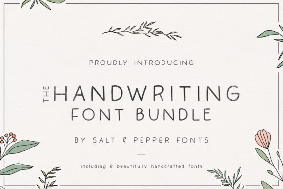
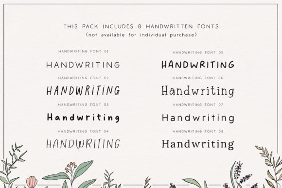
Every designer needs a solid collection of handwritten typefaces, and this bundle delivers eight gorgeous options that I keep coming back to. Each font has its own personality—some are playful and bouncy, others feel like vintage journal entries, and a few lean into that elegant, modern calligraphy style.
I love how seamlessly they work across my favorite tools, from Procreate for digital illustrations to Canva for quick social graphics and Cricut for physical projects like custom mugs or greeting cards. The handmade feel adds warmth to anything I’m designing. While these aren’t Sans Serif Fonts themselves, I often pair them with clean, structured sans serifs to create beautiful contrast—letting the handwritten elements shine against a crisp, modern backdrop.
Whether I’m designing wedding invitations, crafting sticker sheets, or adding personality to branding materials, having this bundle in my toolkit means I always have the right handwritten voice ready to go. It’s versatile, reliable, and brings that human touch every project craves.
11. Bird House Sans Serif Font
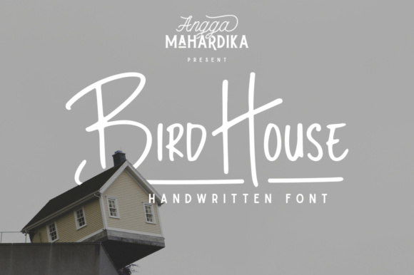
Sometimes I need a typeface that feels like it was made by hand, not by a computer. Bird House is exactly that—a marker-style handwritten font that carries this raw, authentic energy. The strokes have that natural variation you get from actual markers, with subtle texture and weight shifts that make every word feel organic.
I’ve used it for branding projects where clients wanted a personal, approachable identity—think small bakeries, artisan shops, or creative studios. It also works beautifully for signatures, giving logos that hand-crafted touch that feels genuine rather than overly polished. What I love most is how effortlessly it adds character.
When paired with clean Sans Serif Fonts, Bird House creates this perfect balance between structured professionalism and creative warmth. It’s straightforward, it’s versatile, and it brings that handmade charm to any project without trying too hard. A solid addition to any designer’s collection.
12. Paper Notes Sans Serif Font
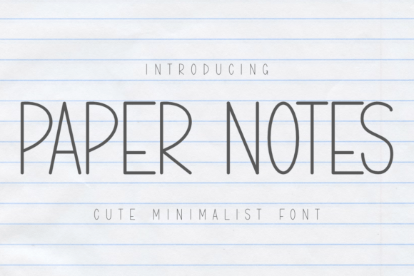
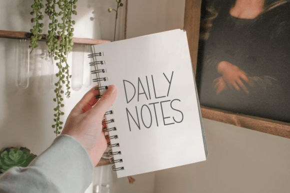
There’s something quietly beautiful about a font that doesn’t shout for attention, and Paper Notes captures that understated elegance perfectly. This is one of those delicate Sans Serif Fonts that feels like it was written by hand—thin strokes, minimalist forms, and this natural flow that mimics the charm of actual journal entries.
I find myself reaching for it constantly when working on planners, journals, or anything that needs that calm, intentional vibe. The simplicity is its superpower. Whether I’m designing labels for homemade products, creating stickers, or crafting inspirational quote graphics, Paper Notes adds this soft, thoughtful touch that elevates the whole piece. I’ve even used it for KDP interiors where I wanted clean, readable text that still felt personal.
What I appreciate most is its versatility across different mediums—it looks just as beautiful on a ceramic mug mockup as it does in a digital planner spread. When I pair it with bolder Sans Serif Fonts, the contrast creates this lovely balance between structure and softness. It’s minimalist, it’s elegant, and it turns ordinary craft projects into something truly special.
13. Bright Darling Duo Sans Serif Font
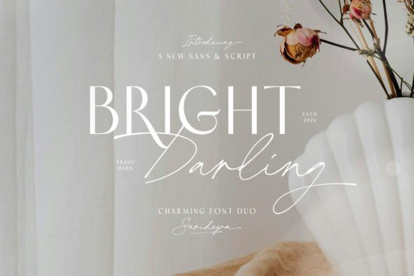
There are font pairings that just work, and Bright Darling is one of those rare combinations that feels like it was meant to be together. This elegant duo gives me a sophisticated Sans Serif Fonts option alongside a graceful script, and honestly, they complement each other perfectly.
The sans serif has this modern minimalist quality—clean lines, balanced proportions, and a chic simplicity that anchors any design. Then the script steps in with its handcrafted elegance, adding warmth and personality without overwhelming the layout.
I’ve used this duo for wedding invitations, luxury branding projects, and packaging designs where I wanted that timeless, refined feel. What I love most is the versatility—I can let the sans serif take the lead for a clean, professional look, or feature the script for something more personal and intimate.
When I’m building brand identities that need to balance modern sophistication with heartfelt charm, Bright Darling is my go-to. Among Sans Serif Fonts that play beautifully with scripts, this one consistently delivers that polished, elevated finish my clients love.
14. RS04 Modern DIY RHINESTONE TTF Template Font
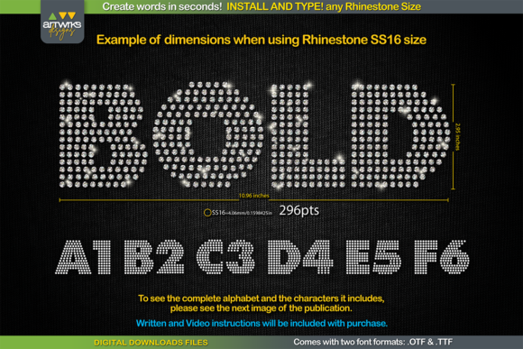
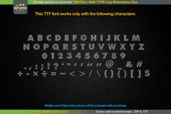
This one is a total game-changer for anyone who works with heat transfer vinyl or rhinestone designs. I stumbled upon this rhinestone template font when I was making custom T-shirts for a family reunion, and honestly, it saved me hours of manual work.
It’s exactly what it sounds like—you install it like any regular font, type your word, and each letter is already filled with perfectly arranged rhinestone dots or trapped for HTV. No more placing individual stones by hand or struggling with complicated templates.
What I love is how customizable it is. The font comes in OTF and TTF formats, and you can adjust the point size to match different rhinestone sizes—SS6, SS10, SS16, or SS20. Just type at the recommended font size, and the stones scale accordingly. It works seamlessly across Cricut Design Space, Silhouette Studio, Inkscape, and Illustrator, whether I’m on my Mac, iPad, or Windows machine.
One thing to note—Cricut Design Space can sometimes get finicky with sizing, but the instructions walk you through the fix. It’s a small hiccup for such a powerful tool.
When I pair this with clean Sans Serif Fonts for branding or garment labels, the contrast between structured typography and sparkling rhinestone text creates something really eye-catching. Perfect for sports jerseys, bachelorette party shirts, dance team apparel, or any project that needs a little bling. It’s practical, it’s fun, and it makes rhinestone designs accessible to anyone with a cutting machine.
15. Brooklyn Sans Serif Font
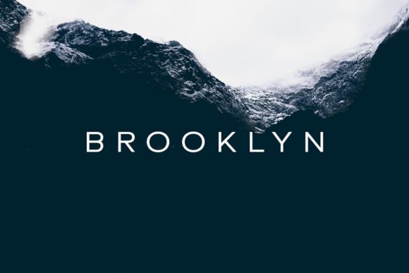
Sometimes I just need a font that gets out of the way and lets the design speak for itself. Brooklyn is exactly that—a minimal, neat Sans Serif Fonts option that feels clean without being boring. There’s a quiet confidence to it. The letterforms are simple, well-balanced, and have this subtle sophistication that works across pretty much any project I throw at it.
I’ve used Brooklyn for everything from corporate branding to editorial layouts, and it never lets me down. It’s the kind of typeface that plays well with others—whether I’m pairing it with bold display fonts for contrast or using it solo for that understated, modern look.
What I appreciate most is its versatility. It handles logos with elegance, scales beautifully for website headers, and remains perfectly readable even at smaller sizes for body text or packaging details.
When I’m building a design toolkit, fonts like Brooklyn are the backbone. It’s reliable, adaptable, and has that timeless quality that keeps it from feeling dated. Among Sans Serif Fonts, this one is my quiet workhorse—always there when I need something clean, minimal, and effortlessly professional. Add it to your collection, and you’ll find yourself reaching for it more often than you’d expect.
16. Chunk Sans Serif Font
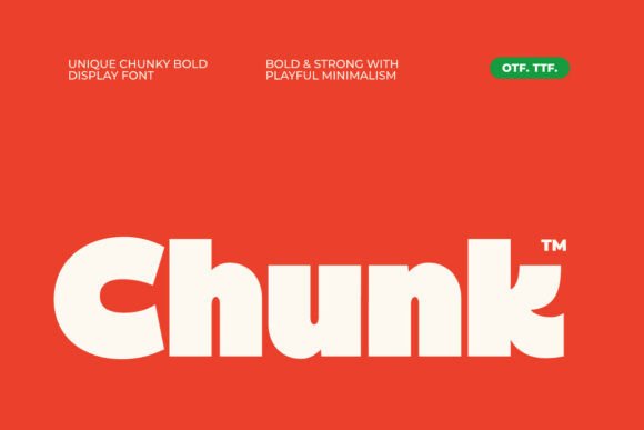
When I want to make a statement that people can’t ignore, I reach for Chunk. This chunky display font has this bold, unapologetic personality that commands attention instantly. It’s the kind of typeface you use when you need your message to feel confident, modern, and a little playful all at once.
What I love about Chunk is how it balances its hefty weight with clean, geometric letterforms that still feel fresh and contemporary. I’ve used it for poster designs where the headline needed to fill the space with presence, and for social media graphics that had to stop the scroll in seconds. The ligatures add this subtle creative flair that makes logos feel custom-crafted, while the multilingual support means I can use it for global campaigns without missing a beat.
While it’s technically a display font, I often pair Chunk with clean Sans Serif Fonts to create that perfect balance—let Chunk handle the bold headlines while a structured sans serif takes care of the body text. It’s a dynamic combo that gives my layouts hierarchy and personality.
Whether I’m working on a streetwear brand’s identity, a music festival poster, or packaging that needs to pop off the shelf, Chunk delivers that bold, memorable punch. It’s chunky, it’s confident, and it never goes unnoticed.
17. Saldo Sans Serif Font
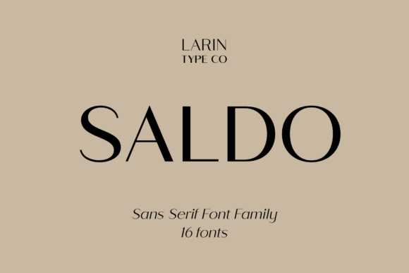
There’s something reassuring about a font that just works, no matter what I throw at it. Saldo is one of those modern Sans Serif Fonts that combines sleek aesthetics with real functionality. The clean, crisp lines give it a professional edge, but what I appreciate most is how effortlessly readable it is—whether I’m setting it at tiny sizes for a business card or scaling it up for a billboard, every letter stays sharp and clear.
I’ve used Saldo across a wide range of projects, from corporate branding and marketing materials to editorial layouts and website interfaces. Its minimalistic design gives it this timeless quality that feels both contemporary and classic at the same time. It’s not trying to be flashy—it’s confident in its simplicity.
What makes Saldo a staple in my toolkit is its versatility. It handles body text beautifully without sacrificing personality, and it holds its own in headlines when I need something polished and sophisticated. When I’m designing for clients who want a clean, trustworthy brand presence, Saldo is often my first choice among Sans Serif Fonts.
It’s sleek, it’s reliable, and it brings that understated elegance to every project. A true workhorse that never lets me down.
18. Noverion Sans Serif Font
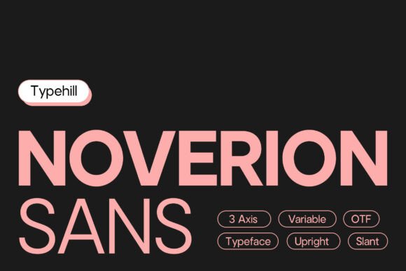
When a project demands both precision and personality, Noverion is the type family I turn to. This modern Sans Serif Fonts collection has this beautiful balance—clean construction that feels intentional, balanced proportions that never look awkward, and refined details that show real craftsmanship.
What I love about Noverion is its flexibility. It’s not just one font; it’s a whole family that adapts to whatever I’m working on. For professional branding, it gives me that polished, trustworthy presence. For editorial layouts, the readability is effortless—even in dense paragraphs. And when I’m designing digital interfaces, the clean lines hold up beautifully across different screen sizes and resolutions.
There’s a contemporary character to Noverion that feels fresh without being trendy. It’s the kind of typeface that can handle large-scale typography just as gracefully as it handles the subtle details of a logo. I’ve used it for corporate reports, website headers, and even packaging designs where I needed that clean, modern aesthetic.
Among Sans Serif Fonts, Noverion stands out for its versatility and visual precision. It’s reliable, it’s refined, and it gives every project a strong, contemporary foundation. A solid addition to any designer’s toolkit.
19. Gc Grind Sans Serif Font
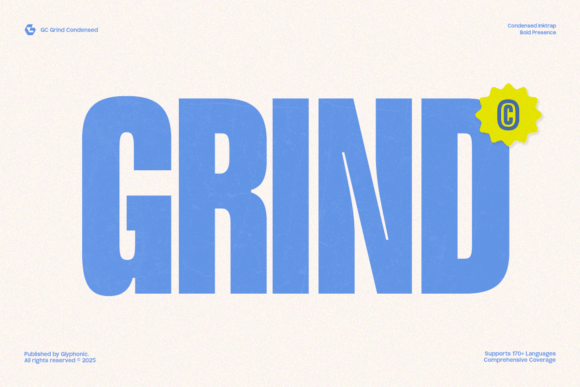
When I need a typeface that doesn’t just speak but commands attention, GC Grind is my secret weapon. This is one of those bold condensed Sans Serif Fonts that brings raw energy and confidence to every project. The sharp edges and tight spacing give it this urban, almost industrial feel that’s perfect for sports branding, streetwear designs, or anything that needs to feel powerful and modern.
What I love about GC Grind is how it balances that aggressive presence with real versatility. I’ve used it for poster designs where the headline needed to punch through the noise, for packaging that had to compete on crowded shelves, and for digital visuals that demanded instant impact. The condensed proportions let me fit big, bold statements into tight spaces—a lifesaver when working with limited layout real estate.
The PUA encoding is a nice touch too. Having easy access to all the glyphs, swashes, and alternate characters gives me room to customize and make each design feel unique. Whether I’m crafting a bold editorial spread or building a brand identity for a fitness company, GC Grind delivers that powerful, assertive voice.
Among Sans Serif Fonts that pack a punch, this one sits at the top of my list. It’s bold, it’s confident, and it never goes unnoticed.
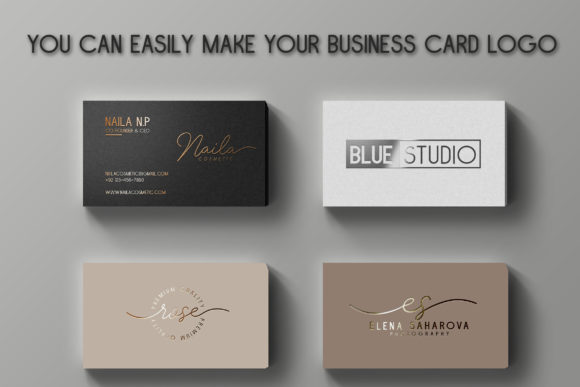
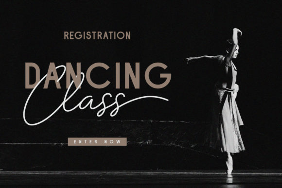
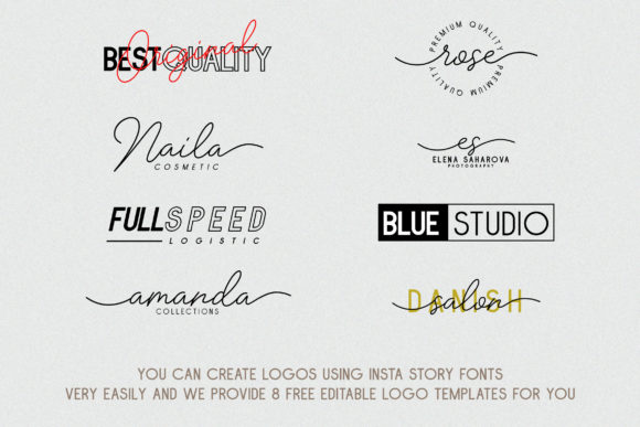
20. Insta Story Duo Sans Serif Font
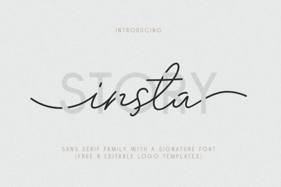
This one is a complete design toolkit disguised as a font. Insta Story gives me a family of ten Sans Serif Fonts styles—ranging from Thin to Bold, with italics and outlines—paired with a natural signature font that has this authentic hand-scratched quality. It’s like having a whole typographic system ready to go for any project.
What I love about this duo is how effortlessly it covers everything. The sans serif family handles the structured, professional side—perfect for logos, business cards, and editorial layouts where I need clean hierarchy and consistency. Then the signature font steps in to add that personal, handcrafted touch that makes social media designs, watermarks, and greeting cards feel unique and approachable.
The versatility is incredible. With ten style variations, I can build entire brand identities without ever leaving the font family. Need something light and elegant? Thin italic. Want bold impact? Bold outline. And the multilingual support means I can use it for global clients without worrying about missing characters.
The bonus? Eight free editable logo templates in AI, EPS, and PSD formats. It’s a huge time-saver when I need quick mockups or client presentations. The PUA encoding also makes accessing all those signature swashes effortless.
Among Sans Serif Fonts that come with this level of flexibility and personality, Insta Story stands out. It’s complete, it’s versatile, and it’s become a go-to in my collection for projects that need both structure and soul.
21. Laura Sans Serif Font
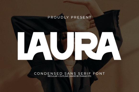
There are fonts that do the job, and then there are fonts that make you stop and admire the craftsmanship. Laura falls into that second category for me. This ultra condensed Sans Serif Fonts gem has this stunning blend of vintage fashion elegance and modern sophistication that I haven’t found anywhere else.
The tall, slender letterforms with their smooth lines immediately transport me to the pages of a high-end fashion magazine. I’ve used Laura for luxury branding projects where the client wanted that chic, timeless feel—think boutique clothing lines, premium packaging, and editorial layouts that need to whisper elegance without shouting.
What I love is how the two styles—Regular and Outline—give me flexibility. I can set a sophisticated headline in the Regular weight, then use the Outline for subtle accents or layered typography that adds depth without overwhelming.
The elegant ligatures are a thoughtful touch too. They add this custom-crafted feel to logos and wordmarks that makes every project feel bespoke. When I’m working on something that needs to feel exclusive and refined, Laura is my first reach among Sans Serif Fonts.
It’s slender, it’s stunning, and it brings that perfect balance of vintage charm and contemporary polish to every design. A true showstopper for projects that demand elegance.
22. Japandi Sans Serif Font
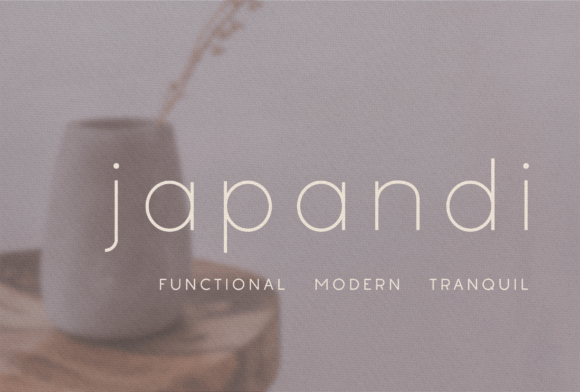
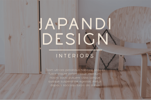
There’s a quiet beauty to fonts that embrace simplicity, and Japandi captures that perfectly. This minimalistic lightweight Sans Serif Fonts option has this clean, crisp quality that feels like a deep breath of fresh air. The name says it all—it draws from that Japanese-meets-Scandinavian aesthetic that values calm, balance, and understated elegance.
I originally discovered Japandi while working on interior design projects, and honestly, it was love at first sight. The light weight and airy letterforms complement mood boards, lookbooks, and home decor branding beautifully. But I quickly realized its charm extends far beyond that. I’ve used it for boutique branding, social media graphics, and even minimalist invitations where I wanted everything to feel intentional and serene.
What I appreciate most is how Japandi doesn’t compete with other elements—it supports them. When I’m designing for clients who want a sophisticated, uncluttered presence, this font lets the visuals breathe while still delivering that polished finish. It pairs beautifully with bolder Sans Serif Fonts or organic textures, creating that perfect balance between structure and softness.
It’s minimal, it’s elegant, and it brings that sought-after Japandi calm to any project. A quiet favorite in my collection.
23. Harmonie Sans Serif Font
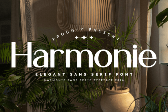
Some fonts just feel right from the first character you type, and Harmonie is one of those for me. This sophisticated Sans Serif Fonts option strikes that perfect balance between modern minimalism and refined elegance—clean lines that never feel cold, refined details that catch your eye without screaming for attention.
I’ve used Harmonie for luxury brand identities where every detail matters, and it delivers every time. The harmonious structure gives it this natural flow that makes layouts feel cohesive and intentional. Whether I’m setting a high-end magazine spread or designing minimalist digital content for a wellness brand, the readability is consistently excellent—even at smaller sizes where other fonts might falter.
What draws me back to Harmonie again and again is its versatility. It handles the weight of luxury branding effortlessly, yet feels equally at home in clean, modern web interfaces. There’s a timeless quality to it that keeps designs feeling fresh years down the line, which is something I always look for when building brand systems for clients.
Among Sans Serif Fonts, Harmonie stands out for its polish and poise. It’s elegant without being fussy, minimal without being boring. A true essential that’s earned its permanent spot in my toolkit.
24. Stencil Army Sans Serif Font
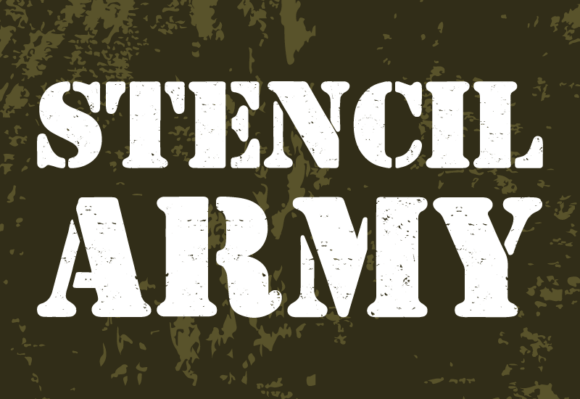
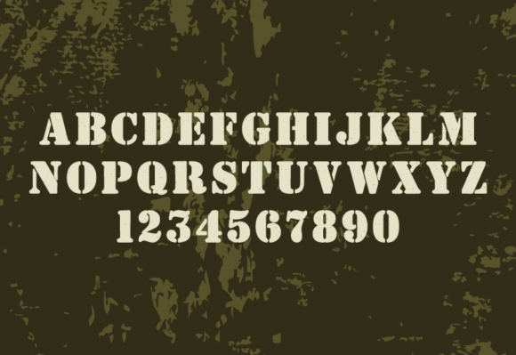
When I want a typeface that breaks the rules and owns it, Stencil Army is my go-to. This isn’t your standard stencil font—it’s something entirely different. The bold, unapologetic lines carry this military-meets-war-game texture that feels raw, gritty, and completely authentic. The distressed finish gives it that worn-in character that makes every design feel like it has a story behind it.
What draws me to Stencil Army is its audacity. It doesn’t try to be polished or pretty—it embraces its rough edges and turns them into strengths. I’ve used it for poster designs where I needed that underground, rebellious energy, for gaming branding that demanded authenticity, and for merchandise that needed to feel bold and unapologetic. Among Sans Serif Fonts, this one stands out for its sheer personality.
The slightly offbeat proportions and innovative construction give it this unique presence that traditional military fonts just don’t have. It’s bold, it’s gritty, and it brings this unyielding individuality to every project. When I’m designing something that needs to feel fearless—like streetwear collections, urban branding, or anything with an edge—Stencil Army delivers that raw, confident voice.
It’s unconventional, it’s memorable, and it refuses to blend in. Exactly what I look for when I want a design to make a statement.
25. Lemon Milk Pro Sans Serif Font
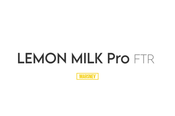
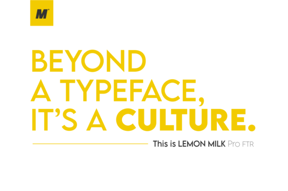
Some fonts just have that magic—that instant chemistry that makes you wonder how you ever worked without them. Lemon Milk Pro FTR is exactly that for me. This Sans Serif Fonts gem has this incredible energy that feels both modern and timeless, with a personality that elevates everything I pair it with.
The first time I used it for a branding project, I was honestly blown away by how effortlessly it commands attention. The letterforms have this bold, confident stance with clean geometric shapes that feel fresh and contemporary. Yet there’s this playful undertone—a subtle warmth—that keeps it from feeling too rigid or corporate. It’s the kind of typeface that works just as beautifully for edgy streetwear brands as it does for sleek tech startups.
What I love most about Lemon Milk Pro FTR is its versatility. The weight and proportions hit that sweet spot where it’s substantial enough for headlines but still incredibly readable for body text. I’ve used it across logos, packaging, website headers, and social media graphics, and it delivers consistently every time.
Among Sans Serif Fonts, this one has quickly climbed to the top of my most-used list. It’s bold, it’s fresh, and it brings this undeniable cultural energy to every project. Once you try it, you’ll understand why it’s earned that permanent spot in my toolkit.
26. Minimalist Lemonade Sans Serif Font
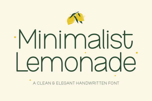
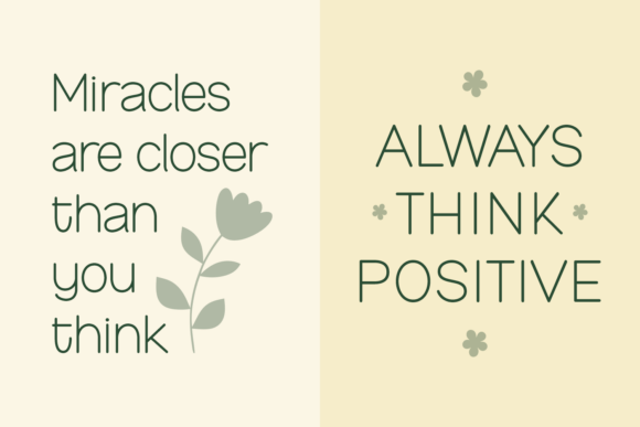
Sometimes a font just clicks, and Minimalist Lemonade clicked with me the moment I tried it. This clean Sans Serif Fonts option has this effortless charm that works across pretty much everything I throw at it. There’s a lightness to it—not just in weight, but in personality. It feels fresh, approachable, and quietly confident.
I’ve used Minimalist Lemonade for beautiful blog headings that need to stand out without being overwhelming, for logos that require that perfect balance of professionalism and warmth, and for social media graphics where clarity and style both matter. What I appreciate most is how versatile it is. It doesn’t demand attention, but it elevates every design it touches.
The letterforms are clean and well-proportioned, making it incredibly readable at any size. Whether I’m designing a delicate invitation or a bold brand identity, this font adapts beautifully. It’s become one of those go-to Sans Serif Fonts I reach for when I need something reliable that still feels fresh and modern.
Honestly, Minimalist Lemonade has that potential to become your favorite too. It’s simple, it’s stunning, and it brings that perfect finishing touch to any project—no matter the occasion.
27. Poppins Sans Serif Font
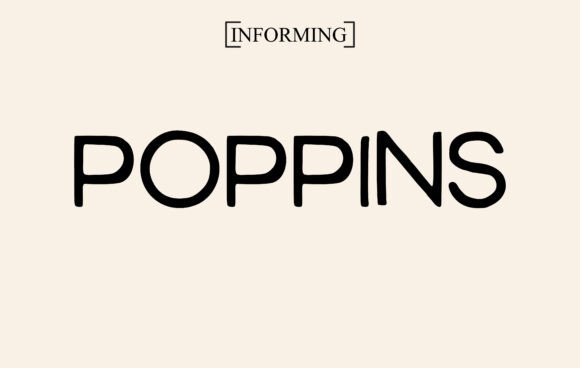
I don’t think I’ve ever met a designer who doesn’t have Poppins in their toolkit—and for good reason. This beloved Sans Serif Fonts classic has earned its reputation as a true favorite, and honestly, it deserves every bit of praise. The moment I started using it, I understood why it has the potential to take creative ideas to the highest level.
What makes Poppins so special is its versatility. The geometric letterforms are clean and modern, with a friendly, approachable vibe that works across almost any project. Whether I’m setting bold magazine headlines that need to grab attention, designing t-shirts that need to feel fresh and contemporary, or crafting wedding invitations that balance elegance with readability, Poppins delivers every single time.
The legibility is outstanding—it looks just as crisp in massive display sizes as it does in body text for branding materials or social media graphics. There’s a reason this font has become such a staple across the design community. Among Sans Serif Fonts, Poppins strikes that perfect balance between personality and professionalism.
It’s reliable, it’s beautiful, and it never lets me down. A true workhorse that belongs in every designer’s collection.
Ready to elevate your next project with the perfect typeface? Whether you’re crafting a bold brand identity, designing for the web, or adding a personal touch to social media graphics, the right Sans Serif Fonts can make all the difference.
I’ve shared some of my personal favorites here—fonts that have earned permanent spots in my toolkit. Now it’s your turn to explore, experiment, and find the ones that speak to your creative voice.
Explore More Patterns
Typography is just the beginning. If you’re looking for even more inspiration to fuel your design projects, be sure to check out the full collection of patterns, textures, and design resources available throughout this article. From subtle background textures to bold geometric patterns, these elements pair beautifully with the Sans Serif Fonts featured here—giving you everything you need to create cohesive, standout designs from start to finish.
Conclusion
Building a reliable collection of Sans Serif Fonts is one of the most valuable investments a designer can make. Throughout this article, I’ve walked you through a curated selection of typefaces that I’ve personally tested and trusted across countless projects—from bold condensed powerhouses like GC Grind and Hoodie to elegant minimalists like Japandi and Harmonie, and versatile workhorses like Poppins and Lemon Milk Pro FTR.
What I’ve learned over years of designing is that the right font does more than just display text—it sets the tone, communicates personality, and elevates everything around it. Whether you’re working on branding, editorial layouts, web design, or print-on-demand products, having a thoughtful selection of Sans Serif Fonts at your fingertips gives you the flexibility to adapt to any creative challenge.
My hope is that this roundup has introduced you to some new favorites and reminded you why timeless, well-crafted typefaces matter. So go ahead—download a few, play with pairings, and let your next design speak with confidence.
Happy creating!
Ready to transform your next project?
Browse all Sans Serif Fonts on Creative Fabrica
You may also like:
Disclosure: This post contains affiliate links. If you make a purchase through my links, I may earn a small commission at no extra cost to you. Thank you for supporting my site! ♥️