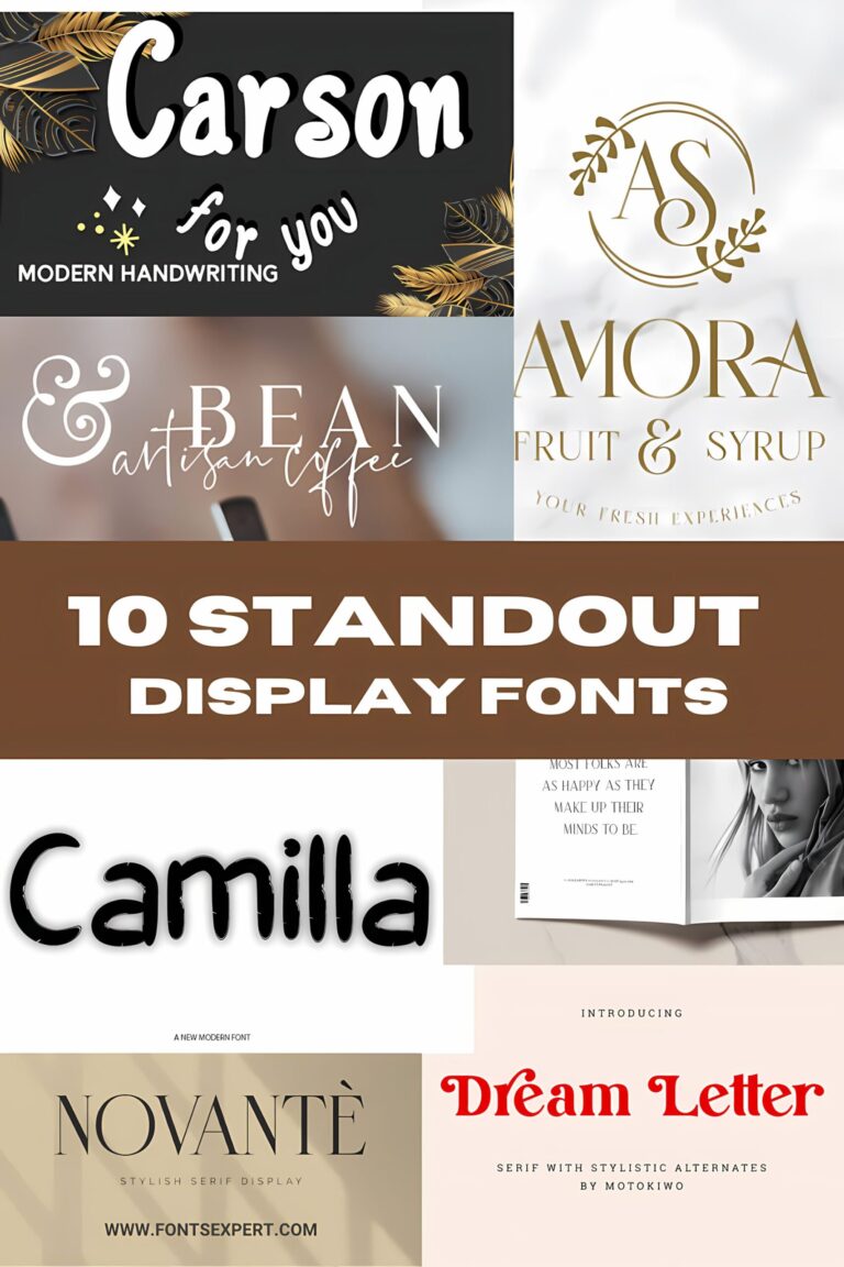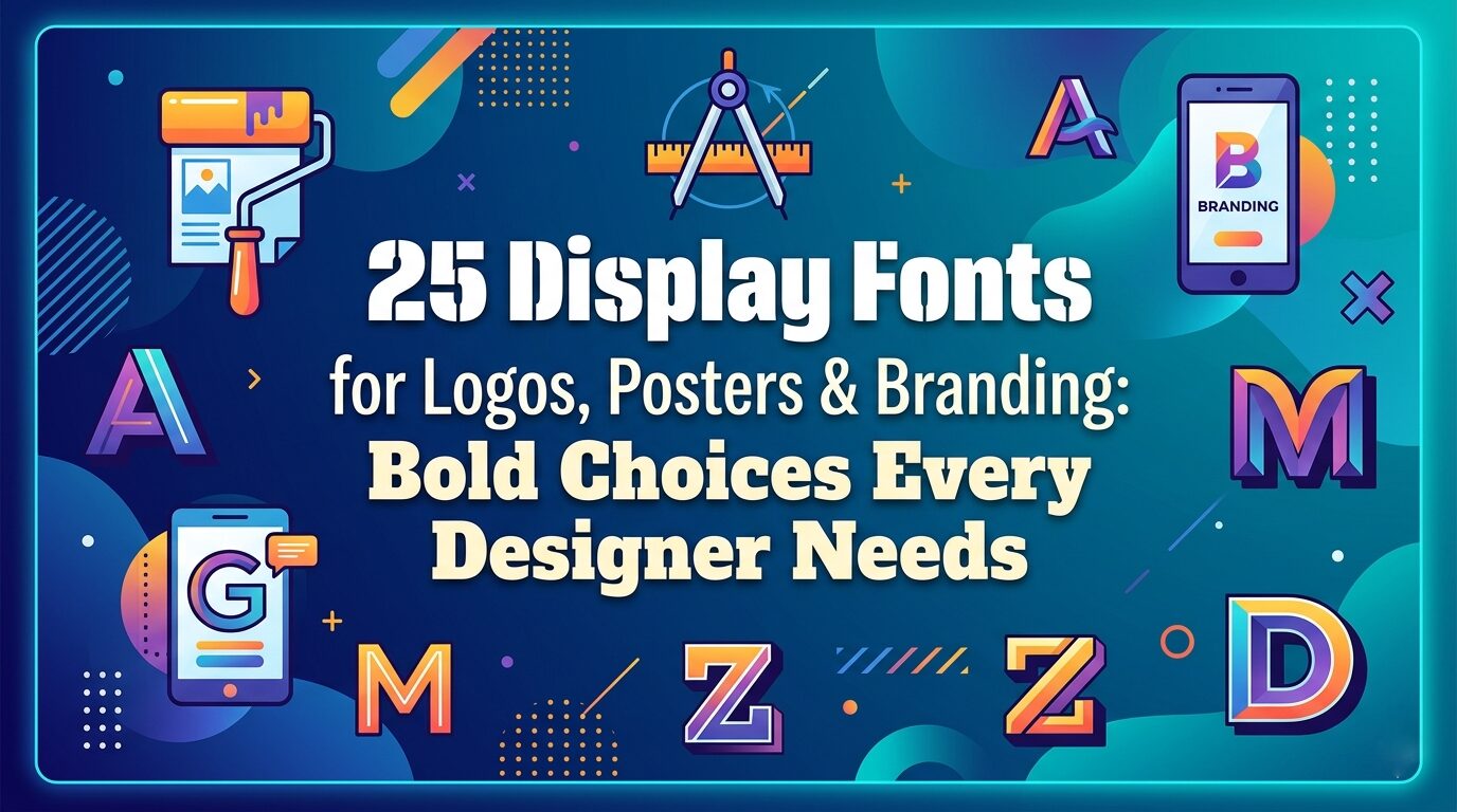
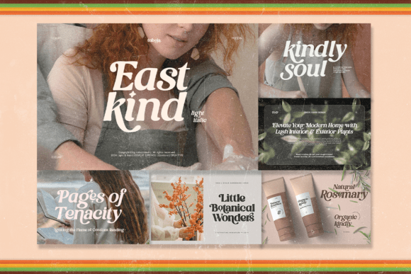
25 Display Fonts for Logos, Posters & Branding: Bold Choices Every Designer Needs
Let’s be honest for a second—as designers, we’ve all been there. You’re staring at a blank canvas, you’ve got the layout figured out, the colors are picked, and then… the font hunt begins. Scrolling through endless lists, second-guessing every choice, wondering if the typeface you’re about to use actually has a pulse or if it’s just… there.
That’s why I put this collection together.
I’ve gathered some of my favorite Display Fonts—the kind that don’t just fill space but actually bring a project to life. We’re talking bold retro vibes, playful bubbly letters, nostalgic varsity energy, and even a little spooky charm for good measure. These aren’t your everyday workhorses. These are the fonts you pull out when you want people to stop scrolling, look twice, and feel something.
Whether you’re designing a logo, a poster, a sticker set, or just experimenting with something new, this list is here to spark ideas and maybe introduce you to your next go-to typeface.
So grab your favorite drink, open up your design software, and let’s dive into a world of personality-packed Display Fonts that are ready to make your work unforgettable.
Let’s go. ✨
1. Stay Chunky Display Font
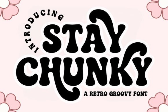
When I’m reaching for Display Fonts that actually have a pulse, Stay Chunky is my first pick. It’s got that thick, bubbly 70s groove—like something you’d find on an old vinyl sleeve or a vintage tee. I love using this one for posters that need to shout, or for stickers where the letters just feel squishy and fun.
The best part? Those stylistic alternates. They let me break up the letterforms so the words don’t look too perfect.
If I’m working on a retro branding project or just want a header that makes people smile, this one never lets me down. It’s bold without being aggressive—just pure, cheerful nostalgia.
2. Stacked Chunky Display Font
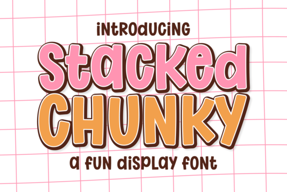
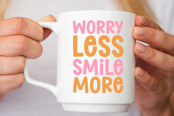
Sometimes you need a font that feels like a sugar rush, and that’s exactly why Stacked Chunky lives in my Display Fonts folder. It’s bold and stacked (literally), but those rounded edges keep it from feeling aggressive.
I gravitate toward this one when I’m designing for kids—think toy packaging or birthday invites—because it has that playful, bouncy energy without losing readability.
What I love most is how it handles color. Slap a bright gradient on this, or add a white border for that sticker effect, and it instantly pops off the screen. It’s my go-to for YouTube thumbnails or anything that needs to stop a scroll. Pure, joyful impact.
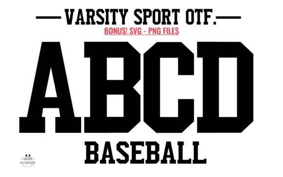
3. Varsity Spirit Display Font
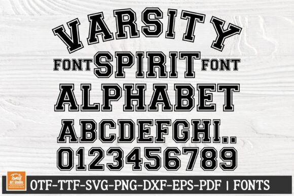
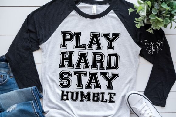
When a client says they want that classic college vibe, I don’t hesitate—I pull up this Varsity Font SVG. It’s the real deal. Those bold, blocky letters instantly scream team spirit, pep rallies, and championship rings.
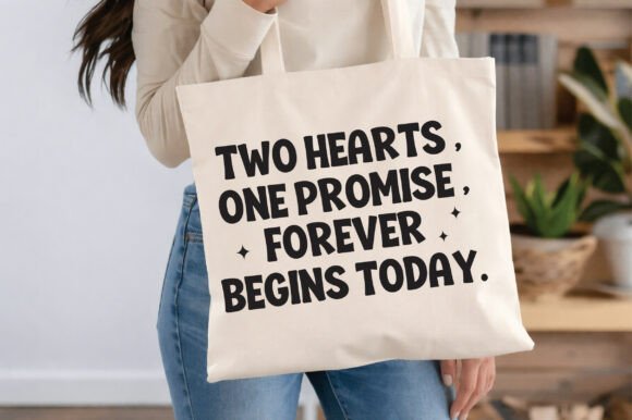
What makes this one a staple in my Display Fonts collection is the versatility. I get the standard OTF for quick layouts, but the SVG files? That’s where the magic happens for Cricut projects. I’ve used it for everything from custom jerseys to monogrammed totes, and it cuts like a dream.
Whether I’m working in Illustrator or Canva, this typeface gives me that authentic athletic edge without any fuss. Perfect for school spirit designs or when a project just needs to feel legendary.
4. Beautiful Smile Display Font
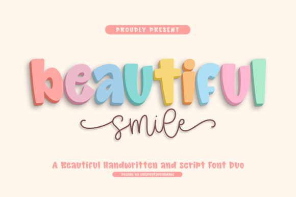
Beautiful Smile is a playful handwritten font duo combining bold, rounded display lettering with a smooth, flowing script companion. The main typeface features chunky, soft-edged letterforms with gentle curves, subtle stroke variation, and a lively baseline that creates a cheerful, friendly personality, while maintaining strong legibility through open counters and balanced proportions.
Complementing it, the script style introduces elegant monoline strokes with natural rhythm, seamless connections, and expressive swashes that add movement and warmth.
Together, the contrast between the puffy, dimensional display and the graceful handwritten script creates a harmonious and versatile typographic pairing ideal for branding, packaging, invitations, and joyful design themes.
5. My Wednesday Night Display Font
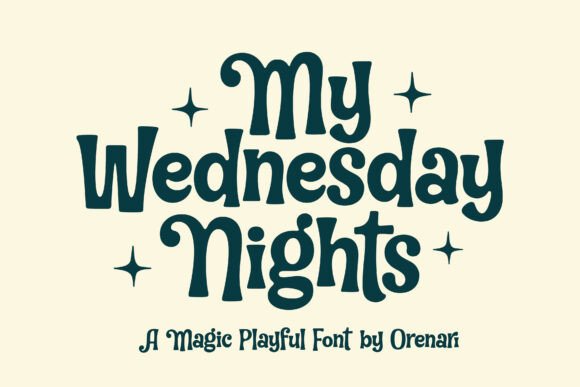
This one is for the weird, wonderful projects that fall somewhere between cute and creepy. My Wednesday Night has that quirky horror vibe I didn’t know I needed until I found it. The strokes are bold but wobbly—like something out of a slightly spooky storybook.
I reach for these Display Fonts when Halloween rolls around, sure, but honestly? It works for so much more. I’ve used it for children’s book titles that need a little mystery, or for invitations where I want guests to smile and raise an eyebrow at the same time.
The PUA encoding is a lifesaver too—I can easily grab those alternate glyphs and swashes without any hassle. It’s playful, it’s eerie, and it’s endlessly charming. Perfect when you want your design to whisper “what if?”
6. The Crafty Marie Display Font
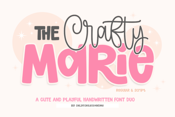
I’ll be honest—I’m a sucker for a good font duo. The Crafty Marie takes all the guesswork out of pairing, which means more time creating and less time staring at my screen wondering if two fonts actually like each other.
You’ve got this bold, rounded sans that just feels friendly, and then a script that flows like a handwritten note from a favorite teacher. Together? They’re magic. I use this combo constantly for classroom materials, nursery art, and birthday invites. The bold handles the main message while the script adds that personal touch.
Being PUA-encoded means I can grab all those lovely swashes without jumping through hoops. For my Cricut projects, the clean outlines cut like butter. It’s approachable, energetic, and just plain fun to work with.
7. Bubble Joy Display Font
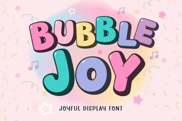

Sometimes I just want a font that feels like a balloon floating through a birthday party, and Bubble Joy delivers exactly that. What hooked me immediately is the two-style setup—Regular and Outline. They stack perfectly, so I can build those layered, colorful titles in seconds without any fiddly alignment work.
It’s become my secret weapon for Display Fonts that need to pop on stickers, mugs, or kids’ T-shirts. The rounded, chunky letters stay readable even when I shrink them down for tiny stickers, yet they hold their own on big banners too.
I’ve used this for birthday invitations, classroom prints, and even a little logo for a juice stand. It’s cheerful without being childish, bold without being overwhelming. Pure bubbly joy in typeform.
8. Girls Lover Display Font
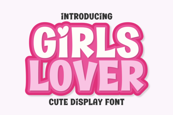
This one just makes me smile every time I open it. Girls Lover has that high-energy, joyful vibe that instantly turns a ordinary design into something celebratory. The letterforms are chunky and rounded—friendly without being overly cutesy, which is a balance I’m always chasing.
I find myself reaching for these Display Fonts when I’m working on projects for kids’ brands, birthday stationery, or anything that needs to feel genuinely fun. What I love is how versatile that boldness is. I can slap on a bright pink gradient for that candy-like feel, or keep it clean with a thick outline for a sticker effect.
It reads beautifully on everything from nursery decor to apparel mockups. There’s a youthful energy here that just works. Perfect for when your design needs a little spark of joy and a whole lot of personality.
9. Rabbit Hole Display Font
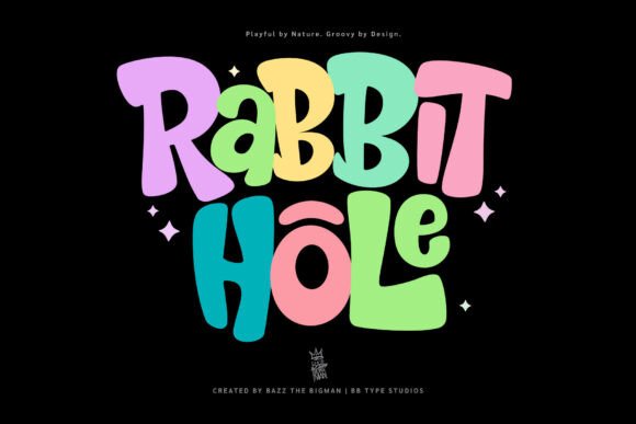
This font has personality for days. Rabbit Hole caught my eye with that quirky retro vibe—it’s bold, a little wobbly in the best way, and feels like it just danced right off a vintage cereal box.
When I’m digging through my Display Fonts for something that balances playful with punch, this one always delivers. The letterforms have this organic, lively rhythm that makes them perfect for projects aimed at kids or creative branding that doesn’t take itself too seriously.
I’ve used it for posters where I needed to stop people mid-stride, and for packaging that needed to feel fun without being chaotic. There’s a warmth here that’s hard to fake. It invites you in, makes you smile, and still commands attention. Honestly, it’s the kind of font that makes my work feel more like play.
10. Have a Nice Day Honey Display Font
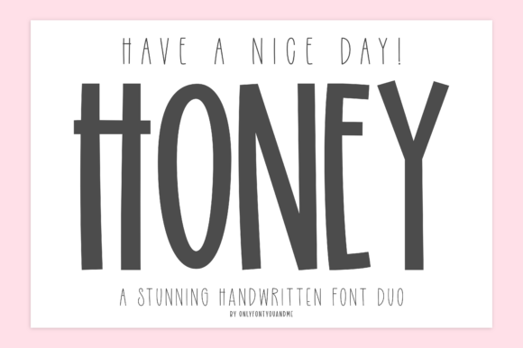
There’s something about this font duo that just feels like a warm hug. Have A Nice Day! Honey gives me that perfect balance—a tall, bold display font with quirky proportions and rounded edges, paired with a light, narrow handwritten companion that floats alongside it like a little whisper.
When I’m browsing Display Fonts for branding projects or greeting cards, I always circle back to this pair. The main “Honey” font has that hand-drawn charm that feels modern and cheerful without trying too hard, while the secondary adds that delicate touch for taglines or supporting text.
I’ve used this combo for social media graphics, posters, even a coffee shop menu board. It strikes that sweet spot between bold personality and subtle elegance. Welcoming, upbeat, and genuinely handcrafted. It just makes people smile.
11. Cowboy Block Display Font
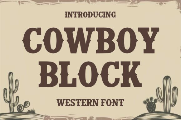
When a project needs to smell like leather, dust, and something strong from the saloon, I grab Cowboy Block. This one has that authentic Western grit without feeling like a costume. The block serifs are thick and confident, and those little decorative spurs on the edges? Pure character.
I’ve used it for barbecue restaurant menus, wanted posters that needed to feel vintage but readable, and album art for country musicians who want that frontier edge. Being an all-caps Display Fonts option means it commands attention every time—perfect for signage or anything that needs to be seen from across the street.
There’s something timeless about this one. It’s rugged, masculine, but still approachable. Whether I’m building a rustic logo or a badge for a outdoor brand, Cowboy Block delivers that Wild-West spirit without any gimmicks. Just solid, powerful typography.
12. Twinkle Dreams Display Font
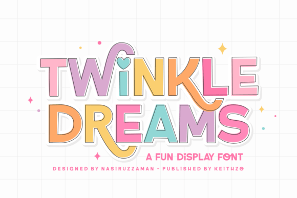
There are fonts that do the job, and then there are fonts that genuinely make design feel like play. Twinkle Dreams falls into that second category for me. I discovered it while hunting for Display Fonts that could handle both holiday projects and children’s themes without feeling forced.
What surprised me? The uppercase set is bold and friendly, but the lowercase has this whimsical, almost twinkling quality that adds so much personality.
I’ve used it for Christmas cards where I wanted warmth, and for a children’s book title that needed to feel magical. The OpenType features are a dream—swashes and ligatures that let me customize without overthinking.
Being PUA-encoded means I can grab all those little decorative touches in seconds. It’s thoughtful, playful, and makes every project feel a little more special. Honestly, it’s the kind of font that sparks joy before I even start designing.
13. Thick Honey Duo Display Font
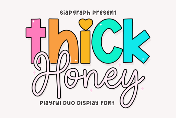
This one is pure sweetness in type form. Thick Honey gives me that perfect duo dynamic I’m always chasing—a bold, chunky display font that demands attention, paired with a fluid script that adds just the right touch of elegance.
When I’m scrolling through Display Fonts for bakery logos or nursery art, this pair always catches my eye. The display version has those thick, rounded letters that feel friendly and approachable, while the script dances alongside it with a graceful rhythm. I love using them together to build layered compositions that feel playful but polished.
It’s become my go-to for children’s branding, custom stickers, and anything that needs that sweet, handmade charm. The contrast between heavy and delicate creates instant visual interest without trying too hard. PUA-encoded too, so all those lovely alternates are right there when I need them. Just a genuinely delightful duo to work with.
14. Varsity Signature Display Font
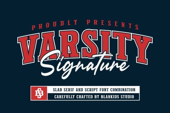
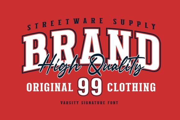
When a branding project needs that classic athletic energy, I reach for Varsity Signature. This isn’t just another sports font—it’s a complete duo that gives me both that bold varsity presence and a more refined companion for details. I’ve used it for everything from college-inspired logotypes to watermarks on team merchandise, and it never lets me down.
What I appreciate most is how authentic it feels. Every letter carries that sporty, game-day spirit without looking like a cookie-cutter template. The full set of uppercase and lowercase gives me flexibility, so I’m not stuck in all-caps mode when I want a softer approach.
Whether I’m designing posters for a championship event or building branding for athletic apparel, Varsity Signature fits right in. It’s one of those Display Fonts that just understands the assignment. Clean, confident, and undeniably sporty.
15. Hunters K-pop Display Font
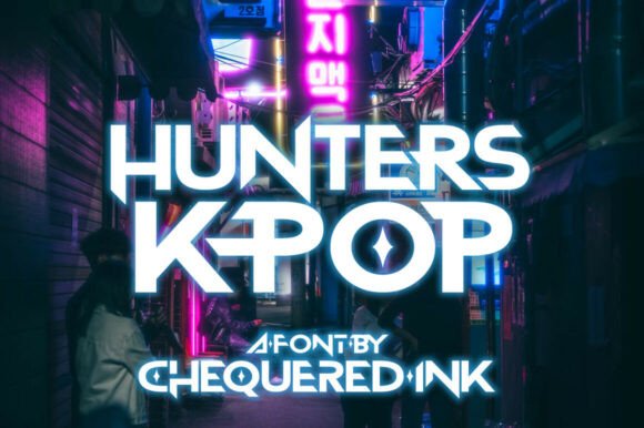
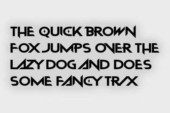
This one hits different. Hunters K-Pop has that sharp, edgy energy that instantly makes me think of lightsticks, music shows, and album covers that need to grab attention. The straight edges and those cut-out counters give it a futuristic, almost techno feel that works perfectly for K-pop projects but honestly stretches further than you’d expect.
I’ve used it for gaming interfaces, streaming graphics, and even a few festival posters where I wanted that modern, high-energy vibe. When I’m digging through Display Fonts for something that feels current and bold without being overly aggressive, this is my pick.
There’s a rhythmic quality to the letterforms—like they’re ready to drop a beat. Perfect for album art, video game titles, or any design that needs to feel like it’s pulsing with energy. Clean, sharp, and undeniably cool.
16. Slime Display Font
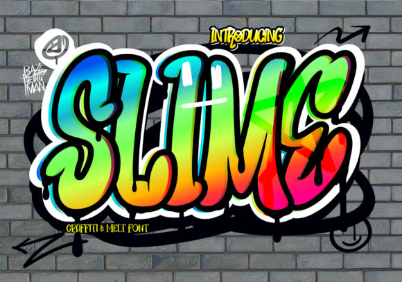
When I need a font that drips with attitude, Slime is the one I pull out. This graffiti-styled typeface has that authentic street art energy—messy in the best way, but still totally readable.
I’ve used it for streetwear logos, urban apparel designs, and even a few skateboard graphics where I wanted that raw, unfiltered feel.
What I love about it is the flow. The letters have this organic movement that feels like they were sprayed on a wall somewhere, not just typed out on a screen. It’s one of those Display Fonts that adds instant credibility to anything street-inspired.
Whether I’m designing t-shirts, sportswear branding, or advertisements that need to feel fresh and cool, Slime delivers. It’s bold, it’s gritty, and it doesn’t try to be anything it’s not. Pure urban energy in typeform. Perfect for when your design needs a little edge.
17. Back to Vintage Display Font
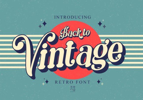
This font takes me straight back to the era of diners, cassette tapes, and sun-faded posters. Back to Vintage has that unmistakable retro soul—inspired by the typography of the 60s, 70s, and 80s all rolled into one. What caught my eye first is the shape. Every corner is softer, rounder, almost melted in the most charming way.
It’s one of those Display Fonts that instantly grabs attention without screaming. I’ve used it for album covers that need that warm nostalgia, for signage at a retro-themed café, and even for a festival poster where I wanted a throwback feel that still felt fresh.
There’s something about this font that just feels familiar in the best way. It whispers memories while still standing bold. Whether you’re designing merch, branding, or anything that needs a special retro touch, this one delivers with effortless vintage charm.
18. Retro Groovy Bundle Display Font
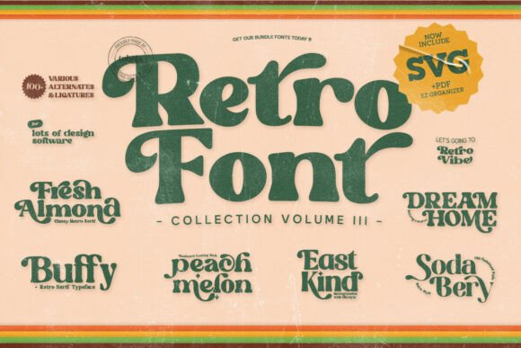
Sometimes one retro font just isn’t enough. That’s why I love having this bundle in my toolkit. Seven groovy display fonts, each with its own personality—it’s like opening a time capsule from the 60s and 70s every time I start a new project.
Fresh Almond gives me those soft, friendly curves. Peach Melon brings the juicy, bold energy. Dream Home has that warm, nostalgic feel. And Buffy? She’s pure fun. When I’m curating Display Fonts for a branding project or a vintage-style album cover, having this variety saves me so much time. I can mix and match, find the perfect vibe without digging through a dozen different foundries.
Everything is PUA encoded, so all those lovely alternates are right there when I want to add a little extra flair. It’s compatible with everything—Illustrator, Canva, you name it. Whether I’m designing packaging, T-shirts, or a groovy event flyer, this bundle delivers that authentic retro warmth. Pure nostalgia, no compromises.
19. Varsity Sport Army Display Font
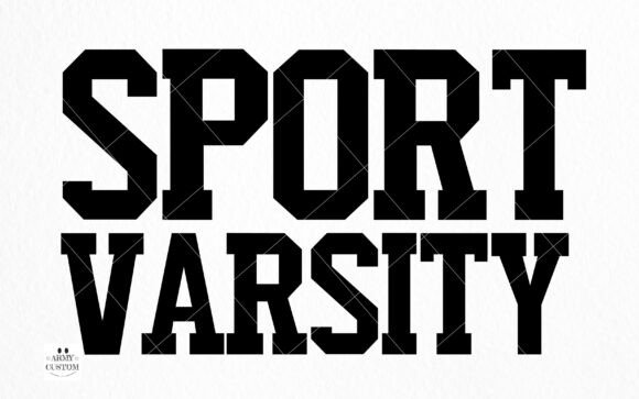
This font takes me straight to Friday night lights and packed stadiums. Varsity Sport Army has that authentic collegiate energy that’s so hard to find—the kind that feels like it’s been stitched onto a letterman jacket for decades. Every letter carries that rush of the big game, the echo of the crowd, the pride of university spirit.
When I’m browsing Display Fonts for athletic branding or school merchandise, this one always makes the final cut. I’ve used it for team logos, championship banners, and even alumni event materials where I wanted that nostalgic campus feel.
There’s something about the way these letters stand that just feels right—bold, confident, and full of community pride. Whether you’re designing for a university league, a local sports team, or anything that needs that premium varsity look, this font delivers. It’s more than just letters; it’s a feeling. Game day, every day.
20. Picky Retro Display Font
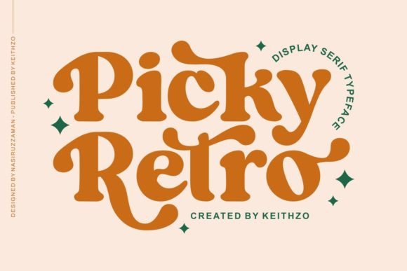
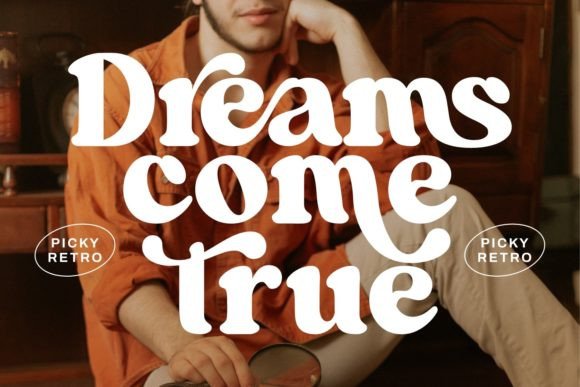
There’s a reason I keep coming back to this one. Picky Retro has that bold serif presence that feels both timeless and playful—a combination that’s harder to find than you’d think. The letterforms are strong, distinctive, and carry this classic elegance that doesn’t feel stuffy or pretentious.
When I’m sifting through Display Fonts for logo work or headline designs that need real personality, this one always catches my eye. I’ve used it for wedding invitations where I wanted vintage charm without looking too delicate, and for branding projects that needed to feel established but approachable.
There’s a warmth to the curves, a little nod to the past that makes every project feel more thoughtful. It’s bold enough to command attention, yet refined enough to feel sophisticated. If you’re after that sweet spot between nostalgia and modern confidence, Picky Retro delivers every time.
21. Playful Children Display Font
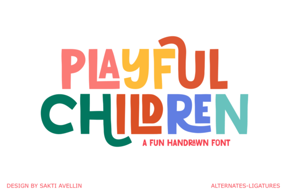
This font feels like a box of crayons and a blank wall—pure creative freedom. Playful Children has that handcrafted, organic energy that captures exactly what a kid’s universe should feel like: uninhibited, vibrant, and full of imagination. Every character has its own little personality, like each letter was drawn with a different mood in mind.
When I’m working with Display Fonts for kindergarten branding or toy packaging, this one instantly sets the right tone. I’ve used it for daycare logos, children’s book covers, and even snack wrappers where I wanted to spark a little joy. There’s something about the way these letters sit on the page that just feels right for kids—approachable, warm, never too perfect.
It works on everything from wall decals to birthday invitations, always adding that handmade charm. Whether I’m designing for a toy store or a children’s apparel line, Playful Children helps me create work that doesn’t just look good—it feels good too. Pure, joyful creativity in every stroke.
22. Playful Sans Display Font
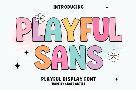
This one lives in my “happy place” font folder. Playful Sans has that chunky, rounded energy that instantly makes any project feel more welcoming. The letters are thick and smooth—readable from across the room but still packed with personality.
When I’m scrolling through Display Fonts for kids’ branding or birthday invitations, this one always makes me stop. I’ve used it for nursery decor, sticker sets, and even a little ice cream shop logo where I wanted that sweet, friendly vibe. What I love is how versatile that boldness is. It holds up on a giant poster and still looks adorable on a tiny sticker.
Soft pastels, bright neons, whatever palette I’m working with—this font just adapts and shines. It’s the kind of typeface that makes my clients smile when I present the mockups. If your project needs warmth, creativity, and a genuine touch of joy, Playful Sans is ready to deliver.
23. Retro Kids Display Font
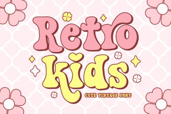
This font makes me want to pull out my old yearbook and a slice of watermelon. Retro Kids hits that sweet spot where vintage charm meets playful innocence—like something straight out of a 70s classroom but still feels fresh today.
The serifs are soft, the curves are friendly, and there’s this undeniable groovy energy that just works. When I’m digging through Display Fonts for back-to-school projects or kids’ birthday invitations, this one always feels right.
I’ve used it for summer camp flyers, t-shirt designs, and even a little sticker set for a school fundraiser. The alternates give me room to play, swapping uppercase and lowercase letters to find just the right rhythm. It’s adorable without being overly cutesy, vintage without feeling dated.
Whether I’m designing for a classroom or a crafting project, Retro Kids brings that warm, nostalgic touch that makes people smile. Perfect for when your design needs a little throwback charm with a whole lot of heart.
24. Lemon Harvest Display Font
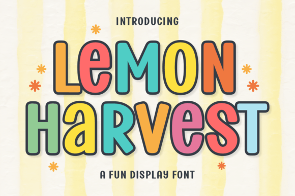
Some fonts just make you feel good the moment you type them out. Lemon Harvest is one of those. It’s chubby, it’s friendly, and it has this lighthearted energy that instantly adds warmth to any project. I stumbled on it while looking for Display Fonts that could bring a little sunshine to a summer branding gig, and honestly, it hasn’t left my toolkit since. The characters have that perfect balance—bold enough to stand out, soft enough to feel approachable.
I’ve used it for farmers’ market logos, lemonade stand signs (of course), and even a little café menu where I wanted that homemade charm. There’s something about the roundness of each letter that feels almost huggable. It’s typography at its cutest, but never cheesy.
Whether I’m designing packaging, stickers, or just a fun social media graphic, Lemon Harvest brings that sprinkle of enchantment that turns ordinary designs into something memorable. Pure sunshine in letterform.
25. Ask Why Display Font
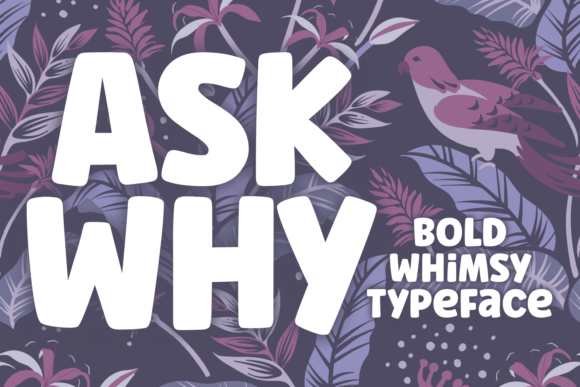
This font has a personality that makes me smile every time I kern it. Ask Why is bold, chunky, and just the right amount of whimsical—like it’s got something clever to say but isn’t going to shout it. I discovered it while working on some Cricut projects, and honestly, it’s become my go-to when I want letters that feel substantial but still playful. The thickness makes it perfect for cutting—no fiddly bits that peel up, just clean, bold shapes that pop off the page.
I’ve used it for card making, scrapbook titles, and even a few fun sticker designs where I needed that chunky, statement-making look. When I’m browsing Display Fonts for projects that need to feel alive and energetic, Ask Why always delivers. There’s a confidence to these letters that I really appreciate.
They’re not trying too hard—they just show up, take up space, and make everything around them look better. Perfect for crafters, card makers, and anyone who wants their designs to stand out with a little extra charm.
Stop. Think. Admire.
Before you close this tab, take a second to really look at what Display Fonts can do. They’re not just letters—they’re mood-setters, storytellers, and the fastest way to give your project a personality that sticks.
Whether you’re crafting a nostalgic logo, a playful poster, or something that just needs to make someone smile, the right typeface changes everything.
👉 Check out all the font patterns and collections above. Play around. Mix, match, and find the one that speaks to your next project. Your next favorite font is waiting.
Conclusion
Putting together a collection of Display Fonts always reminds me why I love this work. Every typeface has its own heartbeat—some are bold and loud, others are soft and dreamy, and a few just want to make you laugh. What I’ve learned is that the best designs happen when you stop forcing the “rules” and start choosing fonts that actually feel right for the story you’re telling.
So whether you’re designing for a kindergarten classroom, a barbecue joint, a K-pop album, or just a birthday card for someone you love, remember this: the right font doesn’t just decorate your design—it becomes part of it.
Take your time. Experiment. And don’t be afraid to let your typography show a little personality.
Happy designing, friends. ✨
Ready to transform your next project?
Browse all Display Fonts on Creative Fabrica
You may also like:
Disclosure: This post contains affiliate links. If you make a purchase through my links, I may earn a small commission at no extra cost to you. Thank you for supporting my site! ♥️