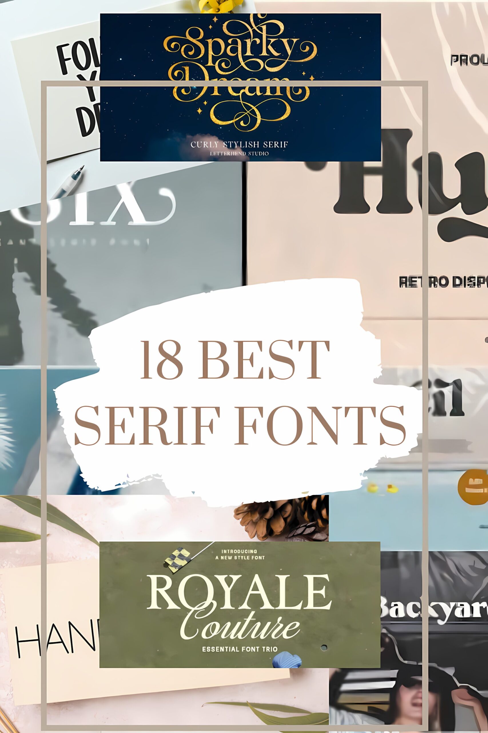
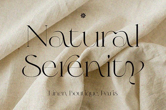
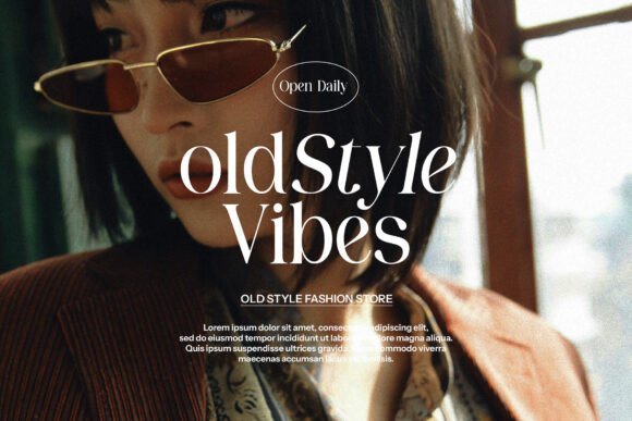
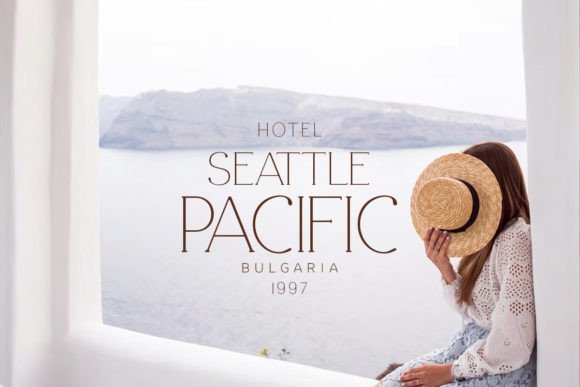
18 Best Serif Fonts for High-End Design in 2026
In the fast-paced world of digital design, your choice of font is often the first “handshake” between your brand and your audience. While trends come and go, Serif Fonts remain the undisputed champions of elegance, authority, and timeless style. Whether you are aiming for the nostalgic warmth of a 70s vinyl cover or the razor-sharp minimalism of a high-fashion magazine, the right serif does the heavy lifting for you—it tells your story before a single word is even read.
As we look into the design landscape of 2026, we’re seeing a beautiful shift toward “personality-driven” typography. Designers are moving away from the safe and sterile, opting instead for typefaces that offer unique ligatures, custom swashes, and a sense of human touch. This curated selection of Serif Fonts represents the best of this movement, offering everything from “quiet luxury” to “bold retro” vibes.
I’ve personally explored these fonts to see how they behave in real-world layouts. In the following roundup, I’ll walk you through my favorite picks, sharing exactly where they shine and why they might just be the missing piece in your next creative project. Let’s find the perfect typeface to elevate your design from “standard” to “standout.”
1. Amanda Serif Font
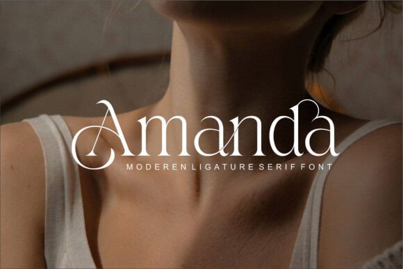
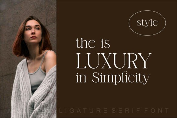
When I first laid eyes on Amanda, I knew it wasn’t just another addition to the world of Serif Fonts. It has this rare, “spicy” edge—fashion-forward, sleek, and undeniably confident. It’s a contemporary family that doesn’t just sit on a page; it commands it with elegant curves and a touch of effortless “sexy” flair.
Best Used For: This is your go-to for branding and logo design. If you’re aiming for a look that feels high-end, “haute couture,” and deeply personal, Amanda delivers. It’s stunning for editorial layouts, lifestyle magazines, and premium packaging where personality is key.
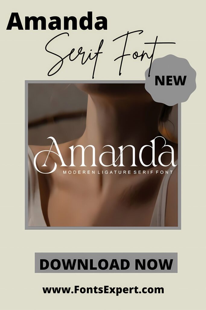
Why I Love It: What sets it apart from more rigid Serif Fonts is its versatility. With various weights and stylish extras, you can transform a simple word into a unique logo in seconds. It’s classy, unique, and has just enough soul to make your design feel alive.
2. Magic Seventie Serif Font
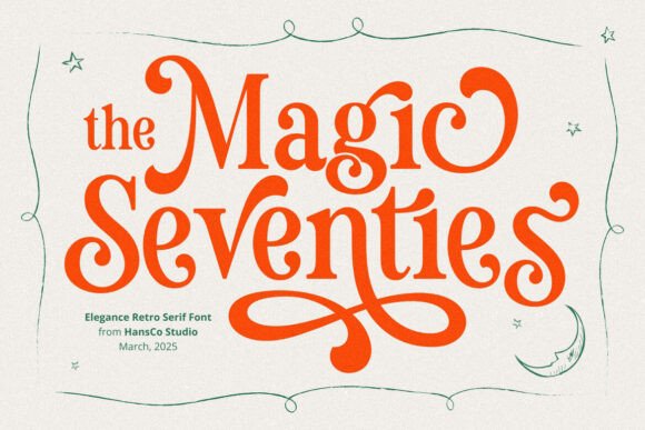
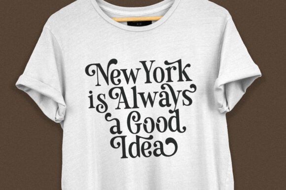
There’s something incredibly soulful about Magic Seventies. While many Serif Fonts try to be either strictly “old-school” or “ultra-modern,” this one sits perfectly in the middle. It captures that groovy, feminine retro energy but keeps it polished enough for today’s high-end aesthetics. It’s warm, inviting, and full of rhythmic movement.
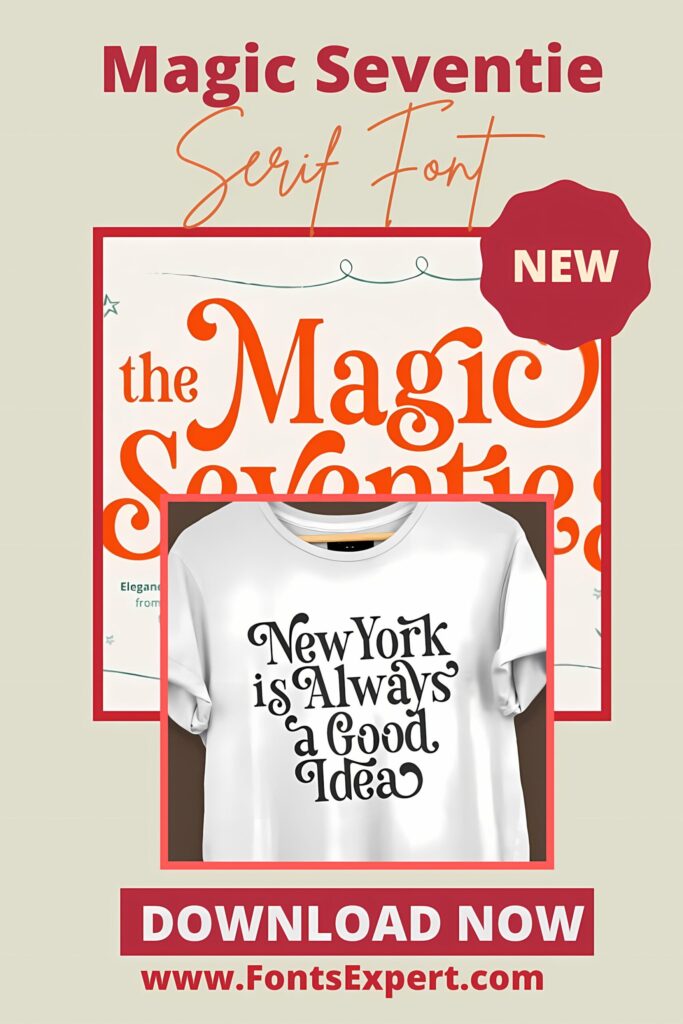
Best Used For: If you’re working on a branding project that needs a “soul,” this is it. It’s a dream for logotypes, posters, and packaging that want to stand out. Because of its unique character, it works wonders for lifestyle brands, artisanal crafts, or any design that needs a human, approachable touch.
Why I Love It: The real magic lies in those smooth, flowing swashes. Every character feels like it was hand-drawn with intention. Unlike more static Serif Fonts, Magic Seventies adds a sense of flow and personality to your text, making even the simplest word look like a custom piece of art.
3. Olive & Citrus Serif Font
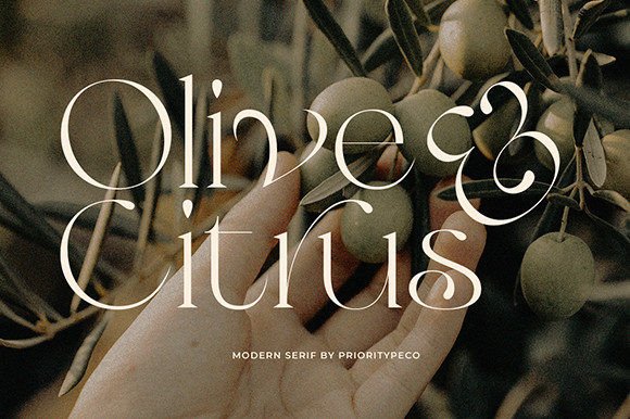
I’ve always felt that Olive & Citrus is the “white button-down shirt” of Serif Fonts—it’s classic, effortlessly chic, and fits perfectly in almost any high-end setting. It balances a modern edge with traditional elegance, making it feel both fresh and established at the same time.
Best Used For: This is a powerhouse for editorial-style branding. I highly recommend it for fashion magazines, sophisticated logos, and curated social media grids. If you want your Instagram posts or brand identity to breathe luxury and calm, this typeface is your best friend.
Why I Love It: The best part? It’s PUA encoded, so you don’t have to be a tech wizard to use its stunning ligatures and glyphs. Unlike some finicky Serif Fonts, Olive & Citrus gives you easy access to those “designer-only” flourishes that make a layout look custom-made and truly professional.
4. Love Signal Serif Font
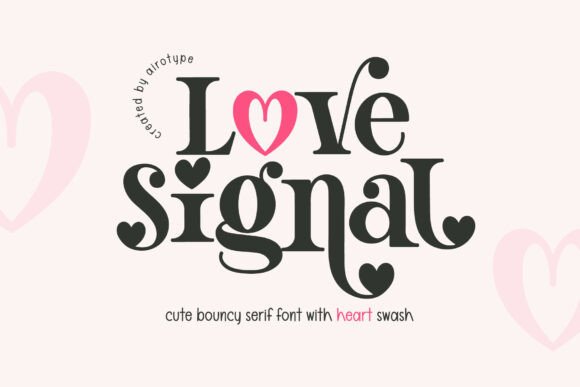
I can’t help but smile whenever I use Love Signal. It’s a total departure from the serious, stiff nature of traditional Serif Fonts. This one is all about “bouncy” energy and pure joy. With its plump, curvaceous lines and those adorable heart-shaped swashes, it feels less like a typeface and more like a warm hug for your design.
Best Used For: If you’re working on wedding stationery, Valentine’s Day campaigns, or branding for children’s products, this is a winner. It’s a fantastic display font for headlines that need to feel approachable, feminine, and undeniably sweet.
Why I Love It: The irregular baseline gives it a handcrafted, “living” feel that most Serif Fonts lack. It’s playful without being messy. Those integrated heart glyphs are the real showstoppers—they allow you to add a dash of romance to a logo or card instantly, making the whole layout feel personalized and deeply charming.
5. Moon Creme Serif Font
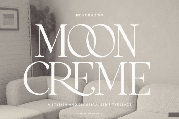
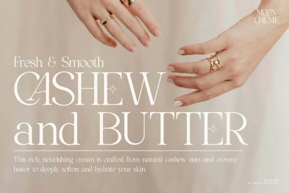
There is something incredibly soothing about Moon Creme. To me, it feels like a bridge between eras—it has that nostalgic, vintage soul we all crave, but it’s polished with a very clean, modern edge. Out of all the Serif Fonts in my kit, this is the one I reach for when I want a design to feel “expensive” yet deeply grounded and refined.
Best Used For: I’d suggest using Moon Creme for high-end editorial work, sophisticated wine labels, or boutique hotel branding. It’s a stellar choice for any project where you need to communicate class and attention to detail without trying too hard. It’s built for designers who value understated luxury.
Why I Love It: The craftsmanship here is top-tier. Unlike some decorative Serif Fonts that can feel cluttered, Moon Creme remains airy and legible. It brings a “quiet confidence” to the page, giving your headlines a refined aesthetic that feels both timeless and perfectly in tune with today’s trends.
6. Modern Retro Serif Font Bundle
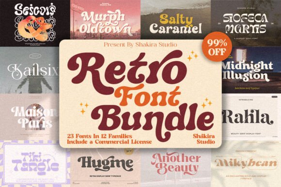
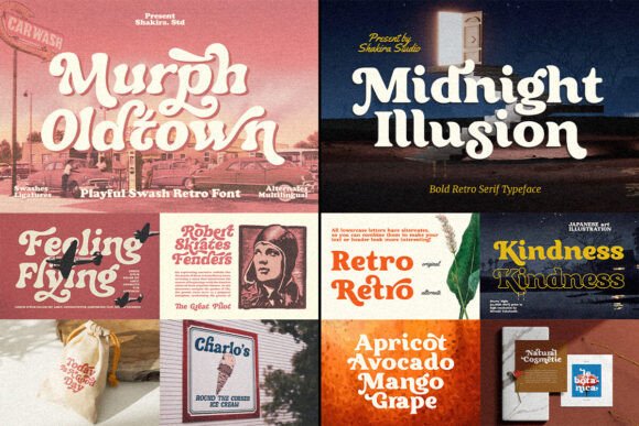
Honestly, finding a collection like this feels like hitting the jackpot. This Modern Retro Bundle is a massive treasure chest of Serif Fonts that perfectly capture that “Boho-meets-Groovy” vibe. Instead of hunting for individual styles, you get a curated set of best-sellers—like Masion Paris and Salty Caramel—that instantly bring a professional, cohesive look to any project.
Best Used For: This bundle is a “Swiss Army knife” for creators. Whether you’re crafting dreamy wedding invitations, designing catchy T-shirts, or setting up a chic blog, these fonts work seamlessly across Canva, Cricut, and Procreate. It’s my top recommendation for anyone building a brand from scratch who needs variety without losing that stylish, retro edge.
Why I Love It: The “tails” and swashes are the real game-changers here. Unlike standard, flat Serif Fonts, these have those gorgeous decorative extensions that make your logos look custom-lettered. It’s a huge time-saver for designers who want that high-end, “SVG-ready” look for posters or fashion magazines without spending hours on manual tweaks.
7. Maglite Serif Font
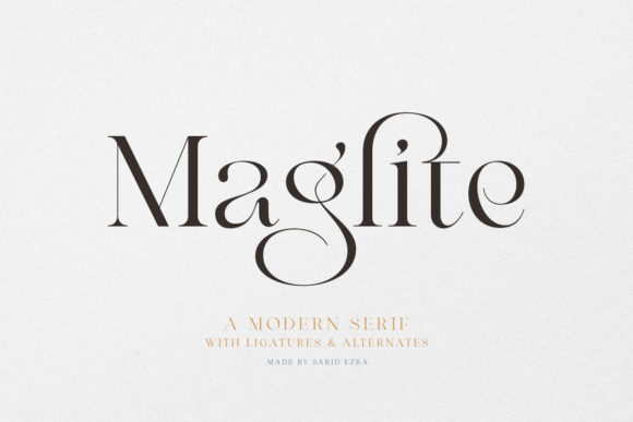
If I had to pick one font that defines “modern polish,” it would be Maglite. It’s a stunningly sharp and elegant serif that feels like it was plucked straight from a luxury fashion house. While some Serif Fonts can feel a bit stuck in the past, Maglite has this crisp, high-contrast look that makes every letter pop with a certain “wow” factor.
Best Used For: I find it absolutely perfect for high-stakes presentations where you need to look like the smartest person in the room. It’s also a gorgeous choice for wedding invitations that lean toward a more editorial, chic aesthetic, or as a primary branding typeface for a startup that wants to look established but innovative.
Why I Love It: The beauty of Maglite lies in its features. It comes with a “bunch” of extras that help your project stand out from the crowd. Unlike more basic Serif Fonts, it has those subtle, modern touches that make a logo feel custom-made. It’s effortless, stunning, and makes a serious statement without being loud.
8. Elegant Serif Font
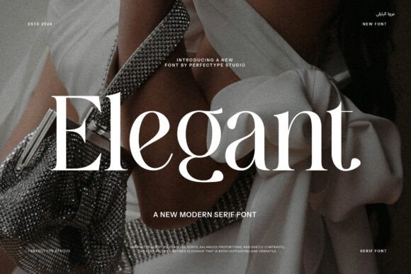
When I think of a “blank canvas” for luxury, I think of an Elegant Font. It’s the kind of typeface that doesn’t need to shout to be heard; its beauty lies in those whisper-thin lines and graceful, sweeping curves. Among various Serif Fonts, this style stands out for its sheer liquid smoothness and sophisticated silhouette.
Best Used For: This is your “go-to” for anything that needs a touch of prestige. I love using it for high-end stationery, minimalist jewelry branding, or upscale restaurant menus. If you’re designing a project where “less is more,” an elegant serif like this provides the perfect balance of white space and style.
Why I Love It: The main advantage here is the immediate sense of trust it builds. Unlike trendier, more aggressive Serif Fonts, an elegant typeface feels timeless. It gives your text a polished, high-society look that feels both expensive and deeply professional, making your headlines look like a piece of art.
9. Montage Serif Font
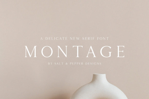
I like to think of Montage as the “jewelry” of Serif Fonts. It is an incredibly thin-lettered, authentic typeface that feels light as air but carries a heavy sense of prestige. If you’re looking for a font that adds a delicate, luxury spark without overwhelming your visuals, this is the one I’d tell you to grab first.
Best Used For: It’s a natural fit for high-end beauty branding, minimalist photography portfolios, or boutique business cards. Because of its elegant, slender profile, it works beautifully in large display sizes—think stunning website hero headers or the cover of a premium lookbook.
Why I Love It: What makes Montage special compared to heavier Serif Fonts is its “authentic” feel. It doesn’t feel manufactured; it feels crafted. The thin strokes create a sophisticated rhythm on the page that looks modern and expensive. It’s the perfect way to make any design project feel curated and high-fashion with very little effort.
10. Fairy Dreams Serif Font
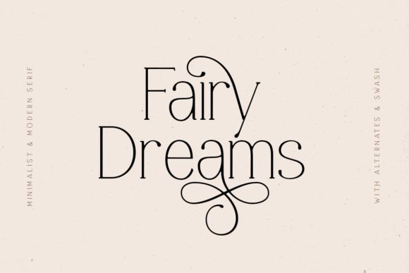
I’ve always felt that Fairy Dreams lives up to its name—it’s light, airy, and has a touch of something ethereal. It’s a minimalist take on Serif Fonts that manages to be modern without feeling cold. If you’re tired of “heavy” designs and want something that feels like a breath of fresh air, this is the one I’d recommend.
Best Used For: It’s incredibly versatile. I’ve seen it work wonders for organic skincare branding, simple and elegant logos, and minimalist wedding invitations. It’s the kind of font that shines when you want your message to feel clear, calm, and sophisticated.
Why I Love It: The real charm is in the alternates and swashes. While many minimalist Serif Fonts can feel a bit “plain,” Fairy Dreams lets you dial up the personality whenever you want. You can keep it strictly simple or add those elegant flourishes to give your headlines a custom, hand-finished look that feels truly special.
11. Silkydusk Serif Font
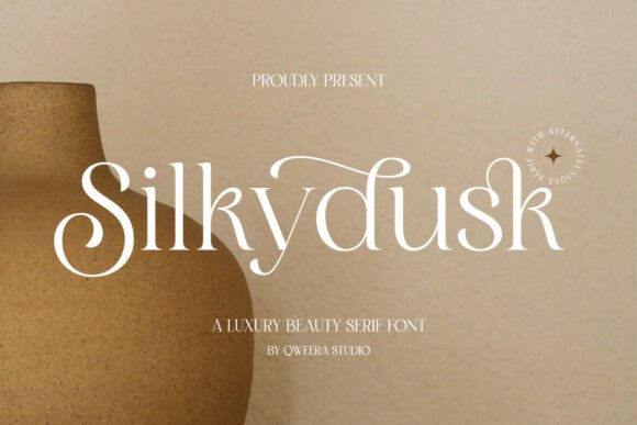
In my experience, finding a font that is both “bold” and “delicate” is a rare win, but Silkydusk nails it. It’s a refined typeface that feels like it was designed specifically for high-end boutique brands. Among many Serif Fonts, this one stands out because it doesn’t try too hard—it simply exudes an air of prestige and timeless sophistication through its perfectly balanced proportions.
Best Used For: I’d suggest using Silkydusk for fashion magazines, high-end logo designs, or premium packaging. It’s versatile enough to handle a bold headline but graceful enough for refined body text. If you’re designing for a client who demands exclusivity and a “luxury minimalist” vibe, this is your secret weapon.
Why I Love It: The graceful alternates and delicate ligatures are where the magic happens. They allow you to customize your text to look like a bespoke piece of art. Unlike more basic Serif Fonts, Silkydusk provides that professional, polished finish that makes any project feel like it belongs on the shelf of a luxury department store.
12. Et Emilia Grace Serif Font
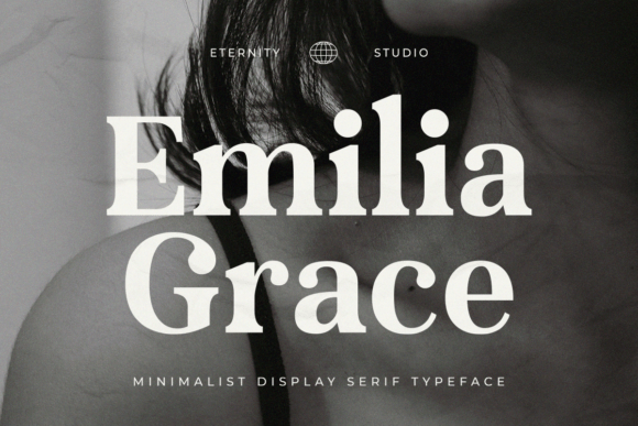
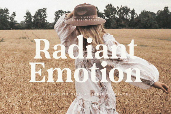
There’s something remarkably confident about ET Emilia Grace. It’s a modern serif font that feels like it has one foot in traditional elegance and the other in the future. I love how the clean lines and refined details give it a “polished” look without feeling stiff. It’s the kind of typeface that makes your design look expensive and thoughtful from the very first letter.
Best Used For: This is a workhorse for editorial layouts—think magazines, books, and catalogs. Because it’s so versatile, I also recommend it for romantic wedding stationery or premium packaging. If your project needs to balance a “classic” feel with a contemporary edge, Emilia Grace is a perfect fit.
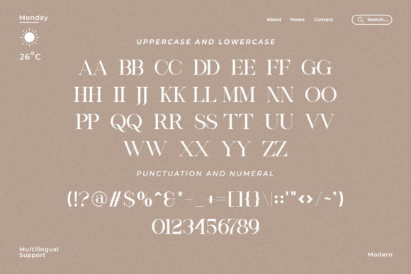
Why I Love It: What sets it apart from other Serif Fonts is its sheer professional appeal. It doesn’t just look good; it works hard. With full multilingual support and a design that holds up beautifully in both digital and print, it’s a reliable choice for global branding where you need a stylish, impactful visual that people will actually remember.
13. Kind Avenue Serif Font
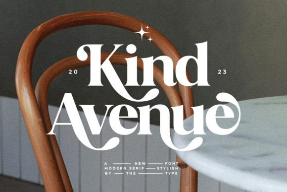
What I love about Kind Avenue is its dual personality. At its core, it’s a stylish, almost conservative serif that’s incredibly easy on the eyes, making it a rare find among Serif Fonts for actual long-form text. But the moment you start playing with the alternates, it transforms into an expressive, playful masterpiece that screams “cool and unique.”
Best Used For: It’s a fantastic choice for lifestyle blogs, editorial spreads, or branding that needs a “approachable-meets-expressive” vibe. If you need a font that can handle a serious paragraph and then pivot to a groovy, stylized logo on the same page, Kind Avenue is your go-to.
Why I Love It: The “play” factor here is huge. Because it’s PUA encoded, you can swap in those gorgeous ligatures and substitutes without any technical headaches. It’s one of those Serif Fonts that encourages you to be a designer—giving you the tools to create a custom look that feels uniquely yours with just a few clicks.
14. Lovely Serif Font
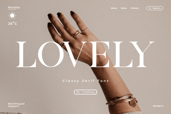
If a font could feel like a heartfelt handwritten note, it would be Lovely. It strikes that beautiful, rare balance between high-end sophistication and genuine warmth. While many Serif Fonts can feel a bit “cold” or distant, Lovely pulls you in with its graceful curves and delicate, stylish details that feel incredibly personal.
Best Used For: This is a dream typeface for wedding invitations, romantic branding, or boutique logos. If you’re designing for a florist, a jewelry brand, or an editorial project that needs to feel “polished yet exquisite,” this font will leave a lasting impression on both digital and print layouts.
Why I Love It: The “secret sauce” here is definitely the PUA encoding. It gives you instant access to all those cute glyphs and decorative swashes without needing complex software. Compared to other Serif Fonts, Lovely makes it effortless to add those extra flourishes that turn a simple design into something truly memorable and high-fashion.
15. Sparky Dream Serif Font
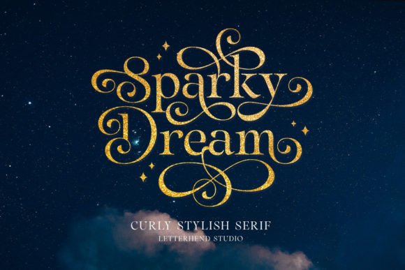
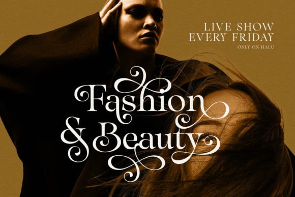
There’s a certain magic in Sparky Dream that you don’t often find in standard Serif Fonts. It takes that traditional, “timeless” foundation and adds these gorgeous, graceful curly swashes that feel like they’ve been plucked from a fairy tale. It’s sophisticated, yes, but it also has a playful, airy soul that keeps it from feeling too “heavy.”
Best Used For: I’d reach for this when I want to elevate a project from “nice” to “extraordinary.” It’s perfect for stunning wedding invitations, alluring branding for beauty products, or even formal documents that need a touch of class. If your packaging needs to feel both high-end and charming, this is the font to use.
Why I Love It: What I appreciate most is how it balances classic beauty with those decorative curls. Unlike more rigid Serif Fonts, Sparky Dream flows across the page. It’s a fantastic display font that adds an instant “wow” factor to headlines, ensuring your designs stand out with a signature style that’s both polished and full of character.
16. Royale Couture Serif Font
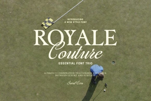
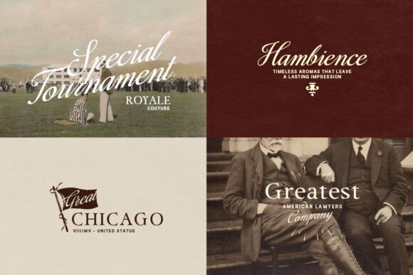
If you’ve ever spent hours agonizing over font pairings, Royale Couture is going to be your new best friend. It’s not just one of those standalone Serif Fonts; it’s a perfectly curated trio. By combining a bold serif, a clean classic sans, and a fluid script, it removes all the guesswork and gives you a professional, high-fashion look right out of the box.
Best Used For: This collection is a powerhouse for cohesive branding. I’d use it for everything from luxury logos and wedding invitations to social media quotes. Because the three styles are designed to live together, it’s ideal for projects that need a variety of textures—like a magazine layout or a complex product packaging system.
Why I Love It: The “couture” in the name isn’t just for show. The bold serif has a confident, editorial weight that feels incredibly expensive. The best part is the versatility; you don’t need to be a typography expert to make your designs look balanced. It’s a complete toolkit that ensures your work resonates with elegance and a “custom-made” feel every time.
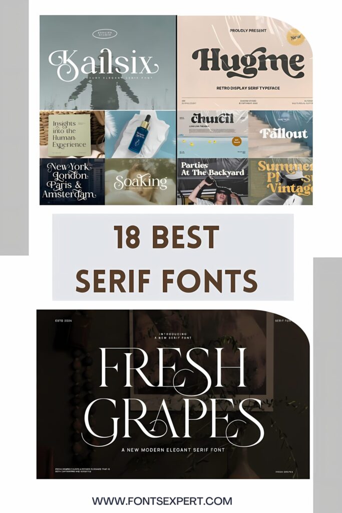
17. Fresh Grapes Serif Font
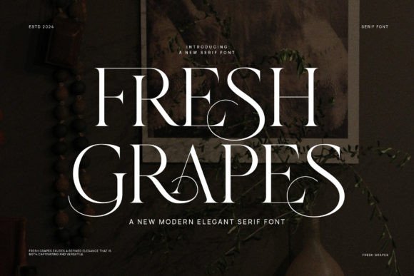
There is something so satisfyingly crisp about Fresh Grapes. It clearly draws inspiration from those iconic, minimalist logos we all know and love, stripping away the clutter to focus on pure, balanced form. In the world of Serif Fonts, this is the one I choose when I want my design to look “expensive” through simplicity rather than decoration.
Best Used For: It’s a natural fit for advertising branding, high-end brochures, and video overlays. If you are working on a beauty brand or an elegant layout design where the white space is just as important as the text, Fresh Grapes will pull the whole look together. It’s also fantastic for modern invitations that need a clean, editorial touch.
Why I Love It: What I appreciate most is its “modern-traditional” hybrid feel. Unlike some overly complex Serif Fonts, Fresh Grapes feels incredibly fresh and breathable. It’s professional, sharp, and gives off an air of “quiet luxury” that makes even a simple logo look like it was crafted by a top-tier agency.
18. Milk and Honey Serif Font
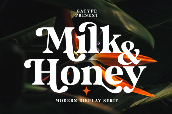
If you’re looking for a font that feels like a warm latte on a Sunday morning, Milk and Honey is it. It’s a beautifully bold, thick-lettered serif that perfectly captures the “soft-retro” trend taking over social media right now. While many Serif Fonts try to be sharp and serious, this one is all about comfort, curves, and a friendly, high-end vibe.
Best Used For: I’d recommend this for any project that needs to feel spectacular and “now.” It’s a dream for lifestyle branding, catchy social media quotes, and modern packaging. Because it’s so thick and legible, it’s also a fantastic choice for website headers that need to grab attention immediately.
Why I Love It: The versatility is where it really shines. Since it’s PUA encoded, you can easily tap into a treasure trove of swashes and glyphs to customize your look. Unlike more “flat” Serif Fonts, Milk and Honey has a rhythmic, bouncy quality that makes your typography feel alive and incredibly stylish.
Conclusion: Finding Your Perfect Serif Signature
Choosing from such a diverse collection of Serif Fonts really comes down to the “soul” of your project. Whether you are leaning into the nostalgic, groovy vibes of Magic Seventies, the sharp, high-fashion lines of Silkydusk, or the bold, approachable comfort of Milk and Honey, the right typeface does more than just display text—it sets a mood and builds an immediate connection with your audience.
In 2026, the trend is moving away from generic designs toward typography that feels personal and intentional. By utilizing the unique ligatures, PUA-encoded swashes, and varied weights found in these Serif Fonts, you aren’t just “picking a font”; you are crafting a brand identity that resonates with prestige and character.
My Final Advice: Don’t be afraid to experiment. Use a clean, minimalist serif like Fresh Grapes for your body text and pair it with a decorative showstopper like Sparky Dream for your headlines. The magic happens in the contrast!
Ready to transform your next project?
Browse all Serif Fonts on Creative Fabrica
You may also like:
Disclosure: This post contains affiliate links. If you make a purchase through my links, I may earn a small commission at no extra cost to you. Thank you for supporting my site! ♥️